%20png%20copy.avif)
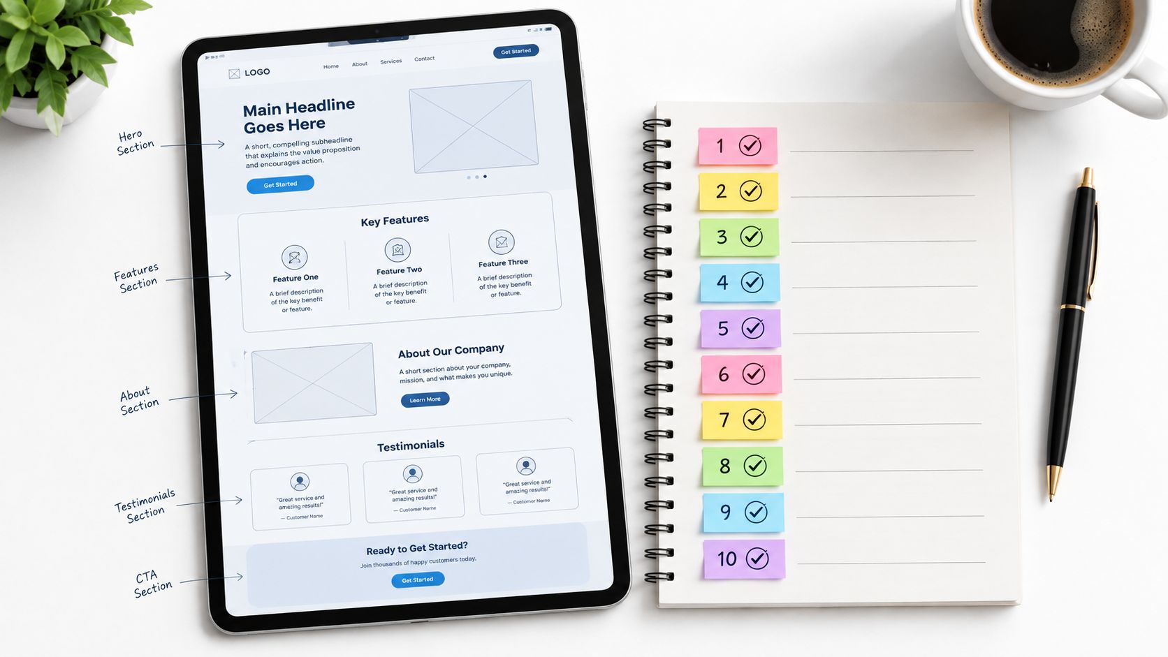
Most B2B landing pages fail before the first scroll. They don't fail because the button is the wrong shade of blue. They fail because the page asks a skeptical buyer to do work the traffic source never prepared them for. A paid-search visitor arrives with a specific problem. An organic visitor arrives with a question. An email visitor may already know your category. Treating all three as the same audience creates friction before the buyer has found a reason to care.
The fix is sequential. Match the promise first. Prove it second. Remove friction third. Protect performance and measure what changes throughout. That order matters. A fast page with vague positioning still underperforms. A concise form can't rescue a page that makes unsupported claims. A strong headline won't compensate for proof that appears after the decision point.
These landing page best practices are ranked by where they break in B2B SaaS. Each one has a trade-off tied to ICP, sales cycle, traffic intent, and team capacity. Use them to fix the page from the top down, starting with the promise that brought the buyer there.
Most B2B SaaS teams send every campaign to the same product page and call the problem “traffic quality.” The actual issue is message mismatch. A buyer searches for pipeline forecasting, clicks an ad promising clarity, and lands on a generic platform page full of features. The page makes the buyer reconstruct the connection.
The headline, proof, visuals, and CTA should confirm the reason for the click. A search visitor looking for a sales tool needs a different first impression from an operations leader responding to an email about workflow automation. HubSpot's separate pages for CRM software, email marketing software, and sales tools reflect this basic principle. Slack also varies paid-search messaging by use case, including pages for remote teams and sales.
Build a message matrix before building more pages. Map each traffic source to:
Use UTM parameters to compare conversion by source, campaign, and audience. Create a small set of reusable page variations by ICP, use case, or buyer stage rather than cloning dozens of fragile pages. A focused Webflow landing page approach helps teams keep those variations consistent without turning every campaign into a new web project.
Many teams put the product category above the outcome. “AI-powered revenue intelligence platform” tells a buyer what the company sells. It doesn't explain why a revenue leader should spend time on it.
The first viewport needs one outcome-focused statement in the buyer's language. Not three competing claims. Not a slogan followed by abstract adjectives. A skeptical visitor should understand what problem the product solves, who it serves, and what action comes next without decoding the company's positioning.
Notion leads with “All-in-one workspace,” which establishes the product's organizing idea before discussing detailed capabilities. Calendly starts with “Scheduling done for you,” not a list of integrations. Stripe's “Payments infrastructure for the internet” defines the job it performs and leaves the implementation complexity for later.
Write one primary value proposition, then support it with a small number of benefits and one CTA. Remove secondary headlines that compete with the main claim. If the hero tries to serve founders, sales leaders, developers, and finance teams at once, the page is exposing an ICP decision the company hasn't made.
Stress-test the statement against the paid campaign keywords and the organic query. Then ask sales whether the headline answers the buyer's “why should I care?” question. Concrete outcomes are stronger than abstract benefits, but don't invent precise outcomes your product can't substantiate. The conversion optimization guidance from Big Moves Marketing is most useful when it starts with positioning rather than button styling.
Practical rule: If the hero needs a paragraph to explain the headline, the headline isn't doing its job.
Most SaaS landing pages promise transformation and show decorative product screenshots. That's not proof. A buyer evaluating a high-consideration product wants to see whether the product can handle the stated problem, fit the existing workflow, and produce a credible next step.
Show the capability in context. Figma's interactive product demonstrations let visitors experience the product rather than read claims about it. Calendly uses a short animated demonstration to show the scheduling workflow. Stripe uses annotated screenshots to explain how the payment flow works. Notion shows templates and use cases that make setup easier to imagine.
Choose one or two capabilities that directly support the hero promise. A revenue platform might show how a forecast is assembled from pipeline signals. A security product might show the investigation workflow rather than a dashboard full of unreadable charts. Feature volume creates cognitive load and gives skeptical buyers more reasons to ask unanswered questions.
Use:
Place proof near the claim it validates. A short visual can sit above the fold, while deeper screenshots belong beside the relevant objection or use case. Review your product visuals regularly. Outdated UI creates a credibility gap that polished copy can't hide. For decisions about commercial transparency, pair capability proof with the thinking in Big Moves Marketing's analysis of pricing pages in B2B websites.
A product demonstration should reduce uncertainty. If it only adds motion, remove it.
Many teams hide their strongest objection handling in a footer FAQ. Buyers don't wait until the bottom of a page to raise concerns about security, integrations, time to value, procurement, or price. They raise them when the page first makes a claim that creates risk.
Place the answer next to the concern. If the product touches sensitive data, explain the security model near the capability that uses that data. If implementation is complex, show the onboarding path near the product demonstration. If the buyer needs an integration with Salesforce or a data warehouse, surface that information before the CTA.
Sales teams already have the raw material. Review lost-deal notes, listen to discovery calls, and ask prospects who didn't convert what stopped them. Don't turn every objection into defensive copy. Translate it into useful evidence.
Keep answers concise on the page, then link to deeper security, integration, or implementation resources. FAQ schema can help search engines interpret genuine questions, but structured data won't repair weak answers. The page must earn trust from the person evaluating it, not just from a crawler.
A generic FAQ says the company expects questions. A strategically placed answer proves the company understands risk.
Most SaaS teams place logos near the top and testimonials somewhere in the middle, then leave the CTA unsupported. That arrangement assumes trust is established once and stays established. It doesn't. Buyers reassess risk at the moment they're asked to submit contact details or book time with sales.
Put relevant proof immediately before the decision point. Use named customers, attributed quotes, credible review sources, or specific implementation evidence. Generic praise such as “great platform” doesn't help a revenue leader explain the purchase internally. A useful quote identifies the situation, the change, and the person who can stand behind it.
Segment proof by visitor. Enterprise prospects want evidence that the product survives security review, procurement, scale, and operational complexity. Smaller teams may care more about speed of setup and the amount of support required. Showing a famous logo to every audience creates recognition, but it doesn't necessarily establish fit.
Ask customers for permission before using their names, titles, images, or recordings. Link third-party reviews to the full source instead of presenting unattributed fragments. A short customer video can work well when it explains a real workflow, not when it repeats marketing language.
Use proof in three places:
The Big Moves Marketing case study writing guidance helps turn customer evidence into a useful business argument. The XBurst social proof guide offers another perspective on selecting and presenting proof.
Refresh evidence when the customer mix, product, or positioning changes. Repetition weakens attention. Relevance restores it.
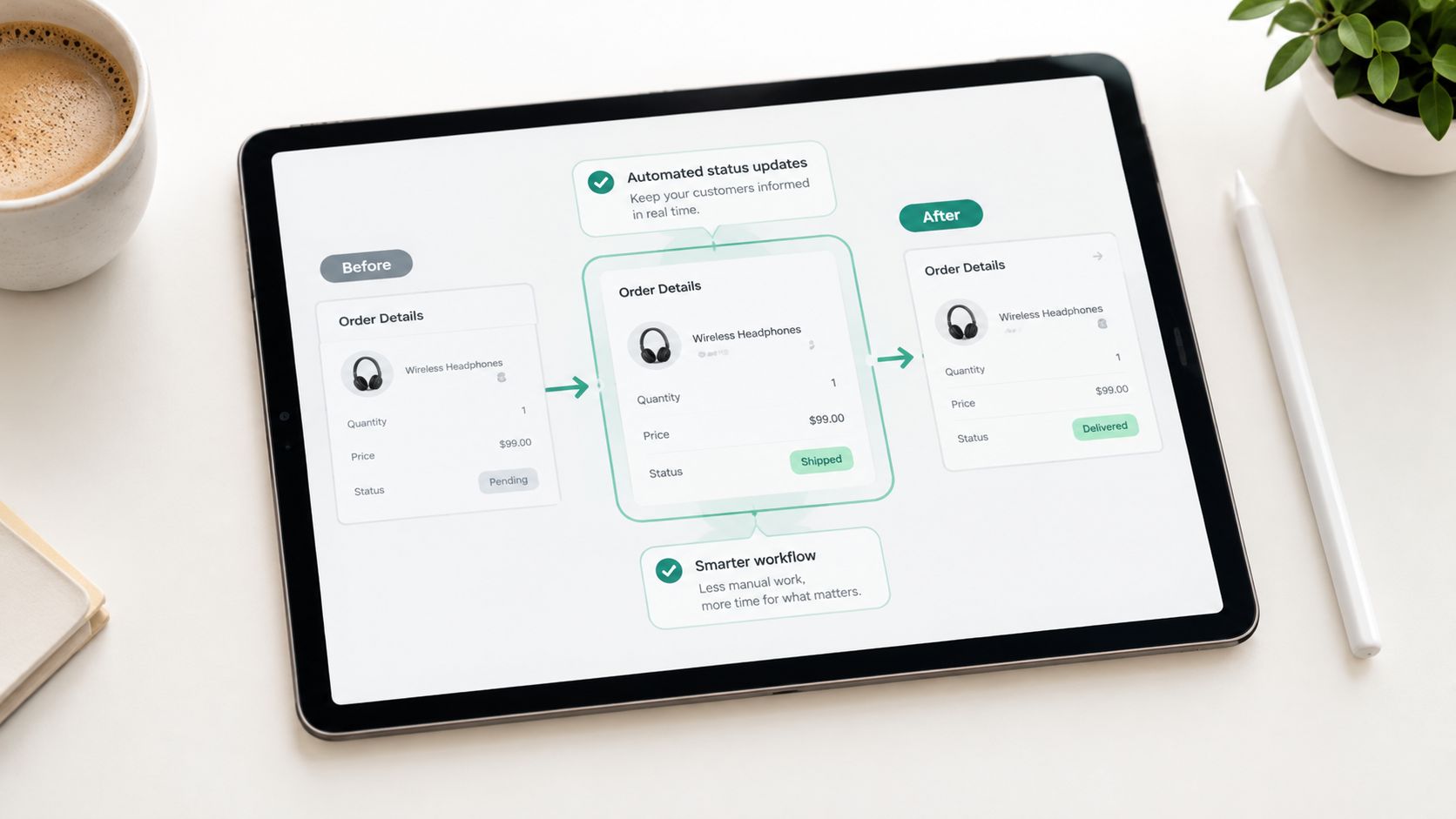
Most teams confuse choice with helpfulness. They put “Book a demo,” “Start free,” “Watch the video,” “Talk to sales,” and “Download the guide” on the same page, then wonder why attribution and buyer intent look muddy.
Give the page one primary job. Repeat the same CTA at the points where the buyer has enough information to act. A self-serve product may use “Start free.” A sales-led enterprise product may use “Request a demo.” A technical evaluation page might use “See the product in action” if the buyer isn't ready for a sales conversation.
The CTA should describe the next step clearly. “Submit” is an administrative instruction. “See how forecasting works” sets a clearer expectation, provided that's what happens after the click. Don't promise a demo if the form only creates a marketing record and starts an automated email sequence.
A page serving a complex buying group may need a secondary resource, but it shouldn't compete with the primary conversion. Put the secondary action below the main decision path and make its role clear. A buyer who isn't ready to talk can download an implementation guide, while a high-intent visitor can book time with sales.
Repeat the primary CTA in the hero, after proof, and near the end when the page is long enough to justify repetition. Make the form visible when the action requires information. Measure form starts, completions, and qualified outcomes separately. A higher click rate that produces unqualified records is not progress.
Heat maps can reveal whether visitors notice the CTA, but they can't tell you whether the offer is strategically right. That requires source-level and pipeline-level reporting.
The most common form mistake is asking sales questions before the buyer has received sales value. Teams request company size, role, budget, timeline, use case, phone number, and several qualification fields because the CRM can store them. The visitor sees administrative work.
Form length creates a measurable completion cost. One dataset covering 404 form-based landing pages reported conversion rates of 18.2% for one-field forms, 13.0% for two fields, 11.5% for three fields, 9.9% for four fields, 8.1% for five fields, 7.6% for seven fields, 5.8% for eight fields, and 4.2% for nine or more fields, as summarized by Neil Patel's form-field analysis. A separate benchmark showed a directional decline from approximately 17% with five SaaS form fields to about 11% with seven and below 7% with ten or more, according to Unbounce's SaaS demo guidance.
The answer isn't always a one-field form. Enterprise sales may need qualification to route leads correctly. The fix is to make the trade-off explicit.
Track abandonment and errors by field, then compare submission rate with meeting-booked and pipeline outcomes. A shorter form can increase volume while lowering sales efficiency. A longer form can reduce volume while improving routing. The correct choice depends on your sales capacity and qualification model.
Don't use a pop-up as a substitute for a bad conversion path. If you're evaluating one, start with the user experience principles in Big Moves Marketing's website pop-up analysis.
Most B2B teams treat mobile as a QA checkbox. That's a mistake. Buyers research software between meetings, from phones, on inconsistent connections, and often after clicking a campaign that was optimized on desktop.
Google's research associated a 0.1-second improvement in mobile load time with a 10.1% conversion increase and almost 7% better engagement, as reported in its Milliseconds Make Millions research. Those findings are observational and sector-specific, so don't copy the percentage into a forecast for a high-consideration SaaS journey. Use it to justify controlled testing of the initial render and interaction path.
The first mobile viewport should make the value proposition, proof, and CTA usable. Visitors shouldn't pinch to read a headline, fight an embedded video, or scroll through decorative animation before finding the form.
Prioritize:
Test with Google PageSpeed Insights, WebPageTest, and real-user data. Website performance guidance from Amax Marketing provides additional implementation context. Speed matters because it protects intent. It can't create intent where the message is wrong.
Several teams run a speed audit once, fix the obvious image problem, and move on. Performance then degrades as developers add analytics, chat, personalization, video, and campaign-specific scripts. The page becomes slower because every stakeholder adds a reasonable exception.
Treat performance as an engineering constraint. Use modern image formats and responsive sizes. Lazy-load content that isn't needed for the first interaction. Preload the hero asset when it's genuinely critical. Remove render-blocking resources, defer nonessential JavaScript, and use server-side or edge rendering when the page architecture requires it.
A landing page can report acceptable lab results and still frustrate real buyers on a mid-range mobile connection. Real-user monitoring shows how actual visitors experience the page across devices, geographies, and traffic sources. Track Largest Contentful Paint and Cumulative Layout Shift, then investigate the resource that causes the regression instead of treating the score as the diagnosis.
Set performance budgets for images, scripts, and page weight. Add checks to the deployment process so a campaign landing page can't exceed the agreed limits. Monthly audits are useful, but automated checks catch damage closer to the point of release.
Performance rule: Every third-party script needs a job, an owner, and a reason it must load before the buyer can act.
Do not optimize everything equally. The hero, form, CTA, and proof that supports the first decision deserve priority. A low-priority footer image can wait. A blocked form cannot.
Most landing pages decay through organizational change. The ad promise changes but the headline doesn't. The product UI changes but the screenshot remains old. A customer leaves but the testimonial stays. The campaign expands into a new audience and the conversion rate falls because the page was built for the original segment.
Assign one owner to each important page. That person should maintain the message, proof, analytics, form routing, and technical health. Ownership doesn't mean doing every task. It means someone is accountable for noticing when the page no longer reflects the buyer or the campaign.
Review the highest-value pages on a fixed cadence. Run experiments against a defined primary metric and monitor qualified conversion, meeting quality, and pipeline rather than raw submissions alone. Record the hypothesis before changing the page. Otherwise, the team collects activity without learning.
A practical operating rhythm includes:
Keep one source-of-truth document for campaign promises and page messaging. Sync it with paid, organic, sales, and product marketing teams. Use a website usability analysis to identify where the page makes buyers work harder than necessary.
Testing isn't the strategy. It's how you protect a strategy from assumption.
| Item | 🔄 Implementation Complexity | ⚡ Resource Requirements & Speed | 📊 Expected Outcomes (⭐) | Ideal Use Cases | 💡 Quick Tip |
|---|---|---|---|---|---|
| Relevance and Messaging Alignment to Traffic Source | Medium–High: multiple page variants, tracking & routing | Moderate: copy, design, dev + analytics setup | ⭐ High: 15–40% conversion lift; 30–50% bounce reduction; lower CPA | Paid search, segmented campaigns, high-volume channels | Build 3–5 core variations; use UTMs and a message matrix |
| Single Clear Value Proposition Above the Fold | Low–Medium: requires positioning work and editorial discipline | Low: focused copy/design and A/B testing | ⭐ Strong: 25–40% lower bounce; clearer testable hypothesis | Top-of-funnel, awareness and broad search landing pages | Use measurable outcome language; A/B test dominant headlines |
| Feature Proof and Capability Demonstration (Not Promises) | Medium: produce screenshots, short demos, or interactivity | Moderate–High: product, design, video or dev resources | ⭐ High engagement: 2–3x higher than text-only; reduces skepticism 30–50% | Mid-funnel B2B, complex workflows, trial-first offers | Keep demos <60s; prefer annotated screenshots for speed |
| Objection Handling and FAQ Sections Positioned Strategically | Medium: research + inline content placement strategy | Low–Moderate: content, legal/security assets, sales input | ⭐ Moderate: 10–20% conversion lift; fewer sales objections | Enterprise, security-sensitive buyers, high-consideration deals | Address top 3 objections inline; use FAQ schema for SEO |
| Social Proof Positioned Before the CTA | Low: curate and place proof at decision point | Low–Moderate: customer outreach, testimonial assets | ⭐ Significant: 18–45% uplift when placed before CTA; named testimonials ~2.5x | Decision-point pages, account-based landing pages | Use named, outcome-focused quotes and rotate proof regularly |
| Clear Next Step, One Primary CTA Per Page Section | Low: design/copy consistency and repetition | Low: CTA styling, form gating and tracking | ⭐ Effective: 5–15% conversion lift; simpler attribution | Almost all conversion-focused landing pages | Repeat primary CTA 2–4x; keep secondary CTAs visually subordinate |
| Form Friction Strategy, Progressive Disclosure and Data Prioritization | Medium: CRM integration and conditional logic | Moderate: form tooling, CRM workflows, automation | ⭐ Measurable: 2–3x higher submissions for 2-field forms; lower abandonment | Lead-gen, freemium signups, high-volume capture flows | A/B test 2-field vs longer forms; collect qualification post-signup |
| Page Load Speed and Mobile Responsiveness as Conversion Drivers | Medium: continuous engineering and design effort | Moderate–High: performance tooling, asset pipeline, monitoring | ⭐ High impact: 10–25% conversion lift; mobile +20–35%; SEO gains | Mobile-heavy audiences, paid traffic, high-traffic sites | Target <2s on 4G; monitor Core Web Vitals regularly |
| Performance Optimization Tactics | High: build pipeline changes, caching, SSR/edge work | High: engineering, CDN, tooling and CI updates | ⭐ Strong: lower latency, better engagement, reduced costs, improved ranking | Large sites, performance-sensitive products, global audiences | Use RUM, performance budgets and automate audits in CI |
| Monitoring, Testing, and Ongoing Maintenance for Landing Pages | Medium: process + tooling for continuous experiments | Moderate: RUM, A/B platforms, analytics, maintenance cadence | ⭐ Cumulative gains: prevents regressions and drives steady lifts | Any active campaign portfolio or growth program | Run weekly page reviews; refresh proofs quarterly and pre-register tests |
Start with the landing page receiving the most valuable paid or organic traffic. Don't begin with the page that looks worst. Begin with the page where a message or experience problem is already costing the business the most.
Match the headline to the traffic source. A paid-search visitor should recognize the promise they clicked. An organic visitor should see a direct answer to the problem behind the query. An email visitor should understand what changed between the message and the page. If the page doesn't preserve that context, every later improvement works against a broken handoff.
Then tighten the value proposition. Give the buyer one clear reason to continue. Product category language belongs after the outcome, not instead of it. Show the capability that proves the claim, using a workflow, annotated screenshot, short demonstration, or implementation detail that makes the product easier to evaluate.
Place proof before the decision point. A logo at the top may establish familiarity, but a relevant customer example near the CTA helps the buyer justify action. Use evidence that matches the ICP, sales motion, and level of risk. A founder-led sales page needs different proof from an enterprise procurement page.
Remove friction with discipline. Delete fields that don't affect immediate routing. Move qualification into progressive profiling when sales can handle it later. Surface objections where they arise instead of burying them in a footer. Keep one primary CTA so the page has a clear job and the team can attribute the result.
Treat speed and accessibility as part of conversion quality. Google's research connects mobile performance improvements with better conversion and engagement, but B2B teams should test the effect against their own journey rather than assume a retail result transfers directly. Accessibility also belongs in the definition of done. WebAIM's 2025 scan found detectable WCAG failures on 94.8% of home pages among the top one million websites, with low contrast, missing alternative text, and missing form labels among common problems, as reported by WebAIM's accessibility statistics summary. A form that keyboard-only users can't complete is a conversion problem and a data-quality problem.
Measure traffic sources separately. Unbounce's benchmark analyzed more than 41,000 landing pages, 464 million visits, and 57 million conversions, and reported a cross-industry median conversion rate of 6.6%, with industry medians ranging from 3.8% for SaaS to 12.3% for events and entertainment, as described in its 2024 conversion benchmark. That median is a reference point, not a target. Email visitors, paid social visitors, paid-search visitors, and display visitors arrive with different levels of intent. A blended rate hides that difference.
AI referrals deserve measurement, not panic. A 2025 study of 3,000 websites found that AI sources generated only 0.17% of visitors and 0.12% of page views on average, according to Ahrefs' AI traffic study. Keep conventional acquisition working while making pages easy for AI systems and human buyers to understand. Expose specific use cases, customer outcomes, implementation details, and structured FAQs. Track AI referrals, branded searches, direct visits, and assisted pipeline separately.
Finally, assign an owner, define the metric the page must move, and review it on a fixed cadence. Big Moves Marketing approaches landing pages as part of positioning, website, demand generation, and measurement decisions, not as isolated design assets. That's the right mental model. A landing page is where your market promise meets buyer skepticism. Fix that sequence before touching the details.
Big Moves Marketing helps B2B SaaS teams clarify positioning, align campaign and landing-page messaging, and build conversion-ready websites with measurement tied to pipeline. If your pages attract traffic but fail to create qualified conversations, visit Big Moves Marketing to discuss the message, proof, form, and testing sequence that needs attention.


%20-%20white.svg)