%20png%20copy.avif)
A website can look polished, load quickly, and still leak qualified pipeline at every important decision point. That isn't a design opinion. Nielsen Norman Group's foundational usability research found an average 68% difference in measured usability between competing websites, while users failed 35% of website tasks on average across many test tasks. The NN/G research summary makes the commercial implication clear: usability analysis of a website is a quantitative discipline for finding where people stop, hesitate, misunderstand, or abandon.
For B2B SaaS leaders, the important question isn't whether visitors like the website. It's whether the right buyers can understand the product, trust the promise, find proof, and take the next step without unnecessary effort. A qualified prospect who can't complete those tasks doesn't create a dashboard alert. They disappear.
Most B2B SaaS teams treat internal familiarity as evidence of usability. Product marketers know the terminology, founders know the original problem, salespeople know how to explain the value, and designers know where every element lives. The website passes an internal review because the people reviewing it already understand the product.
That process tests recognition, not usability.
Usability research relies on measurable task-performance metrics, including success rate, time on task, error rate, and user satisfaction. The difference matters because a homepage can feel clear to the team that built it while failing a first-time buyer who is comparing vendors under time pressure. If your ideal customer can't identify the problem you solve or the evidence that supports your claim, visual polish won't rescue the visit.
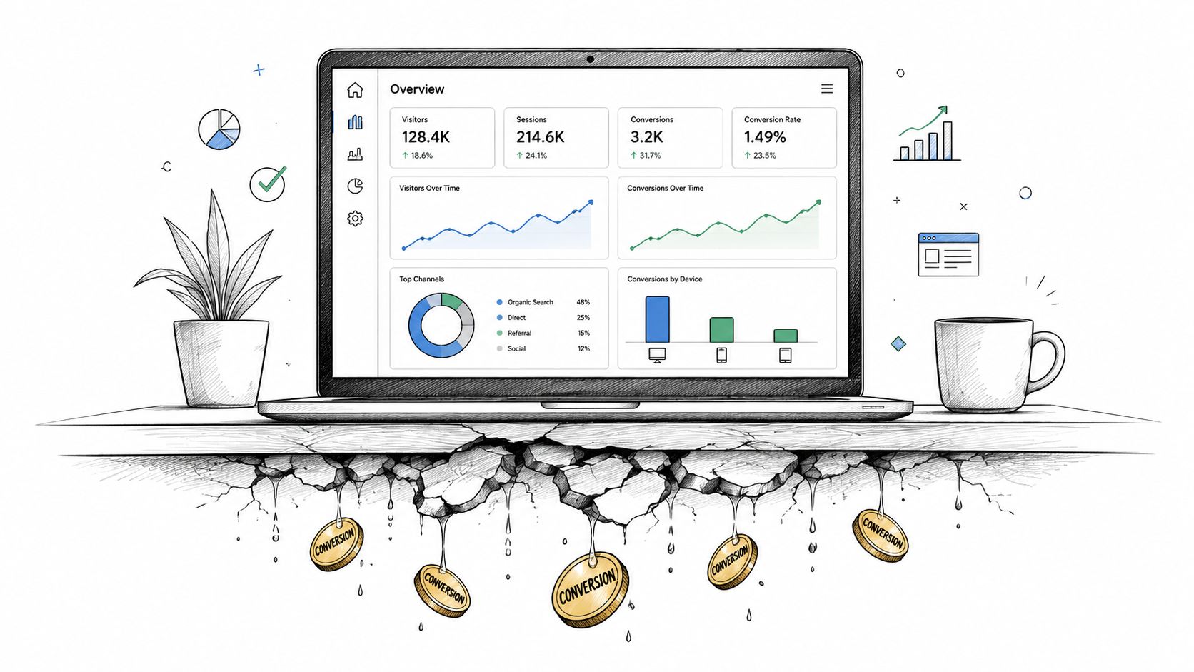
Surface-level analytics can tell you that a page has a weak conversion path. It usually can't tell you whether the buyer failed because the headline was vague, the call to action felt premature, the form asked for information they weren't ready to provide, or the navigation forced them into the wrong story.
Internal feedback has a different weakness. Stakeholders tend to debate preference. Buyers demonstrate behavior.
Nielsen Norman Group's research also reported that about two-thirds of corporate websites made ten usability mistakes. That finding helped establish usability analysis as a practical method for diagnosing recurring design and navigation failures, not as a subjective review of aesthetics.
Commercial reality: A usability problem becomes a growth problem when it blocks a high-intent buyer from completing a revenue-relevant task.
The strongest B2B SaaS teams therefore treat website usability as part of pipeline design. They test whether a target account can find the relevant use case, understand the product category, evaluate fit, locate proof, and request the right next conversation. Those are not decorative interactions. They're the path between interest and pipeline.
A usability analysis should answer a commercial question, not produce a general opinion about ease of use. Ask whether an operations leader can determine if the product fits an existing workflow and request the right demo. That question gives the team a measurable path to qualified pipeline.
Choose one business outcome and define the tasks that lead to it. A sales-led SaaS company can test discovery, solution evaluation, proof validation, and demo submission. A product-led company can test whether a prospect understands the free experience, assesses implementation effort, and starts without sales assistance.
Use neutral task wording. Avoid directing participants to a specific button or repeating internal product language. Give them a realistic situation, then observe the route they choose, the evidence they seek, and the point where confidence drops.
Keep the same task set across releases. GOV.UK's service benchmarking guidance recommends measuring task completion, time on task, abandonment, and perceived difficulty or confidence on a 1–5 scale, then comparing average completion rate and average task time over time. A fixed method turns scattered observations into a trend leadership can act on.
A relevant participant matches more than a job title. Recruit people who resemble those who evaluate, influence, approve, or use the product. Include context that changes behavior, including technical scrutiny, procurement requirements, compliance concerns, and a preference for self-serve research.
Customer familiarity can hide pipeline friction. Existing customers may understand category terms that confuse new buyers, while executives may approve recommendations based on participants unrelated to the actual buying journey. Screen for the decisions your website must support, not just the industry or seniority of each participant.
Useful tasks require a decision. Ask participants to assess product fit for a specific situation, compare the approach with an alternative, find implementation information, or decide whether to book a conversation. Each scenario should test whether the page provides enough evidence for that commercial moment.
For teams refining a commercial page, this resource on how to improve landing page conversion performance connects page behavior with conversion work. For the research process, document recruitment, task wording, success criteria, and exclusion rules in a shared plan, using Big Moves Marketing's user research guidance as practical context.
Store the exact tasks, participant profile, and scoring method after each study. Repeating the method lets founders identify whether a release removes a qualified-buyer obstacle or merely changes the interface. That distinction keeps usability work tied to pipeline outcomes.
Revenue leakage often appears as a usability problem before it appears in the CRM. Measure whether a qualified buyer can complete a commercial task, understand the offer, and move to the next step without avoidable assistance.
Use four measures together: success rate, time on task, error rate, and user satisfaction. NN/G's guide to core usability measures provides a framework for treating usability as observable performance rather than a collection of opinions. Interpret each measure against the buying journey. A product-led site should make self-serve evaluation efficient, while a sales-led site must help buyers reach a confident conversation with the right context.
Define commercial success before testing. A buyer who reaches the demo form but cannot explain the product has not completed the task. A prospect who finds a case study but misreads the customer profile has not validated fit.
Separate full success, partial success, and failure. Partial success often identifies the pipeline leak: the visitor understands enough to continue, but not enough to make a confident decision. Review which missing evidence, unclear term, or weak transition stopped progress.
Time becomes meaningful only when tied to comprehension. A longer evaluation may be appropriate for a complex B2B product. Repeated scanning of irrelevant navigation labels, rereading a vague claim, or backtracking after a wrong choice signals avoidable cognitive effort.
Compare the same buyer scenario across releases, then check whether confidence and understanding stayed intact. A faster route that sends a prospect to an unsuitable form improves a dashboard, not revenue.
Log wrong menu selections, misunderstood product terms, missed required fields, and abandonment after unexpected interactions. Record the step immediately before each error and whether the participant recovered independently. Patterns usually point to a mismatch between the company's internal model and the buyer's decision process.
Apply these findings to conversion work with practical conversion optimization tips from Big Moves Marketing. Remove errors that interrupt high-value actions, rather than chasing activity for its own sake.
Use benchmarks carefully. The IxDF overview of usability evaluation explains why small qualitative samples cannot support quantitative claims without confidence intervals and statistical significance. For B2B SaaS founders, the useful output is a defensible link between a friction point and the qualified pipeline step it disrupts.
Numbers show where performance breaks. They don't explain the mental model behind the failure. A low task-success result could come from unclear positioning, weak information architecture, an untrusted proof point, or a form that asks for commitment before the buyer has enough context.
That is why qualitative observation and standardized satisfaction scores belong in the same study. Watch the participant's behavior, capture their words, and then record how difficult or confident the task felt. The combination tells you whether a problem is visible, consequential, and emotionally costly.
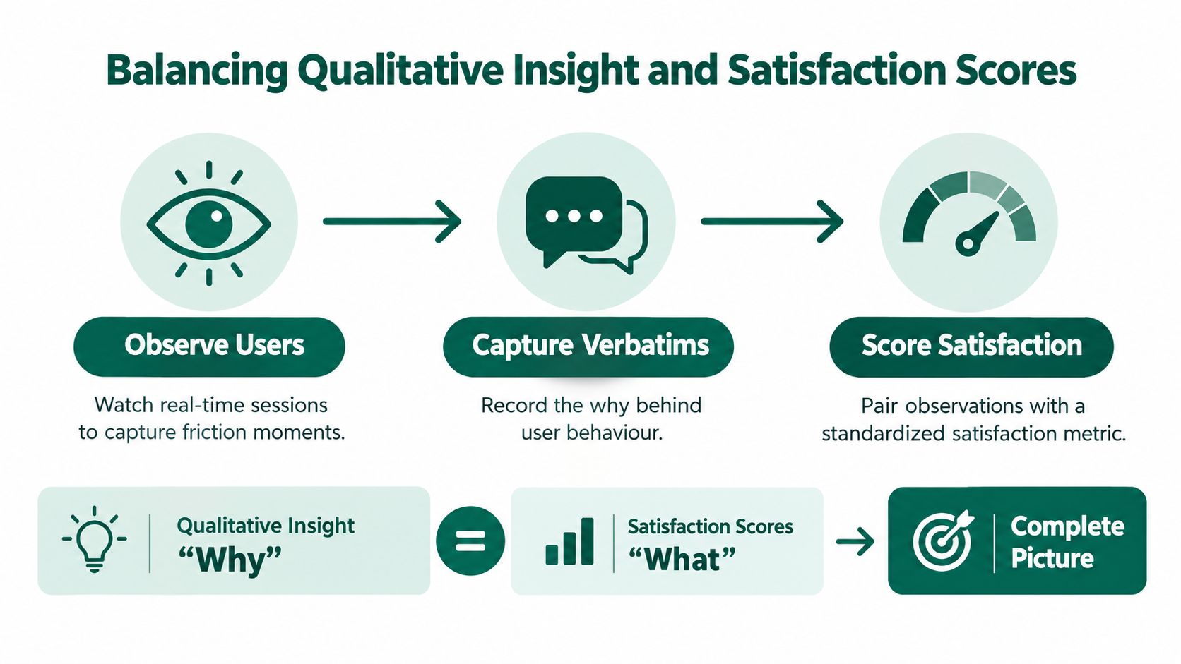
Don't interrupt too quickly. If a buyer pauses at a navigation label, let the pause develop. If they scroll past proof, ask what they expected to find. If they hesitate before submitting a form, record the concern instead of reassuring them.
Look for mismatches between what participants say and what they do. Someone may call a page clear while taking an indirect route. Another may criticize the copy but complete the task efficiently. Those differences help you distinguish a preference from a genuine usability barrier.
A well-designed session can include SUS after the test and SEQ after each task. Nielsen Norman Group recommends this pairing for summative benchmarking because SUS provides a broader usability signal while SEQ captures the difficulty of individual tasks.
Use a simple synthesis model:
For teams expanding their research practice, this overview of user research methods from Figr provides useful terminology for selecting approaches. The commercial discipline is deciding what evidence deserves action.
The useful output isn't a transcript. It's a clear explanation of why a qualified buyer failed to move forward.
This approach also supports stronger customer experience best practices from Big Moves Marketing, because it connects observed experience to the decisions your marketing, product, and sales teams must make.
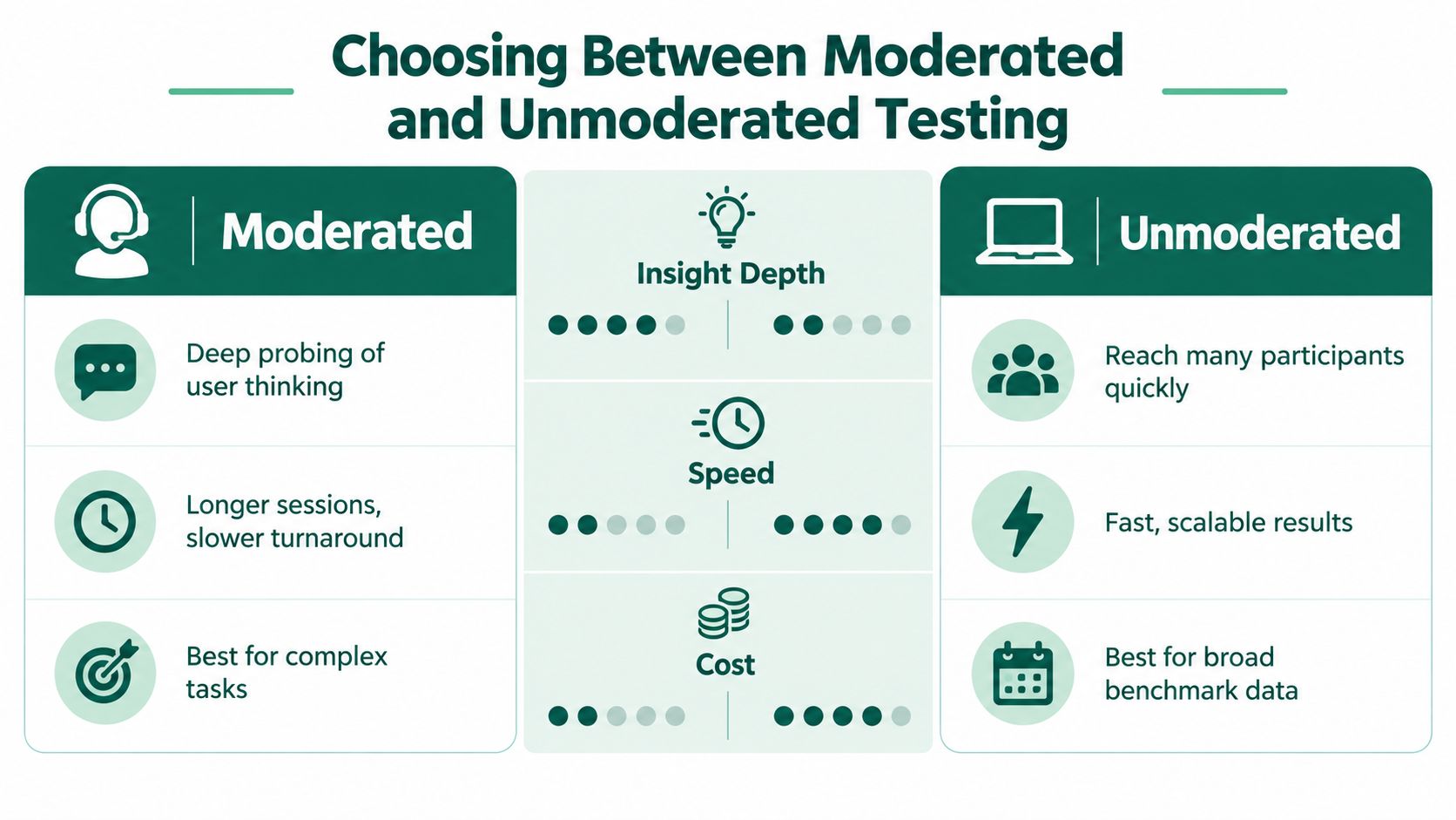
The choice between moderated and unmoderated testing should follow the question you're asking. Teams often choose unmoderated research because it's faster, then discover they collected a large set of shallow reactions to a task that required explanation. Other teams overuse moderated sessions for simple navigation questions that could have been answered efficiently at scale.
A moderator can ask what the participant expected, why a phrase felt credible, or what information would change the decision. That makes moderated testing valuable when the task involves positioning, category education, technical evaluation, or a complex buying journey.
It also helps when the team doesn't yet know what it needs to measure. Early research often contains surprises. A participant may reveal that the primary objection isn't usability at all, but concern about migration, ownership, or internal approval. A rigid unmoderated task may record the failure without exposing the cause.
The trade-off is operational. Recruiting, scheduling, conducting, and analyzing sessions takes more coordination. Moderator behavior can also influence participants, so the discussion guide must avoid leading questions.
Unmoderated testing works well when the task is clear and the team needs comparable behavior across a broader participant group. You can test whether users find a page, understand a label, choose between options, or complete a defined flow without a facilitator shaping the experience.
It's particularly useful after a qualitative round has produced a focused hypothesis. If moderated sessions suggest that buyers misunderstand a navigation term, an unmoderated test can assess whether that issue appears across the intended audience.
The limitation is interpretation. A recording may show abandonment, but not whether the participant lacked trust, misunderstood the task, or encountered a technical problem. Build follow-up questions into the study, but don't mistake a short explanation box for a conversation.
| Decision need | Moderated | Unmoderated |
|---|---|---|
| Understand why buyers hesitate | Strong fit | Limited |
| Compare a defined interaction | Useful | Strong fit |
| Explore complex tasks | Strong fit | Riskier |
| Collect consistent benchmark behavior | Slower | Strong fit |
| Validate an early hypothesis | Strong fit | Useful after the hypothesis is clear |
Nielsen Norman Group recommends testing 5 users when the goal is to discover usability problems, because the first participants typically expose the most important issues. When the goal is metrics rather than issue discovery, NN/G recommends a larger sample, such as 20 users per design, to obtain reasonably tight confidence intervals. Its guidance on test-user volume should shape the method, not just the recruitment budget.
A usability study can produce more issues than a growth team can fix. That isn't success. A long backlog of low-consequence defects creates the appearance of progress while the underlying pipeline leak remains untouched.
Start by placing each issue at the intersection of severity, frequency, audience value, and funnel proximity. A minor alignment problem on a low-intent resource page should not outrank a confusing qualification question on the demo form. The right priority is the issue most likely to block an important buyer from taking an important action.
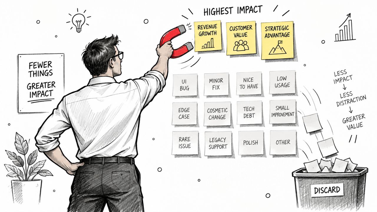
Classify findings in four groups:
Then add audience context. A blocker for an enterprise security buyer may matter more than several minor issues affecting broad, low-intent traffic. Your prioritization model should reflect the business you want, not the number of comments collected.
Practical rule: Fix the point where a qualified buyer loses confidence before fixing the point where an unqualified visitor loses patience.
For each high-priority issue, write the causal chain in plain language: “The security lead can't find deployment information, so they can't validate internal fit, so the demo request becomes premature.” That sentence gives product marketing, design, sales, and leadership a shared decision frame.
Don't turn a finding into an unchallenged redesign. Turn it into a hypothesis with a measure. If buyers miss proof because it appears below an unclear section label, change the information hierarchy and retest findability, task completion, and confidence.
Accessibility belongs in this triage, not in a separate compliance queue. WCAG 2.2 states that content passes the flashing criterion only when there are no more than three general flashes or three red flashes within one second, and it sets pointer-input targets at least 24 by 24 CSS pixels unless an exception applies. The WCAG 2.2 specification also defines requirements for focus visibility, including that author-created content must not obscure keyboard focus.
Review the interaction with keyboard users as well. WCAG 2.2's enhanced focus guidance calls for indicators at least 2 CSS pixels thick with a 3:1 contrast ratio between focused and unfocused states. W3C's WCAG 2.2 update provides the formal criteria.
For a broader practical lens on the customer-facing experience, see how to optimize user experience from Big Moves Marketing. The objective isn't a prettier backlog. It's a smaller number of high-impact barriers between demand and revenue.
A website changes whenever positioning changes, a product launches, a sales team targets a new segment, or a demand program sends traffic to a new page. Treating usability analysis as a one-off redesign review guarantees that new friction will survive until performance drops.
A practical workflow begins with a baseline. Choose a small set of revenue-relevant tasks, document the current success and failure patterns, and keep the participant profile stable enough to make later comparisons meaningful. After each major release, retest the tasks that the release could affect.
Product marketing should own the task scenarios because it understands the buyer's decision. Design and development should own interaction changes. Revenue leaders should help rank issues by pipeline consequence. Someone must maintain the evidence log, including the finding, affected audience, funnel stage, proposed change, and follow-up result.
Run lighter checks between formal studies. Review new pages for message clarity, navigation logic, keyboard access, form behavior, and responsive layouts. For forms specifically, the Orbit AI form usability guide offers a focused reference for reducing avoidable submission friction.
Keep content and usability connected. A page may have flawless interaction design and still fail because it answers the wrong buying question. Big Moves Marketing's perspective on content strategy for websites is relevant here: page structure should support the decisions buyers need to make, not merely increase the amount of published material.
The strongest teams don't ask whether the website is usable in the abstract. They ask whether the right buyer can make the right decision with the evidence available. That question keeps usability tied to positioning, pipeline, and the practical work of growth.
Big Moves Marketing helps B2B SaaS teams connect positioning, website experience, and growth execution so qualified buyers face fewer avoidable barriers. If your website is attracting the right audience but losing momentum before conversion, visit Big Moves Marketing to assess the friction and decide what to fix first.


%20-%20white.svg)