%20png%20copy.avif)
Published by Big Moves Marketing | bigmoves.marketing/blog
There is a page on your website that your prospects are searching for before they read your about page, before they look at your customer stories, and often before they even consider booking a call with your team.
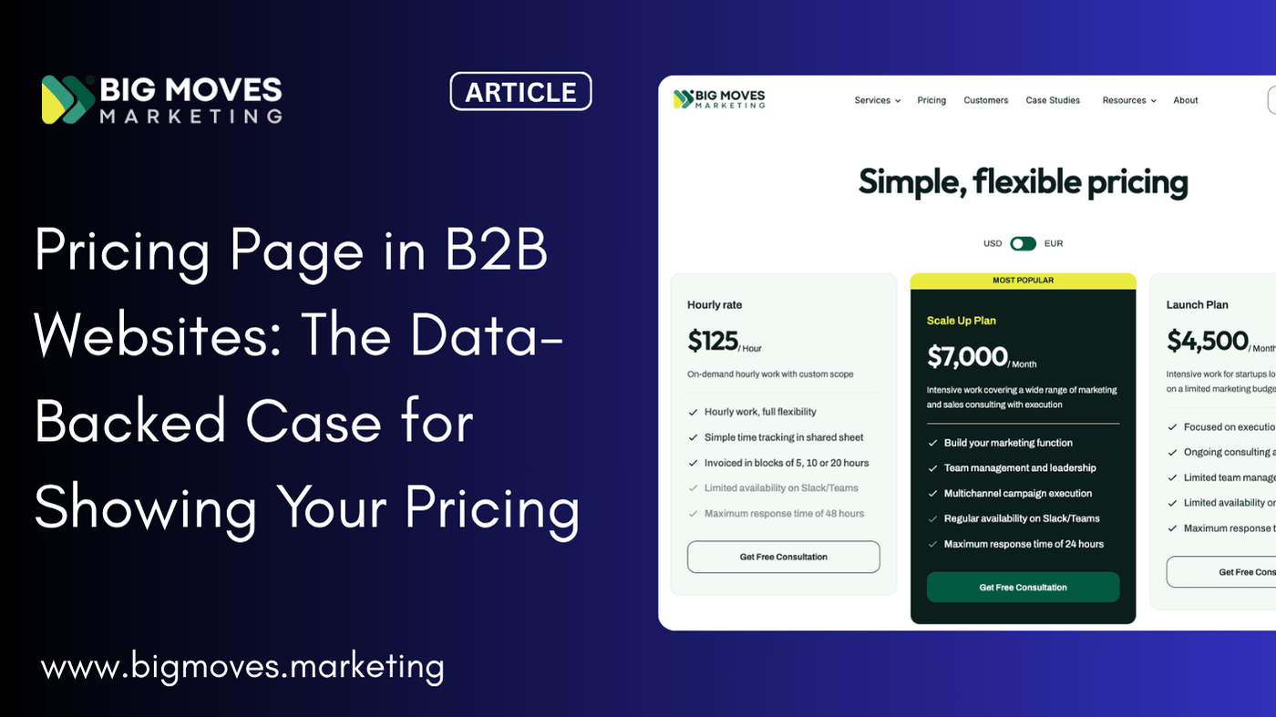
It is your Pricing page.
And yet, for many B2B businesses — whether SaaS companies, professional services firms, or marketing agencies — the Pricing page is either missing entirely, hidden behind a "Contact Us for Pricing" wall, or so vague that it leaves visitors with more questions than answers.
This article is not a criticism of those decisions. In many cases, the reasoning behind them is understandable. What it is, however, is a data-backed, practical guide to help you understand why your Pricing page deserves far more attention than it is likely getting today, and what you can do to turn it into one of your most effective conversion and trust-building assets.
Let us start with real-world data. At Big Moves Marketing, we reviewed 12 months of website analytics across all pages and interactions. The results were clear and consistent: Pricing was the single most clicked button or link across the entire website, accounting for 14.2% of all sessions.
To put that in context, here is how it compared to every other key page on the site:
Visitors clicked through to the Pricing page nearly twice as often as the About page, more than twice as often as the Customers or Blog pages, and over three times as often as the primary conversion CTA.
That is not a coincidence. That is buyer intent, expressed in the clearest possible way.
And this behaviour is consistent with what the broader research tells us about how modern B2B buyers operate.
The traditional sales model assumed that buyers needed to be educated, nurtured, and guided through each stage of a funnel. That model still exists, but the buyer journey that sits in front of it has changed significantly.
According to 6Sense's 2025 B2B Buyer Experience Report, 81% of buyers already have a preferred vendor by the time they make first contact, and 85% have already established their purchase requirements before they ever speak to a sales representative. A separate finding from the same research confirms that buyers still mostly or fully define their purchase requirements 83% of the time before engaging with a sales team.
Think about what that means in practical terms. By the time a prospect fills out your contact form or books a discovery call, they have already done the research. They have compared you to competitors. They have formed an opinion about your company. And very likely, they have already tried to find your pricing.
Gartner research reinforces this further: buyers who find the information they receive from suppliers "helpful in advancing across their buying jobs" are 2.8 times more likely to experience a high degree of purchase ease. Helpful, accessible information — including pricing — actively accelerates the sales process.
Meanwhile, Salesforce data tells us that 86% of B2B buyers now expect self-service options, which explicitly includes seeing costs on a website before speaking to anyone.
Your prospects are not waiting for your sales team to educate them. They are forming their shortlist independently, often having conducted 12 or more online searches before they are ready to engage. 90% of B2B buyers research between 2 and 7 different websites before making a purchase decision. And a large majority — 66% of B2B buyers, according to Considered — are now self-serving more information before contacting vendors than they did even a few years ago.
If your Pricing page does not exist — or if it is too vague to be useful — you are not part of that research process. You are not even in the room.
There are legitimate reasons why many B2B companies hesitate to publish pricing. Understanding those reasons is important, because the goal is not to tell you that you are wrong — it is to help you find a better way forward.
Here are the most common concerns, and a thoughtful response to each.
This is perhaps the most valid reason. If your offering genuinely varies based on scope, company size, geographic requirements, or contract terms, then publishing a single price is not practical. But there is a significant difference between complex pricing and no pricing information at all.
Even in these cases, you can provide a great deal of value by showing pricing ranges, sharing starting points, outlining what factors affect the final cost, or offering a clear and realistic sense of typical investment levels. Buyers who understand the ballpark are far more likely to continue the conversation than those left completely in the dark.
As one senior B2B buyer quoted in Chili Piper's 2025 Buyer First Report put it: "I really like being able to do the internal math to just make sure we're not wasting each other's time. Just have ranges."
That is a remarkably practical and empathetic perspective. Buyers are not asking for a legally binding quote on your website. They are asking for enough information to know whether you are a credible option worth exploring further.
This fear is understandable, but the data suggests the opposite is more often true. McKinsey research found that 68% of B2B customers are willing to pay more for straightforward pricing experiences, particularly for complex software solutions. The perception of transparency correlates with perceived value, not reduced perceived value.
Furthermore, a 2023 Salesforce survey found that 89% of B2B software buyers ranked pricing transparency as a top factor in vendor selection. Being transparent about pricing does not make you look cheaper — it makes you look more trustworthy.
And if a prospect genuinely cannot afford your services, it is far better for both parties to discover that before a lengthy discovery call than after.
This concern has some merit, particularly in highly competitive markets. However, the reality is that most sophisticated competitors already have a reasonable idea of market pricing. Pace Pricing notes that the buyers you are trying to win are far more valuable than any marginal intelligence you are protecting from competitors. Prioritising your prospects over your competitors in this equation is almost always the right call.
There is a compelling business logic here — the conversation allows you to demonstrate value before introducing cost. But this approach requires that buyers are willing to have that conversation in the first place. Many are not.
Modern B2B buyers — particularly the growing cohort of Millennial and Gen Z decision-makers, who now account for 64% of B2B buyers — expect self-service. They are not passive participants waiting to be led through a sales funnel. They are active researchers who want to move at their own pace, and they will eliminate options that create unnecessary friction before they are ready to engage.
When we talk about the cost of not having a Pricing page, the immediate thought might be lost sales. But the impact is actually broader and more structural than that.
When someone navigates to where your Pricing page should be — or searches your website and finds nothing — they are at the peak of their interest and intent. They are not casually browsing. They are evaluating. If that moment is met with a wall, a generic contact form, or a vague "let's talk" message, you have introduced friction at exactly the wrong time.
Research from Unbounce's 2024 Conversion Benchmark Report, which analysed 57 million conversions across 41,000 landing pages, consistently shows that friction at high-intent moments directly suppresses conversion rates. The buyers who would have been your best-fit customers — those doing their research carefully and intelligently — are the ones most likely to be deterred.
When pricing is not available online, every sales conversation has to include a discovery-phase discussion about budget and fit that could have been resolved before the call. This does not just waste the prospect's time — it wastes your team's time.
Consider what happened at Zoom. When they made the decision to publish enterprise pricing tiers publicly — which was historically unusual in enterprise SaaS — it contributed to their accelerated growth by shortening sales cycles by an average of 12 days. Twelve days per deal, across a volume of deals, is an enormous commercial advantage.
Trust is the foundation of every B2B relationship. And the way a company presents itself online — including how open it is about pricing — sends a strong signal about how it operates as a partner.
Buyers who encounter an opaque, contact-us-for-pricing experience are not just inconvenienced. They often begin to question why the information is being withheld. Is the pricing unstable? Is it negotiated down significantly? Is there something about the offer that does not hold up to scrutiny? These are not questions you want your best prospects asking before they have even spoken to you.
Conversely, research consistently shows that transparent pricing builds trust, reduces buyer anxiety, and fosters longer-term customer satisfaction and retention.
Perhaps the least-discussed consequence of not having a Pricing page is its impact on your discoverability. A well-structured Pricing page — with clear tier names, feature descriptions, and contextual language around your offer — contributes to your search engine visibility in a meaningful way.
When buyers are researching options, they are frequently searching for terms like "[your category] pricing," "[competitor name] alternative pricing," or "[solution type] cost." If you do not have a Pricing page, you are simply absent from those results. A well-optimised Pricing page improves your search rankings for high-intent, transactional keywords — the exact type of search that indicates a buyer is close to making a decision.
Understanding why you need a Pricing page is only half of the equation. The other half is understanding what it should actually accomplish — and how to make it work harder for your business.
A great B2B Pricing page is not just a list of numbers. It is a trust-building, value-communicating, lead-qualifying asset that works 24 hours a day, 7 days a week, without a single member of your sales team involved.
Here is what it should do.
The most common mistake on Pricing pages is leading with the number rather than the outcome. Before a prospect can evaluate whether your price is reasonable, they need to understand what they are getting, and — more importantly — what that means for their business.
Pace Pricing's research recommends leading with a strong value proposition rather than simply labelling the page "Pricing" or "Plans." Companies like Asana lead with "Easily organise your work." Monday.com uses "Supercharge your teamwork." HubSpot's marketing platform leads with "Generate leads and automate marketing that drives growth." These are not pricing statements — they are value statements that happen to sit at the top of a pricing page.
Your Pricing page should answer two questions before it shows a single number: What will this do for my business? and Why is this worth the investment?
One of the most commercially valuable — and underappreciated — functions of a transparent Pricing page is its ability to automatically filter out prospects who are not a good fit, before they consume any of your team's time.
Research from Sales Insight Lab suggests that at least 50% of prospects are not a good fit for what a company sells. When pricing is visible, those who are genuinely misaligned on budget self-select out of the process. Those who remain are more qualified, more informed, and more likely to convert.
This is not about filtering out small businesses or early-stage companies indiscriminately. It is about ensuring that every conversation your team has is with a prospect who has already made a meaningful, informed commitment to exploring your offer seriously.
According to research cited by Chili Piper's 2025 Buyer First Report, senior B2B buyers consistently cite transparent pricing as one of the most positive trust signals a vendor can offer. The sentiment echoes across industries and company sizes: seeing pricing upfront signals confidence, clarity, and respect for the buyer's time.
One senior buyer interviewed in the report put it directly: "Transparent pricing? Number one for me personally, I'd love to know what I'm looking at on a monthly, annual basis. I like getting that information right up front."
And when there is no pricing: "If [the company] didn't have transparent pricing, now I'm forced to talk to someone, and I get all those reservations you get when you're not in control."
That sense of being in control matters enormously to modern buyers. Your Pricing page can provide it. A contact-us-for-pricing wall cannot.
When buyers arrive on a call already having reviewed your Pricing page, the conversation shifts entirely. Instead of spending the first 20 minutes establishing budget fit and explaining your tiers, your team can spend that time discussing specific use cases, addressing real objections, and building the relationship.
This is the compounding benefit of pricing transparency: it does not just improve conversion rates in isolation. It makes every downstream sales interaction more efficient and more likely to result in a close.
Your Pricing page works around the clock across every time zone. It is read by prospects on a Sunday evening before they send an enquiry on Monday morning. It is reviewed by a CFO who needs to do a quick internal sanity check before approving the next stage of a procurement process. It is shared internally between buying committee members who will never speak to your sales team directly.
6Sense research estimates that the average B2B buying group involves multiple stakeholders, and that decision-making often involves influencers who never appear on a vendor's contact log. Your Pricing page reaches them. Your sales team does not.
Knowing that you need a Pricing page is one thing. Building one that actually performs is another. Here are the practical principles that distinguish high-performing B2B Pricing pages from average ones.
It is tempting to include every feature, every scenario, and every possible pricing variable on a single page. Resist that temptation. A 2025 UX audit found that explicit, scannable feature comparisons reduce support enquiries by 31% — because buyers can find what they need quickly, without becoming confused.
Three to four tiers is typically optimal. More causes confusion. Fewer limits flexibility. Highlight a "best value" or "most popular" tier to guide the decision without forcing it.
If your pricing is genuinely complex and customised, you do not need to publish a fixed number. What you do need is something. A starting price. A typical range. An example scenario. A "from X per month" anchor.
Unbounce research puts it simply: "If someone hits your pricing page, they're looking for a ballpark amount at the least. If your pricing is complex and legitimately does require a call to figure out the exact amount, try to share common price ranges or minimums so prospects have some context to work with — and will know when to self-disqualify if it's too high for their budget."
That is not a compromise. That is good UX and good business.
Feature lists are necessary, but they should follow — not lead. Before you tell a prospect what your platform does, tell them what their business will achieve. Outcomes-first copy converts better because it connects to the motivation behind the purchase decision.
27% of B2B buyers identify competitive pricing as the biggest factor in their purchase decision, but it is closely followed by product quality, flexibility, and the ease of the buying experience. Your Pricing page is an opportunity to address all of these concerns simultaneously.
This is where many Pricing pages miss an opportunity. By the time a visitor reaches your Pricing page, they are asking themselves: Is this worth it? Social proof — customer testimonials, case study summaries, recognisable client logos, and review ratings — answers that question at exactly the right moment.
A 2024 conversion analysis found that recognisable client logos increase trust scores on pricing pages by 47%. Visible star ratings from third-party review platforms increase conversion by 15–22%. These are not decorative additions — they are conversion mechanics.
Your Pricing page should have a primary CTA that is proportionate to the commitment level of the visit. For most B2B buyers at the pricing stage, that means offering something between "buy now" and "fill out this 10-field form." A demo booking link, a free consultation CTA, or a trial offer all work well.
Research by Unbounce recommends replacing static contact forms with embedded calendars where possible — letting prospects book themselves directly into your team's calendar rather than waiting for a follow-up. This alone significantly reduces drop-off at the conversion moment.
And if you do include a form, keep it to 3–5 fields maximum. Analysis of over 40,000 landing pages by HubSpot found a clear negative correlation between form field count and conversion rates. Each additional field beyond five drops completion rates significantly.
Mobile traffic accounts for approximately 58% of SaaS pricing page visits in 2025, yet desktop still converts at a meaningfully higher rate. This tells you something important: buyers often discover and review your Pricing page on mobile, but make their decisions and take action on desktop.
This means your Pricing page needs to be genuinely excellent on both — not just responsive, but thoughtfully designed for each context.
While much of the research cited above focuses on SaaS companies, the principles apply with equal force to professional services, agencies, consultancies, and any B2B business that delivers a service rather than a product.
The objection in services businesses is often that every engagement is custom, and therefore pricing cannot be published. But consider what the absence of pricing communicates to a potential client: we are not sure what we are worth, or we will charge you based on what we think you can afford.
Neither of those is the message you want to send.
Service businesses can approach their Pricing page in several practical ways. You can publish day rates or hourly rates. You can outline retainer tiers with associated deliverables. You can share package examples with indicative investment ranges. You can include a "starting from" figure alongside a clear explanation of what drives final pricing.
The goal is not to lock yourself into a fixed number. The goal is to give prospective clients enough context to know that you are a serious, transparent, professional business that respects their time — and to let the right clients raise their hand while the wrong ones move on.
Here is a fact worth sitting with: despite all of the data supporting pricing transparency, only approximately 45% of SaaS vendors currently publish their pricing publicly. In professional services and agency sectors, that figure is likely even lower.
That is not a barrier. That is an opportunity.
If your competitors are not publishing pricing — or are publishing it poorly — a well-designed, transparent, value-driven Pricing page is a genuine differentiator. It signals to the market that you are confident in your offer, respectful of your clients' time, and operating as a modern, buyer-centric business.
Chili Piper's 2025 Buyer First Report, which reviewed the websites of the top 100 B2B SaaS companies for buyer-first best practices, found that visibility of pricing and packaging information remains one of the most underdeveloped areas of B2B websites, even among category leaders. The companies that get this right consistently receive feedback from buyers that they stand apart from the competition — not because of their product features, but because of the buying experience they provide.
If you do not currently have a Pricing page, or if yours needs significant work, here is a practical starting point.
Begin by answering these five questions:
1. What is the simplest version of what we offer, and what does it cost?Even if 80% of your business is custom, there is likely a baseline entry point. Start there.
2. What does a typical engagement look like, and what is the typical investment?If you cannot publish a price, you can share a scenario. "A typical three-month engagement for a mid-sized SaaS company involves X, Y, and Z, and is typically priced between £X and £X."
3. What value does a client receive, and what outcomes can we point to?Your Pricing page should be anchored in outcomes, not just deliverables. Frame the investment in terms of what changes for the client.
4. What social proof can we place on this page?Identify two or three pieces of evidence — a testimonial, a case study result, a client logo — that speak directly to value and trust at the pricing stage.
5. What is the right next step for someone who is ready to explore further?Make it easy. A booking link, a low-commitment consultation CTA, or a free assessment offer — whatever is appropriate for your sales model and the commitment level of the visitor.
Your Pricing page is not a liability. It is an asset — one of the most commercially valuable pages on your website, if you treat it that way.
The data from our own site confirms it. The research from 6Sense, Salesforce, McKinsey, Gartner, and dozens of other credible sources reinforces it. And the experience of companies who have moved towards pricing transparency — from Zoom to HubSpot to PostHog — demonstrates it with real-world results.
The buyers who visit your website are not passive. They are informed, self-directed, and time-limited. They are doing serious research, and they deserve a serious, transparent response.
Give them a Pricing page that respects their intelligence, communicates your value clearly, and makes the next step easy. When you do, you will not just improve your conversion rate. You will change the quality of every sales conversation you have, shorten the time it takes to close deals, and build stronger client relationships from the very first interaction.
That is what your Pricing page can do. The question is whether you are going to let it.
This article was written by Big Moves Marketing. If you found it useful, share it with a founder or marketing leader who is still sitting on the fence about their Pricing page.
Explore Big Moves Marketing services and resources:


%20-%20white.svg)