%20png%20copy.avif)

A beautiful Webflow landing page can still be a poor sales asset. In B2B SaaS, visual polish rarely compensates for a vague promise, weak differentiation, or a form that asks a cold visitor to behave like a qualified buyer. The page needs to reduce uncertainty for the right account and make the next step feel proportionate to the buyer's intent.
Webflow gives teams unusual control over structure, interaction, and publishing. That freedom is useful only when the team has already made the harder decisions about positioning, page architecture, proof, and measurement. The right question isn't “How do we make this page look premium?” It's “What does this buyer need to believe before they'll create pipeline for us?”
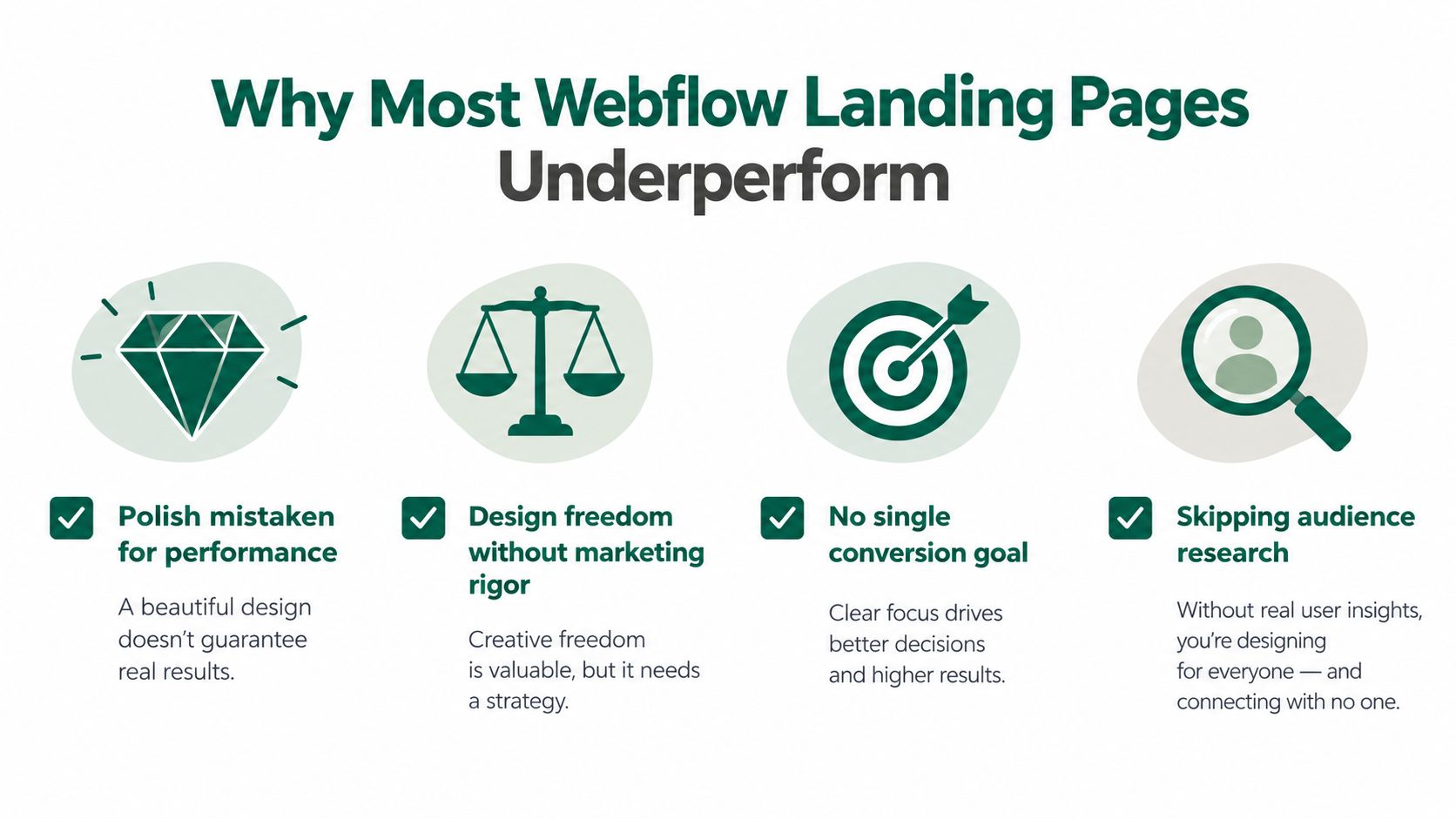
Most B2B SaaS teams over-invest in Webflow aesthetics and under-invest in message-market fit. They build pages that impress internal stakeholders, then wonder why qualified traffic scrolls past the hero, ignores the CTA, and abandons a form that requests a phone number before explaining the commercial value.
Webflow itself isn't the problem. The platform has a meaningful place in the broader CMS market. W3Techs reports that, as of September 2026, Webflow is used by 1.2% of websites with a known CMS, 0.8% of all websites, and 1.5% of the top 1,000,000 websites by traffic. That adoption says the platform is capable of supporting serious publishing operations. It doesn't say your page has a serious go-to-market strategy.
The common failure pattern is predictable:
Practical rule: A plain page with a sharp promise, one primary CTA, credible proof, and a measured form will beat a sophisticated page that makes visitors work to understand the offer.
Conversion benchmarks support a disciplined operating range, not a design contest. A 2026 summary covering more than 57 million conversions, 41,000 landing pages, and 464 million pageviews cites a 6.6% median landing-page conversion rate, while another study reports medians of 4.1% for B2B SaaS, 3.6% for B2B services, and 11.4% for webinar registrations. These figures are reported in this landing-page conversion analysis, and they're useful as operating context, not as a promise.
The structural decision matters more than the animation library. You need to decide whether one tight page can carry the buying argument, whether a deeper page is required for a complex committee sale, and whether a CMS-driven cluster will create useful relevance or merely multiply thin variants. A useful landing page ROI analysis can help clarify that decision before design work begins.
Don't open the Webflow Designer until the sitemap reflects the buying journey. A landing page is not an isolated screen. It's a destination inside a system of campaign paths, search intents, sales conversations, comparison questions, and post-click expectations.
Start with one of three models.
| Model | Best For | Page Count | Maintenance |
|---|---|---|---|
| Single tight page | One offer, one audience, one clear conversion goal | Small | Low |
| Hub and spoke cluster | Several ICPs, use cases, or acquisition channels | Moderate | Moderate |
| CMS-driven programmatic build | Many validated segments, offers, or search intents | Large | High |
A single tight page works when the offer is narrow and the sales motion is simple. It should explain the problem, position the solution, establish trust, handle the main objection, and ask for one action. Don't split a straightforward offer into multiple pages because the navigation feels more complete.
A hub and spoke cluster makes sense when different buyers need different proof. The root page establishes the category and core promise. Spoke pages address ICP variants, use cases, alternatives, or integrations. A sales-led security platform, for example, may need different arguments for a security leader, an engineering leader, and a finance approver.
A CMS-driven build is appropriate only after you've identified repeatable page logic. Webflow's documented workflow is straightforward: design the content, create a CMS Collection, add Collection items, design the page, connect fields to the Collection, and publish from the CMS workflow. Webflow's design system guidance describes this process and supports the case for reusable templates, but reusable structure doesn't excuse repetitive copy.
Create a master landing template, an ICP variant template, and a CMS Collection template for scalable pages. Keep shared components genuinely shared, including the header, proof modules, CTA treatment, FAQ pattern, and footer. Give variant pages controlled fields for the parts that should change, such as the problem statement, use case, proof, and offer.
Use short, descriptive slugs that reflect intent. Keep important pages shallow in the architecture, ideally within two clicks from a relevant hub, blog article, or product page. Naming conventions matter because messy collections create editorial debt long before the site becomes large.
A new page earns its place when it serves a distinct buyer question, audience, or acquisition path. If it only changes a headline and a logo, optimize the existing page first. Teams often create page volume to avoid making a hard positioning decision.
For practical context on how the broader site system affects page performance, see Webflow website design principles.
A landing page shouldn't move from hero to features because that sequence looks familiar. Each block needs a job in the buyer's decision process. If a section doesn't reduce confusion, increase confidence, or make the next action easier, remove it.
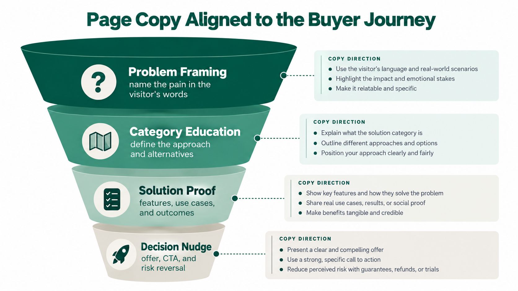
The first question is whether the visitor recognizes the problem. An awareness-stage visitor needs a headline written in the language of the pain, not the language of your product architecture. The subhead should explain who the offer is for, what changes, and why the current approach creates cost, risk, or delay.
Use the page as a sequence of belief changes:
For consideration-stage readers, add a scannable feature-to-outcome section and a comparison block. “Automated routing” is a feature. “Every qualified request reaches the correct owner without manual triage” is a buying argument. The latter gives the buyer something to repeat internally.
Decision-stage prospects need proof early enough to matter. Use named customer logos when you have permission, specific outcomes when they're substantiated, and short case study excerpts that show the starting problem and the resulting change. Don't bury every trust signal at the bottom because the design system says proof belongs in one section.
A complex B2B offer often needs a deeper editorial layout. Finance, security, infrastructure, and AI products can't always compress a committee decision into a few feature cards. Use longer copy when the buyer must understand implementation, governance, integration, or risk. Use a tight page when the offer is familiar and the CTA is low commitment.
Before investing in motion or custom illustration, test the message:
For useful examples of how above-the-fold messaging can work, review hero section examples for SaaS websites.
SEO on Webflow landing pages is mostly a problem of information architecture and editorial discipline. The platform gives you direct control over titles, headings, slugs, metadata, CMS fields, internal links, and indexing behavior. That control doesn't prevent thin pages or confused search intent.
Align the title tag, H1, and page promise without making them identical by default. The title should earn the search click. The H1 should confirm that the visitor arrived at the right destination. The opening copy should clarify the audience and use case before the page moves into product detail.
| Element | Default Webflow Behavior | Recommended Setup | What It Moves |
|---|---|---|---|
| Title tag | Editable page metadata | Match the target intent and audience | Search relevance and click quality |
| H1 | Added by the designer | Use one clear promise tied to the page purpose | Comprehension and topical focus |
| Slug | Manually defined | Use stable, descriptive intent-based paths | Crawlability and sharing clarity |
| CMS content | Reusable fields and templates | Require meaningful unique context per page | Relevance and editorial quality |
| Canonical tag | Configurable in page settings | Point variants to the correct preferred URL | Duplicate-content control |
| Internal links | Added within content and navigation | Link from relevant pages with descriptive anchors | Discovery and authority flow |
| Regional variants | Requires deliberate implementation | Use appropriate hreflang relationships | Regional relevance |
Webflow's SEO guidance highlights semantic HTML, flat-file delivery, a global CDN, and an automatic XML sitemap. It also describes pages as published HTML, CSS, and JavaScript files rather than dynamically generated database pages. Those technical characteristics are useful, but they don't make a weak page relevant. This Webflow SEO overview is a useful reference for the platform-level details.
A CMS Collection should contain fields that support a real buyer or search intent, not just a variable keyword. Each variant needs a distinct problem framing, proof set, use case, and internal-link context. If the only difference is a city name or industry label, the page probably shouldn't exist.
Use canonical tags when multiple URLs represent substantially the same content. Keep internal experiments out of the index with appropriate noindex controls. Regional pages need more than translated navigation. They need local relevance, suitable proof, and correctly implemented language relationships.
Internal links should come from pages that already explain the problem. A product page can link to an integration landing page. A technical article can link to a security use-case page. A comparison article can link to the alternative page that answers the evaluation question. This SaaS SEO strategy resource covers the broader connection between search structure and commercial intent.
A form, CTA, and analytics setup are one system. Choosing the form before defining the qualification model creates bad friction. Tracking clicks without tracking completed submissions creates false confidence. Sending leads to a CRM without preserving source and intent makes attribution unreliable.
A native Webflow form is usually the cleanest starting point for a straightforward lead capture flow. It loads with less complexity, gives the designer control, and works well when routing requirements are limited.
Use a HubSpot or Marketo embed when lifecycle management, progressive profiling, scoring, consent handling, and CRM synchronization are central to the motion. The trade-off is added implementation complexity and a greater need to test styling, loading behavior, and event capture. Typeform can work when the qualification experience needs a conversational sequence. Formspark suits teams that want a lightweight endpoint without building a full marketing automation layer.
Don't ask cold traffic for every field your sales team wants. Ask for the minimum information needed to route the lead and understand the account. Company size and role can be useful when they change qualification or follow-up, but the form should explain why the information matters if it creates hesitation.
Use one primary action. “Book a demo” is appropriate for a high-consideration sales motion, while “See how it works” can be better when the buyer still needs education. A secondary action can support research, such as a product tour or technical guide, but it shouldn't compete visually with the primary path.
Repeat the primary CTA after the sections that resolve the major objections. Don't add a different CTA to every module just because Webflow makes buttons easy to duplicate. Each additional action asks the visitor to decide again.
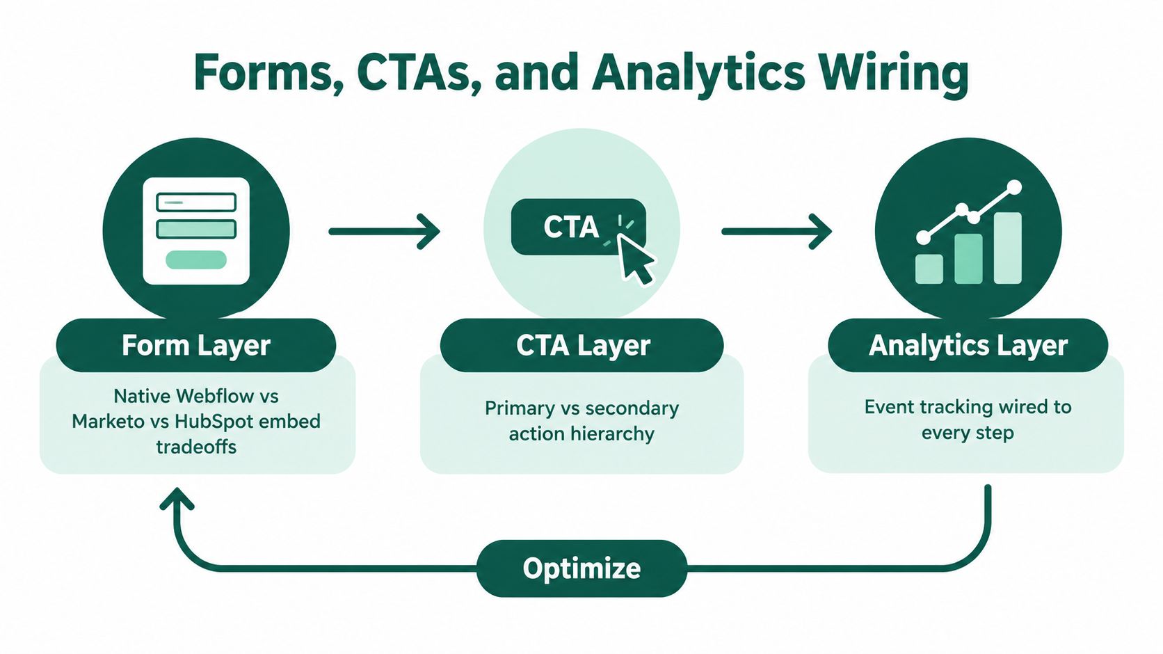
At minimum, send these events into GA4 or Segment:
Preserve campaign parameters across the session and use a consistent UTM naming convention for paid, organic, partner, and lifecycle traffic. The CRM should receive source, campaign, landing page, conversion type, and relevant account data. Don't wait until launch day to wire this system. A conversion event that hasn't been tested is a suggestion, not a metric.
Use conversion optimization guidance for B2B teams when deciding which friction to remove first.
A representative SaaS team can ship a Webflow landing page cluster in about three weeks when the sequence is respected. The timeline breaks when stakeholders treat copy, architecture, and analytics as flexible details that can be resolved during visual design.
The team starts by defining the offer, audience, conversion goal, and proof available. It agrees on the sitemap and template system before opening the designer. The copy comes next, including the root page, ICP variants, comparison content, objection handling, and CTA language.
This order exposes disagreement early. If the founders can't agree on the promise in a document, a polished hero won't solve the problem. It will only make the disagreement more expensive to change.
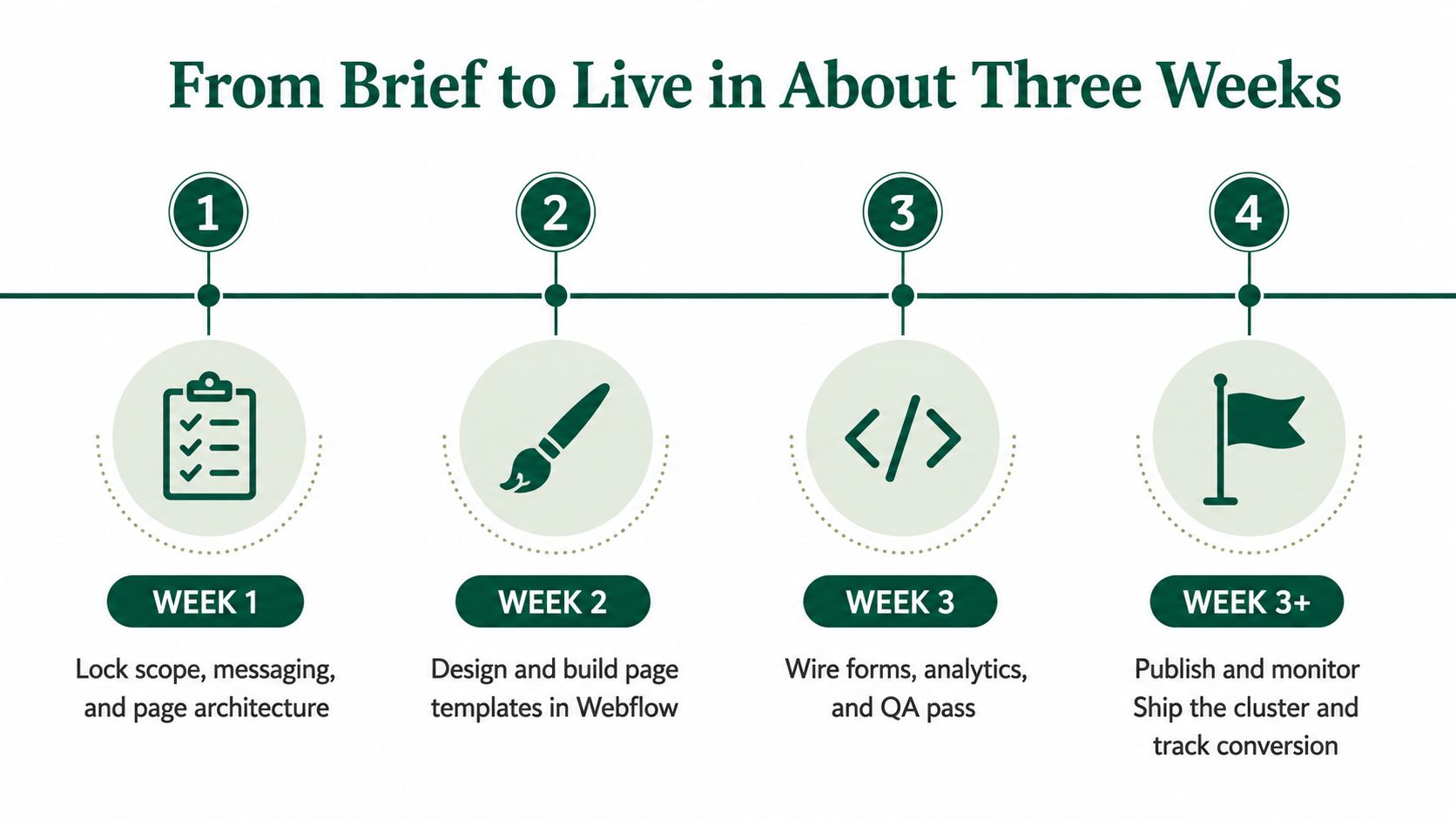
The Webflow build includes the master layout, responsive behavior, CMS Collection setup, and content connections. The team checks mobile layouts while building rather than treating mobile as a final resize exercise. Forms, redirects, thank-you states, consent language, and initial analytics events get wired during development.
Performance deserves a gate at this stage. The practical Core Web Vitals targets are LCP under 2.5 seconds, INP under 200 milliseconds, and CLS under 0.1, as outlined in this Webflow performance guide. The same source documents real Webflow sites with 6.9-second and 4.9-second LCP results, alongside substantial blocking time. Motion-heavy hero sections, oversized media, and unnecessary scripts are common reasons pages miss the target.
The final week covers content QA, responsive review, SEO settings, accessibility checks, form testing, CRM routing, staging review, and production publishing. Stakeholders should review against an agreed brief, not reopen the entire strategy because a different headline feels more fashionable.
Webflow's single-page publishing capability can be useful when a team needs to publish one static page or CMS template without affecting other pages, global styles, or components. Webflow's single-page publishing update documents that workflow.
The timeline usually slips for three reasons: the hero gets redesigned mid-build, copy never gets locked, or analytics wiring is left until the final day. Each mistake removes time from testing, which is the work most likely to reveal whether the page is ready.
When every landing page feels urgent, use this order:
This sequence matters because every new page multiplies editorial, QA, analytics, and maintenance work. A CMS can make publishing efficient, but it can also help a team produce a large number of mediocre pages faster.
A practical pre-launch check is short:
The mental model is simple: prove the message, prove the traffic, then scale the page count. Anything built before the message is credible is a sunk cost, no matter how elegant the Webflow implementation looks. For examples of conversion-oriented SaaS page structures, review these SaaS landing page examples.
Big Moves Marketing helps B2B SaaS teams clarify positioning, structure Webflow websites around buyer journeys, and connect landing-page decisions to measurable pipeline. If your team needs a sharper message, a conversion-ready page system, or senior guidance from strategy through launch, visit Big Moves Marketing to discuss the next move.



%20-%20white.svg)