Stop copying the visual style of successful SaaS companies. Most B2B websites fail before the fold because their teams avoid a positioning decision, not because they choose the wrong typeface. The homepage describes an ambitious platform, addresses everyone, and leaves buyers to work out why they should care.
That ambiguity matters before sales gets involved. In 6sense's 2024 survey of 2,509 recent B2B buyers, 81% had selected a preferred vendor before speaking with a sales representative. Your website needs to support evaluation, not merely collect contact details.
The best B2B website designs make a specific decision easier. Slack makes the product understandable. Stripe connects infrastructure claims to buying risk. McMaster-Carr removes the brand presentation when customers need the catalog.
Study the buying decision behind the design, not the design in isolation.
These are references for different commercial problems, not an aesthetic ranking. For each, identify the choice worth copying, the trade-off that comes with it, and the change your team can implement this quarter. Borrow the reasoning. Don't inherit another company's complexity.
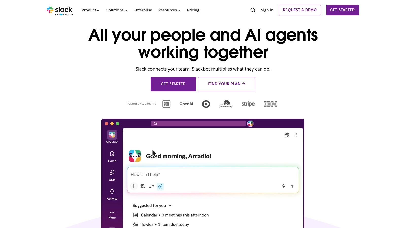
Best for making a familiar product category immediately understandable. Slack's website pairs concise, outcome-oriented messaging with product visuals and distinct routes to getting started or exploring plans. Visitors can understand the proposition without first learning the company's terminology.
The product imagery matters as much as the headline. A collaboration promise is abstract; a visible conversation, channel, or workflow gives the buyer something concrete to evaluate. Product, solutions, resources, and pricing navigation then lets interested visitors move beyond the opening proposition.
Slack operates in a familiar category. An early-stage infrastructure startup can't assume buyers already understand what it replaces, where it fits, or who should own it internally.
That's where founders misapply minimalist design. They remove explanatory copy before establishing comprehension, leaving a polished headline that could describe several unrelated products.
For a founder-led SaaS business, the test isn't whether the hero sounds confident. It's whether a qualified prospect can explain the product accurately to a colleague after reading it.
Replicable lesson: Make the product tangible before making the brand expansive. Keep the first screen focused, but retain the explanation an unfamiliar buyer needs.
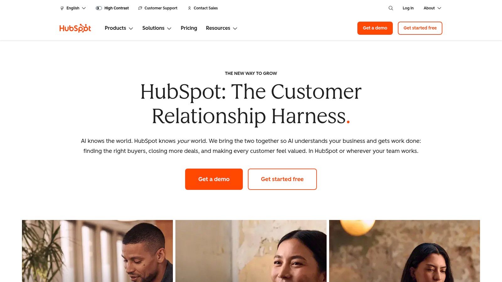
A buyer who wants to try software and a buyer who needs a procurement conversation shouldn't face the same next step. HubSpot's website accommodates both through separate demo and getting-started routes, supported by product exploration, pricing, and educational resources.
Best for serving different buying motions within a broad portfolio. Its useful design decision isn't having multiple buttons. It's connecting those buttons to different ways of evaluating and adopting software.
In HubSpot's 2024 survey of 422 U.S. B2B decision-makers, 75% preferred to gather product information independently. That supports giving buyers a meaningful research path instead of treating every non-demo visit as unfinished conversion.
Practical rule: Split calls to action by the buyer's next job, not by your sales team's preferred outcome.
HubSpot also connects educational discovery with product discovery. A visitor can arrive with a business problem, learn about it, and then investigate the relevant software rather than being pushed straight into a sales conversation.
The cost is breadth. A large portfolio gives unfamiliar visitors more products, terminology, and navigation choices to process. A startup with a narrow offer shouldn't copy that information architecture to appear established.
For your site, make the distinction explicit: independent exploration for buyers checking fit, and expert assistance for buyers evaluating deployment or commercial complexity. Both paths need useful information behind them.
Replicable lesson: Support different levels of readiness without giving every action equal visual weight. Choose the primary action around your dominant buying motion, then provide a credible alternative.
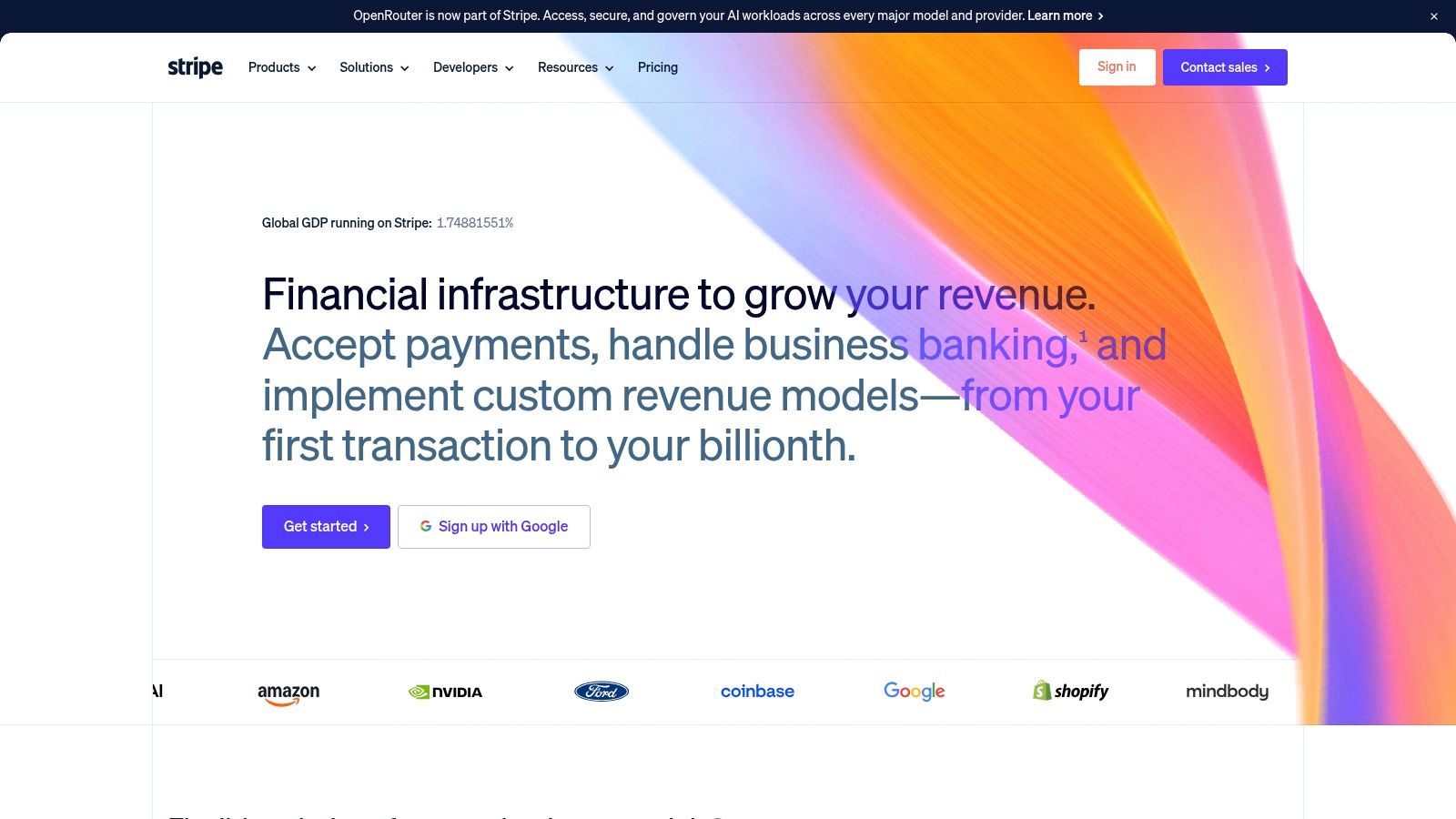
Best for products where implementation failure carries serious business risk. Stripe's website connects its payments and financial-infrastructure proposition with evidence about scale and reliability. Separate product, solution, developer, and resource pathways recognize that commercial and technical evaluators need different answers.
A finance leader needs to understand the business case. An engineer needs to assess integration requirements. Forcing both through the same simplified marketing narrative would leave important objections unresolved.
Stripe's useful lesson is the relationship between a claim and its supporting evidence. Reliability belongs beside infrastructure messaging. Integration detail belongs where developers assess feasibility. Pricing and sales access belong within the evaluation path, not behind an unrelated content journey.
Pricing is another risk question. Buyers need to understand the commercial model before deciding whether deeper evaluation is worthwhile; our analysis of showing pricing on B2B websites addresses that decision.
Don't copy prominent scale claims without equivalent evidence. A smaller SaaS company can be credible by explaining limitations, deployment requirements, and support responsibilities precisely.
Replicable lesson: Put the answer to a buying objection beside the claim that creates it. Trust requires something the buyer can examine.
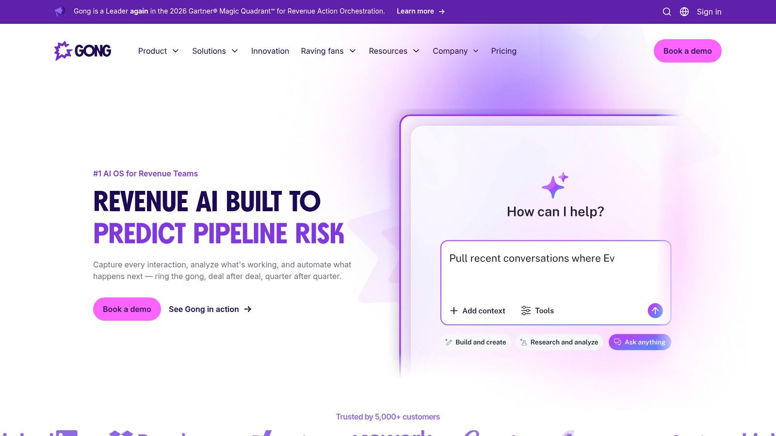
Customer evidence should explain why a product works, not merely suggest that recognizable companies bought it. Gong's website makes its business-software proposition concrete through named customer stories, outcome claims, and routes to product information or a demo.
Best for connecting an abstract business promise to customer context. Product, solutions, resources, and pricing pathways give visitors room to investigate rather than making the customer story the endpoint.
The strongest adaptation is to organize proof around objections. If a revenue leader doubts adoption, show how a relevant team incorporated the product into its workflow. If the concern is management visibility, explain what managers could inspect or change after implementation.
A customer result becomes useful when the buyer can understand the mechanism, not just admire the outcome.
Gong's published outcomes remain company-presented claims, not independent validation. Treat category-leadership language the same way: buyers need to understand the basis of a claim before it deserves weight.
A smaller company may not have a deep case-study library. Start with a narrow, well-documented example that identifies the customer's situation, implementation, and observed result instead of stretching a testimonial into a broad performance promise.
Comparison content should support the same evaluation discipline. Our Gong versus Chorus analysis is a relevant companion when assessing how competing products are presented.
Replicable lesson: Place relevant customer evidence beside the objection it answers. Keep demo access prominent, but give skeptical buyers enough context to decide whether that conversation is worth having.
Best for translating a broad platform into recognizable team workflows. Asana's website offers product information alongside use-case, team, and learning pathways. That gives visitors alternatives to navigating an internal feature taxonomy.
Say your SaaS product supports approvals, reporting, and cross-functional coordination. Those capabilities may be technically connected, but an operations buyer arrives with a problem such as managing campaign requests or coordinating a launch. A use-case page can explain that workflow without requiring the buyer to assemble the solution from feature pages.
Asana is useful to study because a broad product needs several entry points without losing coherence. Pricing and sales-contact access then allow visitors to move from relevance to commercial evaluation.
Don't create near-identical pages for marketing, operations, and sales with only the department name changed. Explain the trigger for adopting the product, the process it replaces, and the work people will perform differently.
The opening message must still establish a shared proposition. Our hero-section examples help distinguish a useful entry point from an overloaded platform introduction.
Replicable lesson: Give each important use case a specific operational story. Breadth belongs in the architecture; it doesn't all belong in the hero.
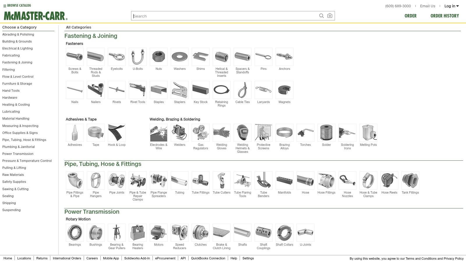
McMaster-Carr's website challenges the assumption that every B2B homepage needs a large brand statement. Its catalog- and search-oriented entry point prioritizes finding products, browsing categories, and evaluating practical ordering information.
Best for knowledgeable buyers with a defined task. The relevant comparison for SaaS founders isn't industrial supplies versus software. It's a visitor who needs an explanation versus a visitor who already knows what to find.
Nielsen Norman Group's B2B website usability study evaluated 293 websites and produced 188 design guidelines. Its emphasis on helping business users complete practical tasks is the right lens for understanding this approach.
For an established customer looking for a component, a long company narrative adds little. Category browsing, product discovery, availability, and fulfillment information are more relevant to the immediate decision.
A SaaS equivalent might be a developer seeking an integration, an administrator checking documentation, or a customer locating a specific template. Give those visitors direct access rather than repeatedly returning them to acquisition messaging.
The trade-off is clear: catalog-first design assumes some prior knowledge. An unfamiliar product still needs explanation, and visitors who can't identify the right category need guidance rather than a denser menu.
Our broader B2B website design examples are useful for comparing task-first structures with proposition-led sites.
Replicable lesson: Choose the homepage around the dominant visitor task. Don't remove positioning because utility looks efficient; remove unnecessary introduction only when buyers already understand what they need.
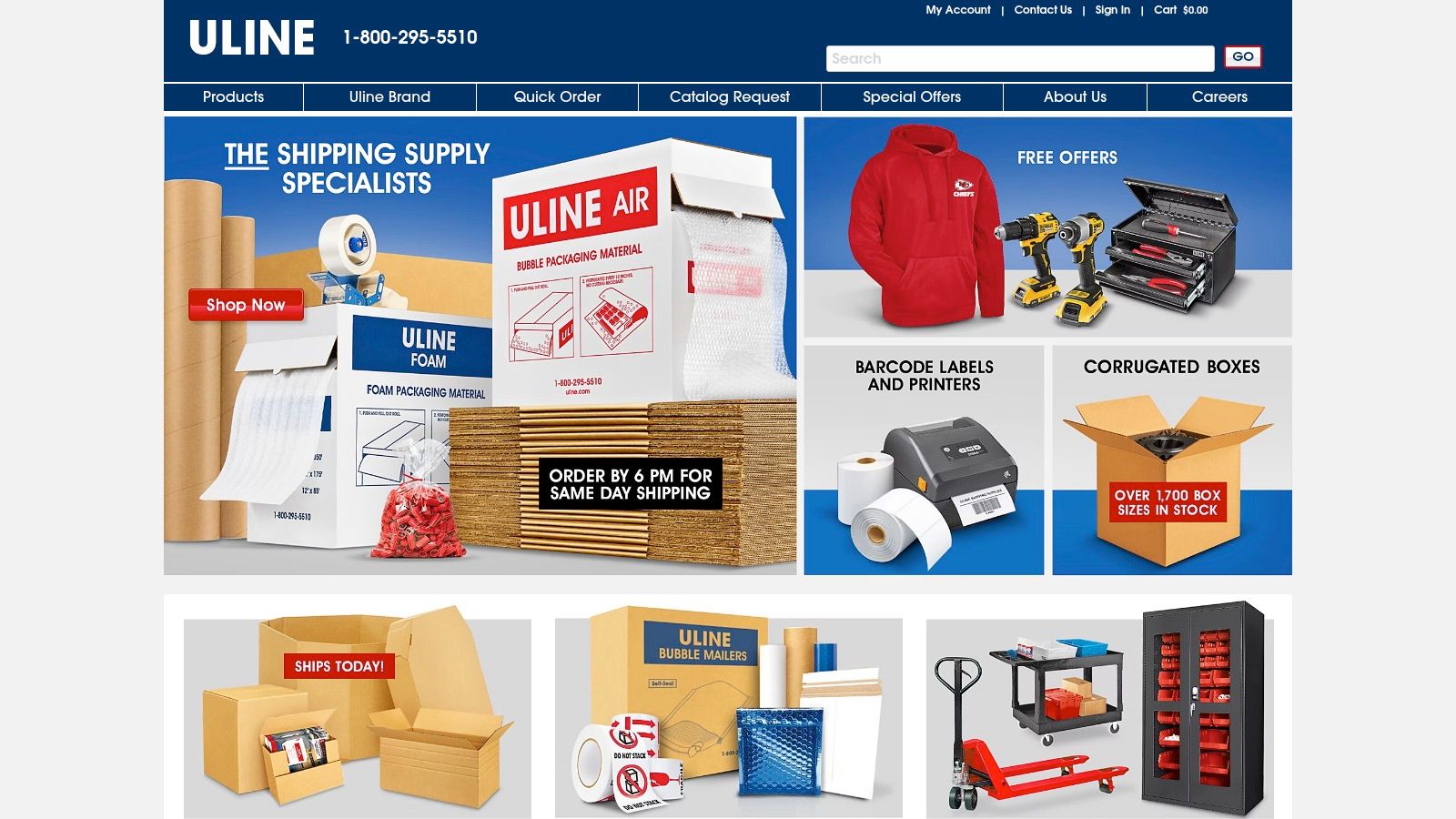
A returning buyer shouldn't have to repeat a first-time buyer's journey. Uline's website emphasizes quick ordering, product categories, catalog access, direct phone contact, and shipping or service information.
Best for repeat purchasing and operational clarity. Where McMaster-Carr illustrates product discovery, Uline is particularly useful for thinking about repeat transactions and access to assistance.
The SaaS lesson extends beyond acquisition. Customers returning to add capacity, investigate another product, or resolve a commercial question need direct paths. A persistent demo prompt is irrelevant when the visitor already uses the software.
Visible human contact also matters. Self-service shouldn't mean abandoning buyers when their circumstances don't fit the standard path; it should let them complete straightforward work independently and seek assistance when necessary.
Use a website usability analysis to assess whether visitors can complete those distinct tasks. Check the journey itself, including forms, confirmation messages, and the destination after each action.
Replicable lesson: Design for the relationship after the initial conversion. A website that helps existing customers act efficiently serves a different commercial purpose from one that only attracts new enquiries.
| Website | Core Design Lesson | Conversion Model | Best For Studying |
|---|---|---|---|
| Slack | Lead with a concise, outcome-focused message and clear next steps. | Self-serve signup and plan exploration | SaaS sites serving buyers at different readiness stages |
| HubSpot | Connect product discovery with educational resources across a broad portfolio. | Demo booking and self-serve signup | Multi-product B2B sites with varied audiences |
| Stripe | Tie credibility and proof points to buyer concerns about reliability and scale. | Pricing exploration and sales contact | High-trust products serving technical and business buyers |
| Gong | Support product claims with customer stories and specific outcomes. | Demo requests and product exploration | B2B sites building credibility through customer evidence |
| Asana | Organize a broad product story around teams, workflows, and use cases. | Pricing exploration and sales contact | Products with multiple use cases and audiences |
| McMaster-Carr | Prioritize product discovery and customer tasks over brand narrative. | Catalog search and ordering | Distributors and manufacturers with knowledgeable buyers |
| Uline | Make repeat purchasing, ordering, and support easy to find. | Quick ordering and phone contact | High-volume catalog businesses with repeat customers |
Each example deserves attention because of a positioning and conversion decision, not a visual style. Slack clarifies the product, HubSpot separates buying paths, Stripe addresses risk, Gong contextualizes proof, and Asana organizes use cases. McMaster-Carr and Uline show when direct task completion matters more than a conventional brand introduction.
Don't combine every feature into a larger homepage. Choose the decision your buyer needs to make, then build the shortest credible path to it.
Marketing should own the website's positioning, information architecture, copy, and conversion priorities. Engineering should own technical safeguards and support complex implementation. If delivery capacity is the constraint, evaluate staffing options such as Lathire after defining that ownership, not instead of it.
Preserve analytics through the redesign and compare equivalent periods. In ANML's Overdrive Digital case study, enquiries increased 317% year over year when comparing the first half of 2021 with the first half of 2020; that's a documented outcome, not an expected redesign return.
Start with the most consequential gap, not a full visual overhaul. We offer a free evaluation of your current website against these seven lessons, so your next decision can be which buyer obstacle to remove first.
Big Moves Marketing helps B2B SaaS teams clarify positioning, structure buyer journeys, and turn those decisions into website messaging and page architecture. Visit Big Moves Marketing to request a free evaluation of your current site and identify the positioning, proof, and conversion changes to prioritize.