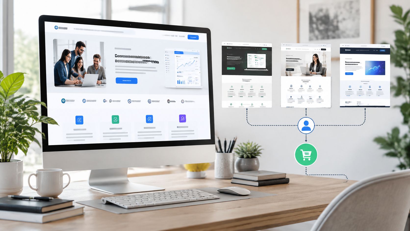
Teams often collect B2B website design examples the way they'd collect furniture. They save screenshots that look clean, modern, expensive. Then they hand the folder to a designer and wonder why pipeline doesn't move.
Taste is the wrong filter. Your buyer isn't judging taste. She's judging risk. Can she defend this vendor to finance, security, and her peers? Can she understand the offer without a sales call?
That friction is measurable. In Nielsen Norman Group's B2B websites usability research, representative business users tested 293 B2B websites and completed intended tasks only 58% of the time, compared with 66% on mainstream websites. The gap isn't typography. It's failed tasks, missed information, unclear next steps.
So judge every example below with one test. Within five seconds, can a skeptical buyer tell what you sell, who it's for, and why she should believe you? If not, the design is weak, however polished it looks.
Treat every roundup here as inspiration, not evidence. None of them proves a design caused revenue. Use them to spot clarity, routing, and proof. Then measure your own site against buyer tasks, not gallery standards.
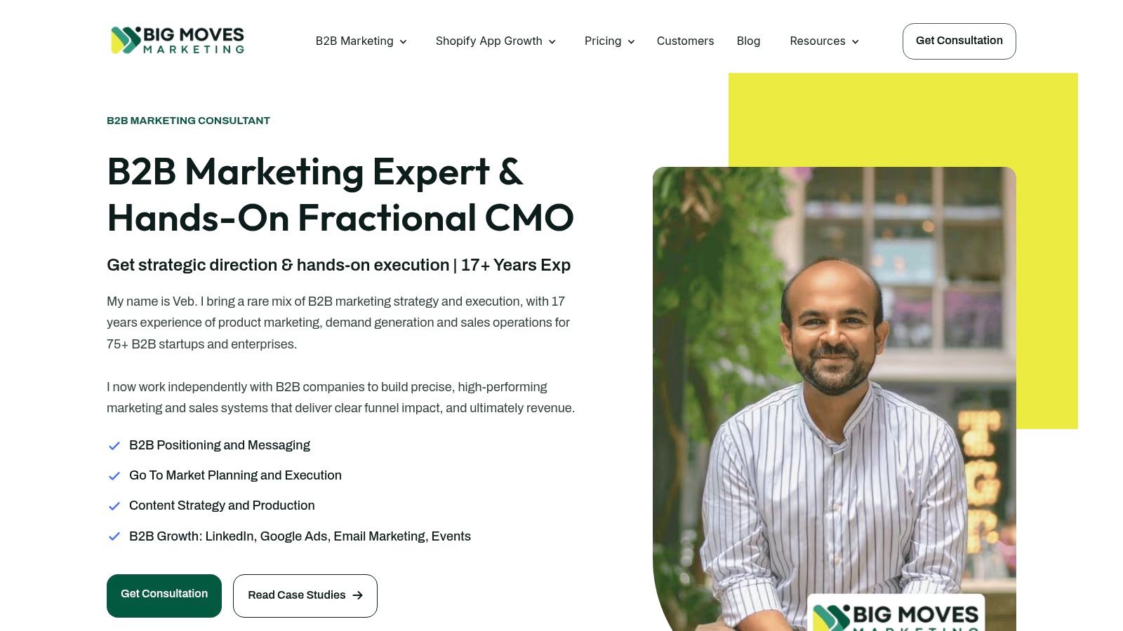
Most example galleries get judged on polish. This one earns its place on a harder test: whether a stranger can name the offer in five seconds. Big Moves Marketing passes. The consultancy, led by Veb, a fractional CMO, says plainly that it sells clarified positioning and conversion-ready websites to B2B technology founders. The buyer and the work sit in the same sentence.
That structure matters more than the visuals. Failed redesigns usually split strategy from execution, with the positioning stranded in a slide deck and the build stranded in a ticket queue. Here one senior operator owns both, which is why B2B SaaS and technology founders get positioning, Webflow builds, go-to-market launches, and channel work across SEO, content, Google Ads, LinkedIn, email, and events, tied to pipeline and revenue instead of impressions. If your homepage cannot name its buyer and its outcome that plainly, copy the discipline before you copy the layout.
The proof is specific enough to check. The consultancy points to 15+ years of B2B experience, work with 70+ companies globally, and 6x revenue growth on the IgnitePOST project. Past website builds including Lexacon.ai, IgnitePost.com, Chargepay.ai, Laboremus.UG, GetRegistered.com, and InsightVoice.AI let a buyer inspect the actual artifact. You can judge messaging, page structure, and conversion paths yourself in minutes. That beats a testimonial carousel every time.
One client put it directly: "Veb executed on key tactics like messaging, website, content and events." Named projects and a named client carry more weight than a rating badge.
The process is foundation-first. Positioning and messaging come before channel experiments, so paid spend never amplifies a muddled offer. Kick-off happens within days, and a typical website deployment runs in weeks rather than quarters. Narrow, senior scope is what makes that speed credible.
Our B2B website service covers the product story, information architecture, page layouts, design, all copywriting, and the technical setup for publishing, SEO, redirects, and forms. A messaging framework builds pillars from the product's and the company's strengths, so every page repeats the same true claim in the buyer's language.
Practical rule: If your designer asks for brand colours before asking who buys and why they hesitate, you are building decoration, not a sales asset.
Two weaknesses deserve a direct call. Pricing pages exist for B2B Marketing and for Shopify App Growth, but the final number follows scope, so budget comparisons still need a conversation. And this is an independent operator rather than an agency bench, so running many specialized workstreams at once is not the model.
Buy it if you need one senior operator connecting strategy to execution. Skip it if you need six workstreams staffed in parallel.
Pros:
Cons:
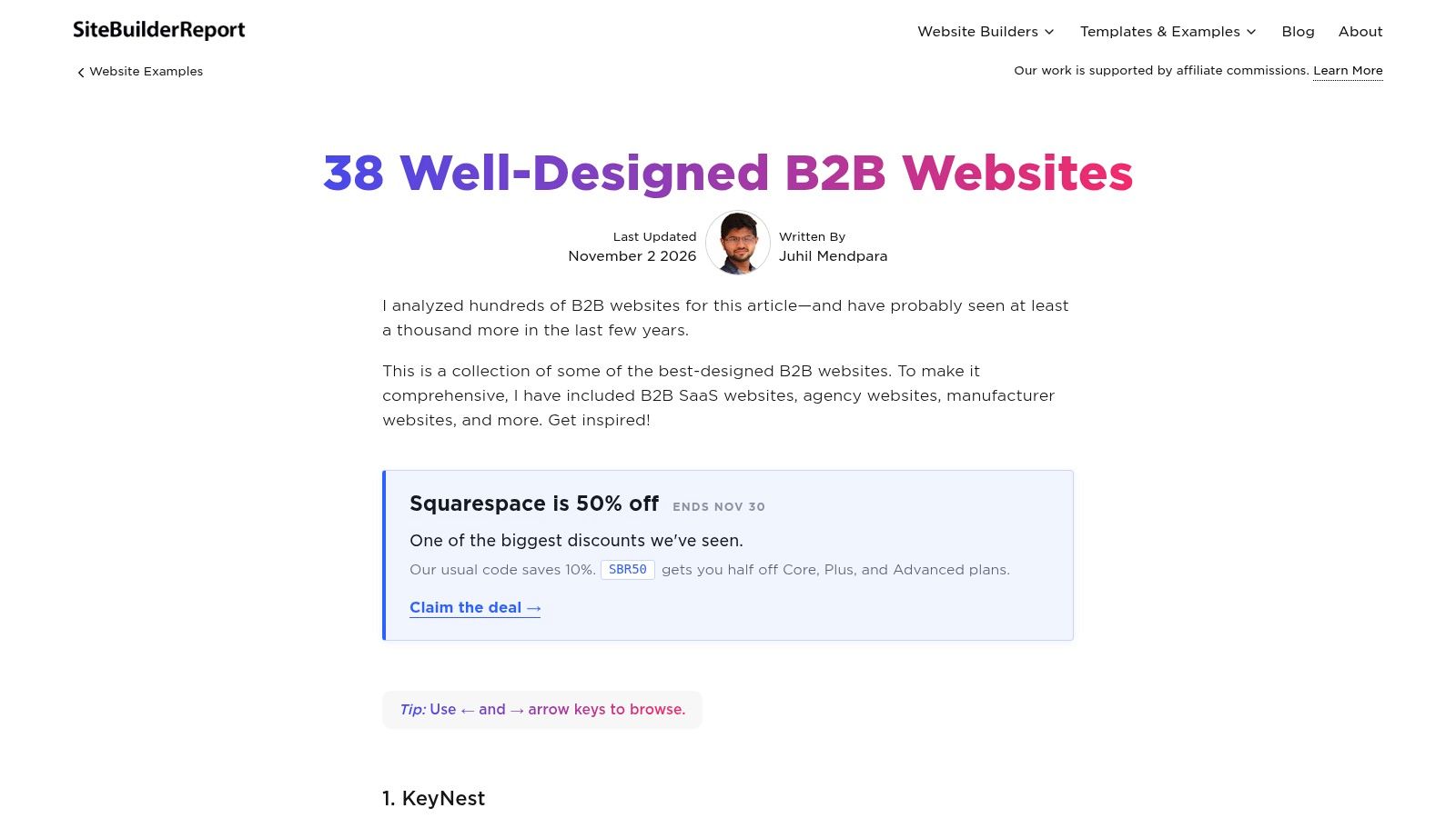
Breadth is the value here. Site Builder Report's roundup of 38 B2B websites spans SaaS, agencies, manufacturing, and other business categories, with editor commentary on design and messaging choices. It's free to read without an account, and the piece is listed as updated November 2, 2026.
Use it for comparison, not copying. When a manufacturer explains its offer faster than a SaaS company with one tenth the complexity, that tells you something uncomfortable about SaaS messaging. Most SaaS homepages hide behind abstraction. Industrial sites often can't afford to. They name the part, the tolerance, the application.
Apply the five-second test across all 38 and you'll build pattern recognition quickly. Which headlines name a buyer? Which subheads state an outcome? Which pages route you somewhere useful instead of dumping you on a generic contact form?
The commentary explains why choices stand out, but it doesn't establish that any design improved business results. That's the honesty test for every roundup, and this one fails it the same way the rest do. You're seeing a curator's judgment, not conversion data.
Some examples will also be irrelevant to B2B SaaS startups. A manufacturing site optimized for procurement specs teaches clarity, but its routing won't map to your demo flow. And the article promotes website-building products, so read recommendations with that commercial context in mind.
Pair this gallery with discipline. Our conversion optimization tips give you the measurement side that a screenshot tour can't. Inspiration without instrumentation is just mood boarding with extra steps.
Best for: Founders who want a fast, cross-industry scan to sharpen their eye for clarity. Skip it if you need SaaS-specific teardown depth.
Pros:
Cons:
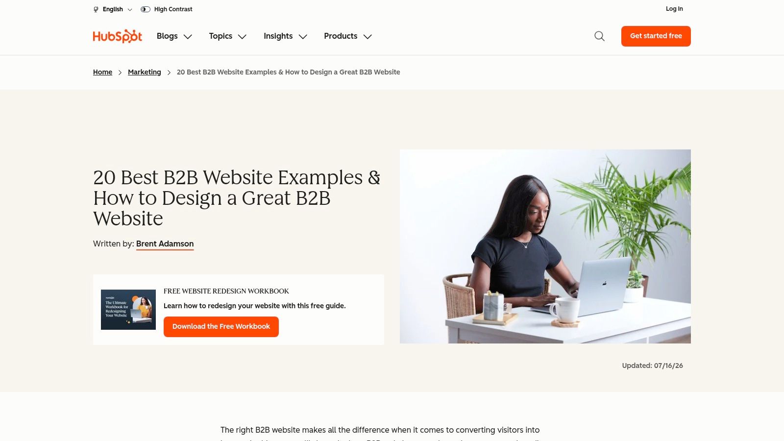
HubSpot's list of 20 B2B website examples is the fastest scan on this page, and the thinnest. Short notes on messaging and presentation, direct links to live company sites, examples across software, services, packaging, and industrial businesses. One coffee gets you through all 20.
The live links are the only feature that matters. Don't trust the screenshot or the summary. Click through and run the five-second test: does the hero name the buyer, and does the navigation follow how a buyer thinks rather than how the org chart looks? Most entries fail one of those.
That test matters more now. Forrester's analysis of zero-click B2B buying makes zero-click buying its headline finding: buyers increasingly complete purchases without visiting a vendor site. A vague, pretty homepage now fails twice. Humans can't parse it, and AI summaries can't quote it accurately.
The weaknesses are structural. Commentary is brief, closer to caption than conversion analysis. Some examples or links may no longer reflect current websites, inevitable for a static list. And the page promotes HubSpot resources and products throughout, so the framing serves HubSpot's funnel, not yours.
A screenshot can't tell you whether a page converts. Only the offer, the route, and the proof can suggest it, and only your analytics can confirm it.
Used correctly, this list is a first pass. Shortlist three sites that pass the five-second test, then study how they handle pricing context, proof, and the path to a conversation. Discard the rest without sentiment. HubSpot's notes can point you toward a page worth inspecting. They cannot prove that page improved a business result.
Pros:
Cons:
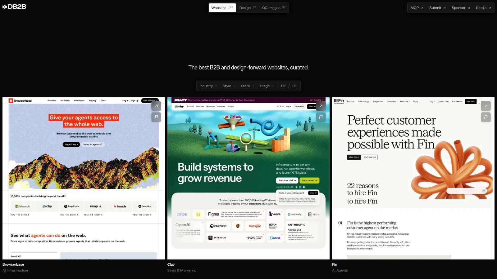
DesignforB2B solves a different problem. It's a browsable gallery built specifically for B2B and design-forward websites, with filters for industry, style, technology stack, and company stage. Browsing is free, and a weekly email surfaces newly added sites.
The filters are useful. A Series A fintech shouldn't benchmark against an enterprise platform with a 40-person web team. Stage filtering keeps your comparisons honest. Stack filtering shows you what's buildable in your environment instead of what looks good in a case study video.
But be clear-eyed about the bias. A gallery curated for design will favour visual novelty. Novelty is not clarity. Some of the most striking sites here will fail the five-second test badly, with animated heroes that never state who the product is for.
The gallery gives you surfaces. Your buyer needs answers. Research covered in Storylane's analysis of the B2B website assurance gap found B2B websites fully answered 69.0% of basic self-serve questions but only 49.8% of high-assurance questions, across 10,580 buyer questions and 529 websites. Security, implementation, integrations, pricing logic. That's where shortlists are won, and galleries don't show it.
There's also less explanatory commentary than a teardown or case study, so you must inspect linked sites yourself to assess copy, buyer journeys, and performance. Budget that time or you'll leave with screenshots and no judgment.
For the messaging layer galleries skip, our B2B website design inspiration guide works through what to extract from an example before you brief anyone.
Pros:
Cons:
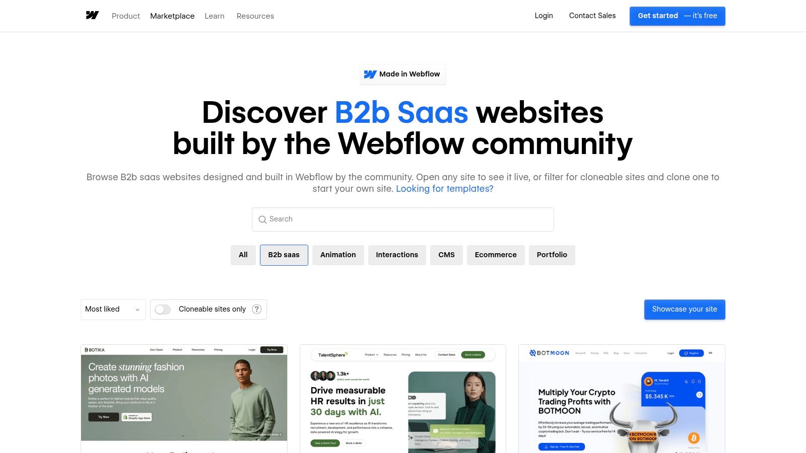
If you're building on Webflow, Webflow's Made in Webflow B2B SaaS showcase is the most practical source here. It's a community showcase of live B2B SaaS sites built with Webflow, filterable by categories and design attributes including animation, interactions, and CMS. Some projects are marked cloneable.
Cloneables change the economics of prototyping. Instead of describing a layout to a designer from a screenshot, you start from working structure and replace the messaging. That's the right order. Structure is cheap to borrow. Positioning isn't.
Test every candidate at phone width first. A history of web design traces how Ethan Marcotte's May 2010 article introduced responsive web design through fluid grids, flexible images, and CSS3 media queries, with Google's 2015 mobile-friendly ranking change strengthening the business case. Fifteen years later, a SaaS homepage that breaks on mobile isn't a trade-off. It's negligence.
Quality varies sharply. Community submissions include student work, abandoned concepts, and polished production sites side by side. The showcase is also Webflow only, so it can't tell you whether Webflow is the right platform, only what people build with it. Cloneables may need heavy customization plus account or plan access before they're usable.
Our Webflow website design guide covers how to turn a borrowed structure into a conversion-focused build without inheriting someone else's messaging mistakes.
Clone the layout if you must. Never clone the words. Borrowed copy means borrowed positioning, and buyers can smell it.
Pros:
Cons:
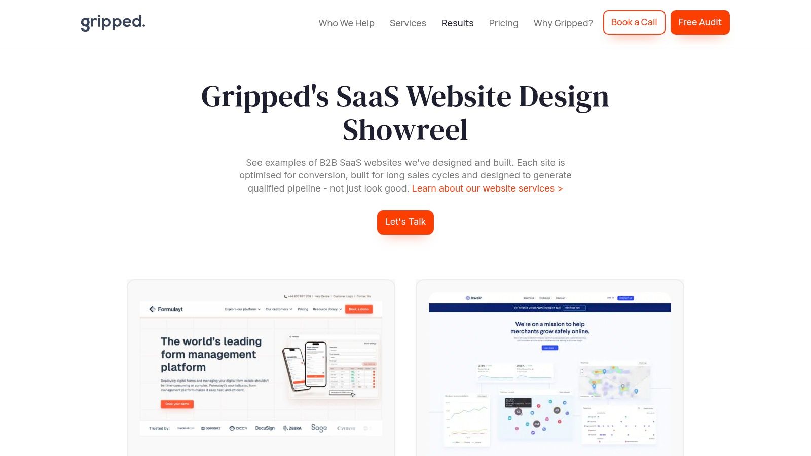
Gripped's SaaS website design showreel is an agency portfolio, and it should be read as one. It showcases B2B SaaS websites Gripped designed and built, including Formulayt, Ravelin, Data Interchange, and Orbus Software, framed around conversion, long sales cycles, and pipeline generation.
The framing is the signal. An agency that talks about buying cycles and pipeline understands the commercial job of a B2B site better than one that talks about brand expression. Click into the live examples and check whether the work matches the claim. Does Ravelin route a fraud leader differently from a payments leader? Does each site give a buying committee enough to shortlist without a call?
That committee point is decisive. G2's 2024 Buyer Behavior Report announcement, based on more than 1,900 B2B software buyers, found 57% expected positive ROI within three months and 79% said the CFO always or frequently held final decision-making power. A site written only for practitioners will stall at finance. Judge every portfolio example on whether an economic buyer can build a case from it.
This is a selected vendor portfolio, not an independent evaluation. You're seeing the work Gripped chose to show, with limited detail on project strategy or results. No baseline conversion rates. No before-and-after pipeline numbers. The sites may be excellent, but the page doesn't prove commercial impact.
Use it correctly. It's an agency evaluation tool, useful if you're shortlisting a specialist for a complex product with a long buying journey. It's weak as broad cross-industry inspiration, and it shouldn't be your only reference set.
Pros:
Cons:
Markettailor's analysis of 11 B2B software homepages is the most disciplined piece on this list. Every example gets reviewed against a consistent checklist covering headlines, subheads, calls to action, proof, navigation, and below-the-fold content. The sites were reviewed in October 2026, and that date is stated openly.
Consistency is what most roundups lack. When each homepage faces the same questions, you can compare clearly instead of collecting impressions. Steal the method even if you ignore the examples. Run your own homepage through the same checklist and you'll find the weak sections in an afternoon.
Pay special attention to proof placement. G2's 2024 Buyer Behavior Report found 31% of buyers consulted review sites more often than other information sources and 81% considered a vendor's history with security breaches. If your homepage buries third-party proof and security below feature grids, it's ordered for your product team, not your buyer.
The scope is homepages only, for B2B software only. Pricing pages, docs, comparison pages, and trust centres sit outside it, yet those pages often close the shortlist decision. Homepage observations also age fast because homepages change constantly, and outcomes aren't independently verified.
Pair it with our hero section examples to pressure-test your above-the-fold message against the five-second standard before you touch anything deeper.
Real redesign evidence looks different from all of this. Crometrics' NAVEX website redesign case study reports a 156% increase in conversion rate on the Contact Us page, plus 10.4% on Pricing and 9.3% on Demo, measured through experiment-led optimization. And Instrumental's Wilmot Modular case study reports leads rising from 0.5 to 5.4 per month and conversion from 0.04% to 0.9%, with $350,000 in closed-won revenue attributed to the redesigned site. Notice the pattern. Pages closest to pipeline, measured separately, beat sitewide aesthetic judgments every time.
Pros:
Cons:
| Item | Format | Access | Best For |
|---|---|---|---|
| Big Moves Marketing | B2B marketing consultancy | Flexible USD/EUR scopes; pricing pages available for B2B Marketing and Shopify App Growth | Strategy plus hands-on execution |
| Site Builder Report, 38 well-designed B2B websites | B2B website roundup | Free, no account | Compare approaches across industries |
| HubSpot, 20 B2B website examples | B2B article with brief notes | Free article | Quick messaging comparisons |
| DesignforB2B, Curated B2B website gallery | Filterable gallery | Free; optional weekly email | Visual references by industry |
| Webflow Made in Webflow, B2B SaaS showcase | Webflow community showcase | Browse live examples; some cloneables need account or plan | Plan a Webflow build |
| Gripped, B2B SaaS website design showreel | Agency portfolio | Links to live examples | Explore agency work for complex buying |
| Markettailor, 11 B2B homepage examples | Analytical homepage article | Article access; pricing not specified | Review homepage messaging |
Read this table by fit, not prestige. Site Builder Report and Markettailor give messaging to inspect. DesignforB2B and Webflow give visual references. HubSpot and Gripped give quick notes and agency examples. Big Moves Marketing is the consultancy behind this article; its row matters if you need the site built, not just benchmarked.
None of these sources proves a pretty site improved revenue. Free browsing gets references fast. A Webflow showcase helps only if you plan a Webflow build. An agency portfolio shows work, not pipeline.
Here's the pattern across all seven sources. The galleries show you surfaces. The checklists show you structure. The case studies show you money. Only one of those three should drive your decisions, and it's the one almost nobody collects before a redesign.
A B2B website wins when a skeptical buyer understands the offer in five seconds and finds proof she can verify without booking a call. Everything else, the motion, the gradients, the clever nav, is secondary. If your favourite example can't pass that test, it's not an example. It's a poster.
Teams also get the ownership wrong. Websites should be built by marketing, not developers. Developers optimize for what's buildable. Marketing owns positioning, the buyer's questions, and the conversion path. Put the person accountable for pipeline in charge of the asset that creates it.
A sound build follows a fixed order. Messaging framework first, built on audience research, competitive mapping, and the product's actual strengths. Then sitemap and information architecture, so every buyer route has a page built for it. Then conversion-focused copy on every page, because a beautifully laid out page with generic copy still fails the five-second test. Design and development come after those decisions, not before them.
That's the mental model to keep. Your website isn't a brochure and it isn't a portfolio piece. It's a buyer enablement system that either reduces perceived risk faster than competitors or it doesn't. Collect examples by all means. But judge them like a buyer with a budget to defend, and judge your own site harder than any of them.
If your homepage fails the five-second test, or your proof can't survive a CFO's first pass, Big Moves Marketing can rebuild the foundation with you, positioning, messaging framework, sitemap, and a conversion-ready Webflow site tied to pipeline. Bring your current site and your hardest buyer questions, and we'll tell you directly what to fix first.