%20png%20copy.avif)
A high-performing hero section does one thing: it tells the right visitor exactly what you offer and what to do next, before they scroll. The recipe is simple: one benefit headline + one supporting subhead + one primary CTA + a visual that reinforces the outcome.
Every element earns its place. Above-the-fold content should include a clear headline, short supporting text, a prominent CTA, a relevant visual, and light trust signals, all visible at first paint. Miss any one of them and you’re asking visitors to work harder than they will.
Before you ship, run three checks:
Figma is the standard tool for designing and prototyping hero sections before handing off to Webflow for production. Run your contrast ratios against WCAG 4.5:1 guidance before you export anything.
Pro Tip: Write your headline first, then design around it. If the copy is weak, no visual treatment will save the conversion.
A high-converting hero section requires clear benefit-led copy, a single visible CTA, WCAG-compliant contrast, and fast first-paint load time, in that order of priority.
| Point | Details |
|---|---|
| Lead with the benefit | Write the headline as an outcome, not a feature description, to increase visitor engagement. |
| One primary CTA | A single high-contrast button above the fold outperforms multiple competing calls to action. |
| Pass WCAG contrast | Check every text-over-image combination at 4.5:1 using WebAIM or Coolors before launch. |
| Optimize for speed | Use WebP or AVIF images with srcset, and serve a static fallback instead of video on mobile. |
| Bigmoves for implementation | Bigmoves builds conversion-first Webflow hero sections for B2B SaaS teams, starting with messaging. |
Choosing the wrong visual style is one of the fastest ways to confuse visitors. Here’s a compact taxonomy with one implementation note per style.
SaaS/product-focused heroes center the product UI, a dashboard screenshot, or an animated product demo. The conversion goal is trial or demo signup. Place the product visual to the right of the headline in a split layout so the copy reads first. HubSpot notes that product-as-design is one of the most effective current patterns when it supports the headline rather than competing with it.
Minimal/typography-first heroes strip everything back to a bold headline, a short subhead, and a CTA on a clean background. High-end SaaS, consultancies, and agencies use this style to signal confidence. The risk is looking generic; solve it with a distinctive typeface or an unexpected color pairing.
Image/video full-bleed heroes use a large photograph or looping video as the background. They work for lifestyle brands, e-commerce, and consumer apps. Shopify recommends testing full-screen, slideshow, and static overlay formats and always providing a video fallback for mobile.
Illustration-driven heroes use custom artwork instead of photography. They’re common in fintech, edtech, and developer tools where abstract concepts are hard to photograph. Custom illustration builds brand recognition faster than stock. Browse Dribbble’s hero-section tag for unconventional illustration ideas.
Split-screen layouts divide the viewport: copy on the left, product or image on the right. This pattern is reliable for B2B SaaS because it separates the message from the visual, making both easier to process. In Webflow, a two-column grid with a sticky left column handles this cleanly.
Interactive/animated heroes use scroll-triggered animations, cursor-following elements, or micro-interactions. Use sparingly. Motion should support the headline-to-CTA sequence, not distract from it.
Slideshow/carousel heroes rotate multiple messages or offers. They suit retailers with multiple product lines. Conversion data consistently favors a single focused message over a carousel, so use this style only when you genuinely have multiple equal-priority offers.
Editorial/search-driven heroes lead with a search bar or a category grid. News sites, job boards, and marketplaces use this pattern. The CTA is the search action itself.
| Style | Best for | Visual weight | Typical CTA placement |
|---|---|---|---|
| SaaS/product-focused | Trial or demo signup | Medium | Left-aligned, above fold |
| Minimal/typography | Agency, consultancy, premium SaaS | Low | Center or left |
| Full-bleed image/video | E-commerce, lifestyle, consumer apps | High | Center overlay |
| Illustration-driven | Fintech, edtech, developer tools | Medium | Left or center |
| Split-screen | B2B SaaS, enterprise | Medium | Left column |
| Interactive/animated | Creative agencies, product launches | High | Center or scroll-triggered |
| Slideshow/carousel | Multi-offer retail | High | Center overlay |
| Editorial/search | Marketplaces, news, job boards | Low | Inline search bar |
Lead with the benefit. One line. Then use the subhead to answer “for whom” or “how fast.” That sequence is the entire formula.
Here are four copy patterns that work for SaaS and product audiences:
For A/B testing, start with these three variables in order: headline length (short punchy vs. full sentence), CTA text (“Start free trial” vs. “See it in action”), and subhead emphasis (outcome-focused vs. process-focused). Run each test for at least two weeks before calling a winner. Aligning your headline with SEO-optimized phrasing can also lift organic click-through alongside on-page conversion.
On accessibility: every CTA button needs a descriptive label. “Get started” tells a screen reader nothing. “Start your free trial” does. Add aria-label attributes in Webflow when the visible button text is short or ambiguous.
Accessibility and load speed are conversion requirements. Treat them as such from the first design iteration, not as a final QA step.
Contrast. WCAG guidance sets a 4.5:1 contrast ratio for body text and 3:1 for large text (18pt+ or 14pt bold). Check every text-over-image combination with WebAIM’s Contrast Checker or Coolors. This is the fastest fix and it works in both Figma and Webflow.
Legibility over backgrounds. Place headlines over the open, low-detail area of a background image, not over faces or busy textures. Webflow’s own guidance recommends keeping headlines over open space and using custom photos or illustrations when stock imagery dilutes brand clarity.
Performance. Use WebP or AVIF for hero images. Both formats deliver significantly smaller file sizes than JPEG at comparable quality. Add srcset attributes so mobile devices load a smaller image variant. For video backgrounds, keep the loop under 10 seconds, compress to under 5MB, and always include a static image fallback for mobile. Webflow confirms that short, looped, compressed video works well when paired with a lightweight static fallback.
One primary action. Visible at first paint. That’s the rule.
Everything else is secondary. Here are the patterns that work and when to use each:
Three quick conversion tips:
For testing, swap “Get started” for “See how it works” and measure which drives more qualified signups, not just raw clicks. Raw click volume is a dangerous metric to optimize for in isolation.
There’s no single pixel height. Follow viewport-fraction rules instead.
The goal is that the headline, subhead, CTA, and a hint of the next section are all visible without scrolling on a 1280px desktop screen.
Responsive rules:
Safe-area margins. On desktop, keep all critical content within the center 1200px of the viewport. On mobile, account for browser chrome at the top and bottom of the screen. A CTA button placed too close to the bottom of the viewport on iOS can be obscured by the Safari navigation bar.
Mailchimp recommends sizing hero imagery to fit device viewports and keeping messaging short enough that visitors understand the offer within seconds of landing.
The fastest path from idea to production-ready hero is a combination of a curated gallery for inspiration and a component-based tool for implementation.
Inspiration galleries:
Tooling:
Figma-to-Webflow implementation tip. Use the Figma-to-Webflow plugin to export your hero frame directly. Before you do, flatten all text to Webflow-compatible web fonts, convert any Figma effects (drop shadows, blurs) to CSS equivalents, and confirm your image assets are exported at the correct resolution. This cuts handoff time significantly and reduces the back-and-forth between design and development. For a deeper look at visual storytelling in hero sections, real product imagery and brand-specific visuals tend to outperform generic stock in building immediate credibility.
These examples are drawn from patterns observed across Landingfolio, Dribbble, Unsection, Saaspo, and Justinmind’s hero collection. Each entry includes a style label, a “why it works” note, and one implementation note.
1. SaaS product hero, split layout Why it works: The product UI on the right gives the headline immediate proof. Visitors see the claim and the evidence simultaneously.
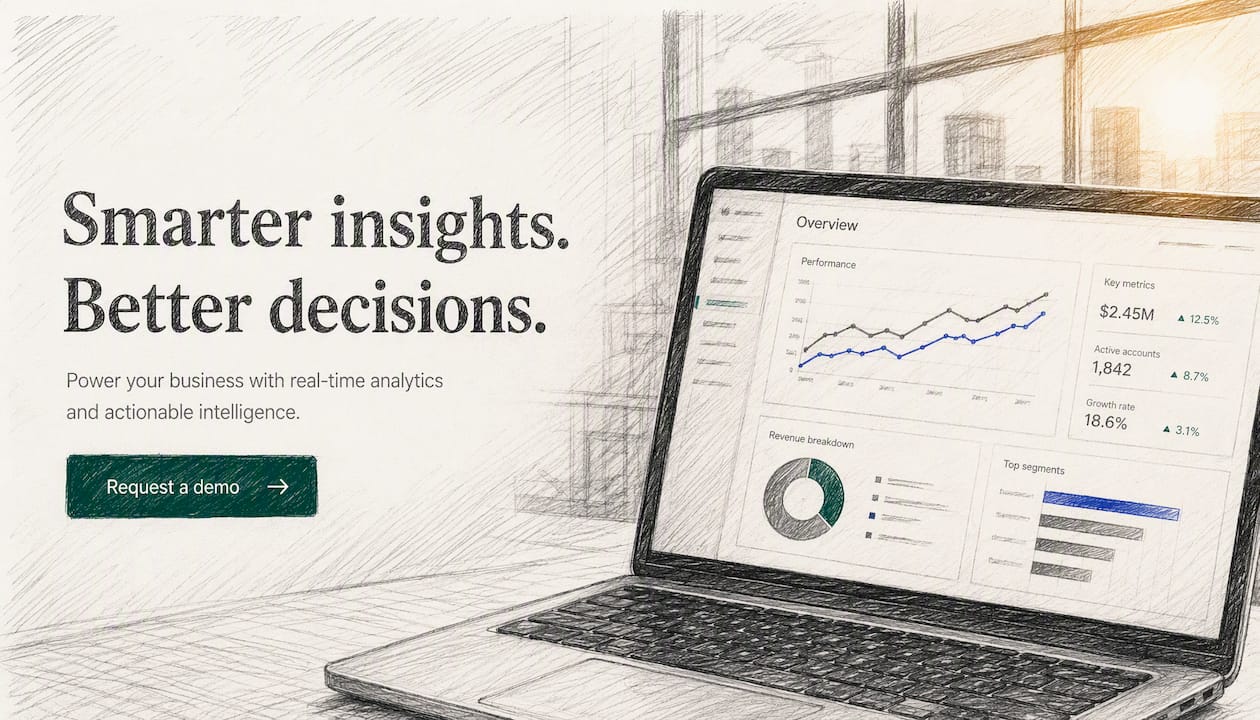
2. Minimal typography hero, centered Why it works: Zero visual noise forces the headline to carry the full weight. Works when the copy is genuinely strong. Implement: Single-column layout, 80–96px headline, generous vertical padding, one CTA button below.
3. Full-bleed video hero with overlay Why it works: Motion creates emotional context instantly. The semi-transparent overlay keeps text readable at 4.5:1 contrast.
4. Illustration-driven hero, fintech style Why it works: Custom illustration signals brand investment and differentiates from competitors using the same stock photos. Implement: SVG illustration for crisp rendering at all sizes, exported from Figma, placed right of copy in a split layout.
5. Full-bleed photography hero, e-commerce
Why it works: A single aspirational image communicates lifestyle faster than any headline. The CTA sits center-bottom over open sky.
Implement: WebP image with srcset for mobile, centered text block with white text on darkened sky area.

6. Product-as-background hero, SaaS dashboard Why it works: The product fills the entire background at low opacity, creating context without competing with the headline.
7. Split-screen hero, enterprise B2B Why it works: Clean separation of message and visual reduces cognitive load. The left column reads like a billboard. Implement: 50/50 Webflow grid, left column sticky on scroll, right column scrolls with page content.
8. Gradient hero, developer tool Why it works: A bold gradient signals modernity without requiring photography. Common in API and infrastructure products. Implement: CSS gradient background in Webflow (no image file needed), monospace font for code-snippet subhead.
9. Animated hero, interactive product demo Why it works: A short looping animation of the product in action reduces the need for a live demo request. Implement: Lottie animation embedded in Webflow, under 200KB, with a static PNG fallback for reduced-motion preferences.
10. Carousel hero, multi-product retailer Why it works: Rotates three distinct offers without requiring separate landing pages. Each slide has its own CTA. Implement: Webflow slider component, three slides maximum, auto-advance at 5-second intervals, pause on hover.
11. Search-bar hero, marketplace Why it works: The search bar is the CTA. Visitors arrive with intent; the hero channels it immediately. Implement: Full-width input field, placeholder text with a specific example query, submit button inline on desktop.
12. Editorial hero, content-first site Why it works: A large headline and category navigation above the fold serve high-intent readers who know what they want. Implement: Newspaper-style grid in Webflow, featured article image left, secondary links right, no decorative imagery.
Examples were selected based on five criteria: recency (patterns current as of 2026), design clarity, presence of conversion-oriented elements, accessibility compliance, and feasibility of implementation in Webflow or Figma. Sources scanned include Landingfolio, Dribbble, Unsection, Saaspo, and Paper Street’s top hero sections list.
Selection criteria and trust signals:
Headline that describes the product instead of the outcome. “An AI-powered project management tool” tells visitors what you built. “Ship projects on time, every time” tells them what they get. The second version converts better.
Too many CTAs. Two equally weighted buttons create decision paralysis. Pick one primary action. Make the secondary option visually subordinate.
Background imagery that competes with text. A busy photograph behind a white headline is a contrast failure waiting to happen. Always test with WebAIM’s Contrast Checker before launch.
Autoplay video on mobile. Video backgrounds that autoplay on mobile drain battery, consume data, and slow first paint. Serve a static fallback instead.
Generic stock photography. A smiling team in a glass office signals nothing about your product. Original, on-brand imagery builds trust faster and typically converts better for B2B and SaaS audiences.
Headline that’s too long. A hero headline should land in under 10 words. Beyond that, visitors skim and miss the point.
No social proof. A single trust signal, a logo strip, a review count, or a customer stat, reduces hesitation without adding visual clutter. Place it directly below the CTA.
Two principles govern how visitors process a hero section: the F-pattern and visual hierarchy.
F-pattern scanning. Eye-tracking research consistently shows that visitors scan web pages in an F-shaped pattern: a horizontal sweep across the top, a second sweep slightly lower, then a vertical scan down the left edge. Your headline belongs at the top-left. Your subhead belongs on the second horizontal sweep. Your CTA should sit on or near the left margin where the vertical scan lands.
Visual hierarchy. A hero is a sequence, not a composition. The headline captures attention first. The subhead supports it. The CTA closes the loop. Background imagery or motion should never pull the eye away from that sequence. HubSpot’s analysis confirms that motion must support the headline-to-CTA path, not interrupt it.
Contrast and attention. High contrast between the CTA button and its background is one of the most reliable conversion levers in hero design. The button color should appear nowhere else in the hero so the eye has a single focal point to land on after reading the headline.
Cognitive load. Every additional element in a hero section adds a decision. A logo, a navigation bar, a headline, a subhead, a CTA, a trust badge, and a background image is already eight competing signals. Add an animation and a secondary CTA and you’ve created a hero that asks visitors to work. Reduce, don’t add. Web accessibility practices that simplify visual structure also reduce cognitive load for all visitors, not just those using assistive technology.
The conventional wisdom says “make it beautiful.” The actual priority order is: clarity of message, visible CTA, accessibility, and speed. Beauty is fifth.
The tradeoff I see most often: a designer wants a full-bleed video background because it looks impressive. The product team wants the CTA above the fold. Both are right, but the video usually wins the internal debate and the CTA gets pushed down. The correct call is to keep the CTA above the fold and use the video as a supporting element, not the hero itself. Muted animation works when it doesn’t reduce CTA contrast or push the button below the viewport.
The second common tradeoff: a long, nuanced headline versus a short, punchy one. Founders often want to explain the product in the headline. Visitors want to know what they get. Short wins. Save the nuance for the subhead.
After 17 years and work with 75+ clients at Bigmoves, the pattern is consistent: the heroes that convert best are the ones where someone made a hard editorial decision to cut something. The ones that underperform are the ones where every stakeholder got to add one more element.
If your hero section isn’t converting, the problem is usually messaging, not design. Bigmoves works with B2B SaaS and technology companies on conversion-first Webflow builds that start with positioning and messaging before a single pixel is placed.
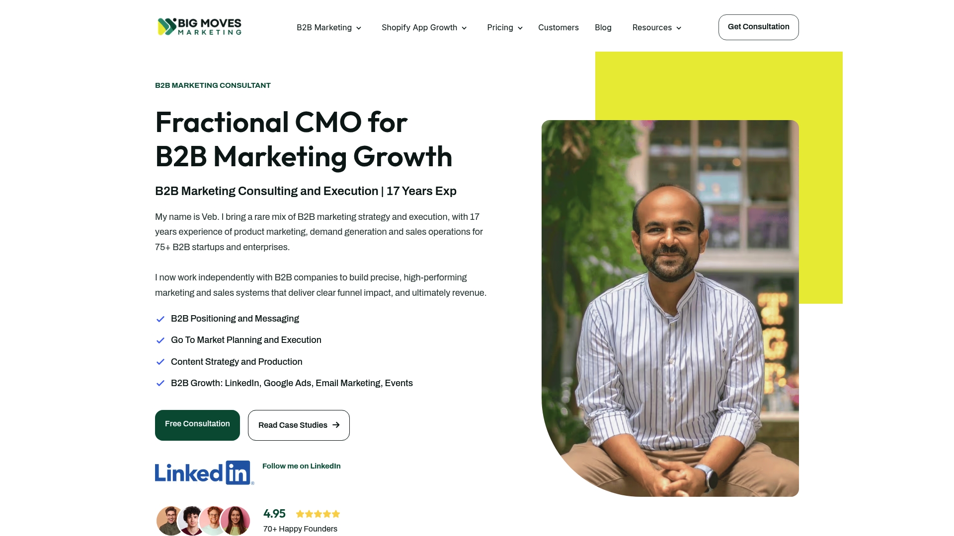
The typical engagement covers hero copy and positioning, Webflow build and launch, and a short conversion testing sprint after go-live. Clients leave with a site that reflects their actual value proposition, not a template with placeholder copy. Veb and the Bigmoves team have run this process with 75+ SaaS and technology companies. If you want a short audit of your current hero section, reach out here.
Inspiration galleries
Accessibility and color
Tooling
A clear benefit headline, a single primary CTA visible at first paint, a supporting visual, and light trust signals. Omniconvert defines above-the-fold content as the initial viewport and recommends all five elements appear before the visitor scrolls.
Lead with the outcome the visitor gets, not the features you built. A formula that works: “Verb + specific result” or “Who + benefit.” Keep it under 10 words.
Mailchimp recommends sizing heroes to fit device viewports so the offer is clear within seconds.
WCAG requires 4.5:1 for body text and 3:1 for large text (18pt+ or 14pt bold). Use WebAIM’s Contrast Checker or Coolors to verify text-over-image combinations before launch.
Landingfolio, Unsection, Saaspo, and Dribbble are the most useful galleries. Landingfolio alone hosts 450+ examples filterable by style and industry.

%20-%20white.svg)