Most advice about B2B web design best practices starts in the wrong place. It starts with the hero layout, the button colour, the scroll animation, the number of fields in the demo form.
Buyers don't grade you on any of that. In a 2024 survey of 150 buyers by Digital Commerce 360 and Forrester, 36% graded their digital buying experience an A and 49% graded it a B (Digital Commerce 360 buyer data). A B is the problem. Nobody is angry with your website. Nobody is impressed by it either, and a buyer who isn't impressed doesn't book the call.
Here's the harder version. Most B2B homepages aren't badly designed. They're built to describe a product the company hasn't defined clearly yet. Design polish can't fix a positioning gap. Conversion tactics can't compensate for a buyer who can't tell whether the product is for them.
These eight practices start with the decisions the site has to reflect, then move through the buying committee, the CTA, and the measurement layer that shows whether any of it produces pipeline. Every one is a decision you can make this quarter. None requires a redesign.
A visitor arrives from a LinkedIn post your VP wrote. The headline reads "The unified revenue intelligence platform for modern GTM teams." They don't know what that means. Worse, they can't tell whether they have the problem it solves, so they leave and read a competitor's page that lists symptoms they recognise.
By the time a buyer reaches your site, most of the work is already done. In 6sense's 2024 survey of 2,509 recent B2B buyers, 69% of the purchase process had happened before buyers engaged with sellers (6sense buyer experience report). Your homepage isn't the opening line of a sales conversation. It's the middle of one, joined late.
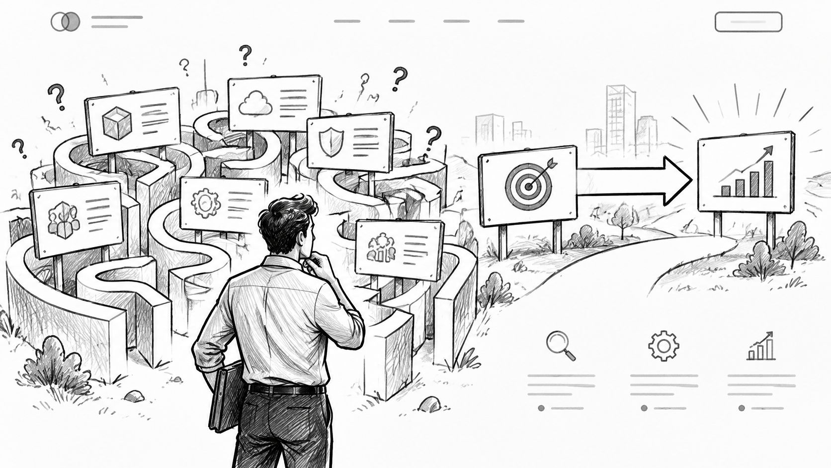
So name the symptom in the buyer's own words. "Deals stall in procurement for six weeks" is a situation a RevOps lead recognises in one second. "Revenue intelligence" is a category you invented for your board deck. The first sentence earns the next ten seconds. Only then have you bought the right to introduce your category.
Sequence beats wording. Positioning comes before copy, and copy comes before layout. If the category, the competitive alternative, and the differentiating attribute aren't agreed internally, the hero just publishes that confusion at scale.
Positioning test: if two people in your company describe the category differently, the hero is a symptom, not the cause.
Big Moves Marketing sequences positioning and messaging work before a line of website copy for this reason. The page should publish a decision the company has already made, not host the debate in public.
Every B2B site says it serves teams of every size. That sentence does nothing. Enterprise buyers read it as "no enterprise features." A five-person startup reads it as "sales call required."
Buyers are already doing the filtering without you. HubSpot's 2024 survey of 422 U.S. B2B purchasing decision-makers found that 75% preferred to gather product information independently, and 57% had purchased a tool without meeting the vendor's sales team (HubSpot B2B buyer research). They don't want a gate. They want a fast way to know whether they're in scope.
So write the exclusion. "Built for teams running 20 seats or more with a dedicated RevOps function" tells a six-person startup to leave in ten seconds, before they consume an SDR's week. That's a good outcome. The founder instinct is to keep every lead. The commercial reality is that unqualified leads cost more than missed ones, because they burn sales capacity and distort pipeline data for the next two quarters.
Exclusions belong inside the buying path, not in a footnote on the about page.
Role-based entry points work for the same reason. A "For CFOs" path that speaks to budget scrutiny converts better than one homepage trying to sound relevant to everyone in the room.
Most B2B teams design the pricing page last, in a hurry, with legal on the call. It's usually the most-visited commercial page on the site.
Buyers care about the mechanics, not just the number. In 2024, 84% of B2B buyers said an easy and accurate online web-store experience was important, according to Sana Commerce survey data reported by Digital Commerce 360. Sit with the word accurate. A pricing page that forces a call to learn the shape of the cost isn't accurate, it's evasive.
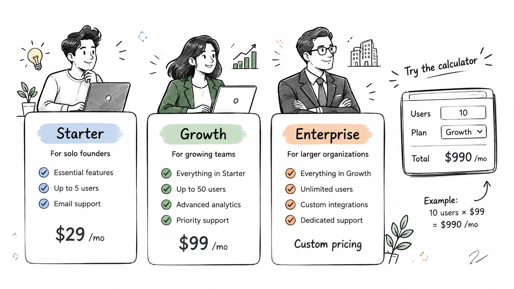
The page supports one decision. Does this buyer self-serve, talk to sales, or leave. Hiding every number protects sales time on large deals, and it also hands every mid-market buyer to whichever competitor publishes a range. Publishing every number anchors you as commodity software. Neither default is right. The sales motion decides, and the trade-off should be visible to the buyer rather than resolved by accident.
Broadly there are two positions, and both are defensible. Pick one deliberately, then make the boundary obvious in the page.
Hiding every price doesn't protect your sales team. It hands the mid-market buyer to whoever publishes a number.
Solution engineers run into the same wall on technical calls, which is why this SE pricing discussion best practices debate keeps resurfacing inside sales teams. If you want the full argument for transparency, our own breakdown covers the data-backed case for showing your pricing.
Picture a RevOps director comparing three vendors. All three show a logo wall of recognisable brands and a testimonial that says "great product, highly recommend." She discounts all of it, because she has written testimonials like that herself.
The vendor that wins her attention publishes something else entirely. A named role, a baseline the reader can picture, the change the team measured, the timeframe, and the mechanics of what changed first. Same tooling, plus one honest sentence about what broke during rollout.

Logos without context are decoration. The strongest proof on a B2B site is the claim a sales rep could repeat on a call without flinching. If your rep softens the claim when a prospect pushes back, it isn't proof, it's marketing copy.
Buyers now check your claims against a second machine. In Mixology Digital's 2025 B2B research, 58% of buyers were using or experimenting with tools such as ChatGPT to summarise or compare vendor content (B2B Research Report 2025). Unsupported superlatives don't survive that comparison. Named sources, visible dates, and factual tables do.
A B2B purchase is a group decision with different risks attached. The economic buyer wants a financial case and a vendor that will still exist in three years. The technical evaluator wants architecture, integration detail, and a security posture they can defend to their CISO. The end user wants to know the daily workflow won't get worse.
Most sites answer one of those well and leave the rest to a call. That's the failure. Your champion can't forward the site to her colleagues and have it do the work, so she writes a summary in Slack instead, and her summary is worse than your page.
This is an information architecture problem before it's a design problem. It decides whether the site helps close deals or only starts them. Nielsen Norman Group's B2B research, based on testing 293 B2B websites across the United States, United Kingdom, and Singapore, produced 188 user-experience guidelines (NN/g B2B website usability research). The volume is the point. Committee needs are specific, and most of them are documented.
Start by listing the questions that recur in late-stage deals. Security review, implementation time, integration coverage, admin overhead, migration risk. Each one needs a page or a document, not a paragraph buried in a product tour.
The language needs to hold up across all of it. Consistent terms for the same feature, the same metric, the same tier, used the same way everywhere, including in sales decks. Our collection of B2B messaging examples shows how that consistency looks in practice.
"Book a demo" sits on every page of most B2B SaaS sites because it's the default, not because anyone decided it. For a product built for self-serve adoption, it's incoherent. For a product with a six-week implementation, a "start free trial" hero is equally wrong.
The CTA is a public statement about how you expect buyers to commit. Gartner reports that 75% of B2B buyers prefer a rep-free sales experience, yet buyers are 1.65 times more likely to regret a purchase made through a purely digital self-service path than one made through a traditional, rep-led process (Gartner B2B buying report). The same research finds buyers are 1.8 times more likely to complete a high-quality deal when they use supplier-provided digital tools alongside a sales representative.
Read that as an instruction, not a contradiction. Buyers want to move alone, and they want a human available at the moment risk appears. Your site has to offer both without making the visitor guess which one you meant.
Write the motion in one sentence: who self-serves, who gets a rep, and where the line sits.
Hybrid motions fail in a predictable way. Both CTAs get equal weight in the hero, and the visitor has to infer the intended path from a page that never states it.
The conversion layer matters more than the button copy. Our conversion optimization tips cover how to instrument the path from first click to activated account.
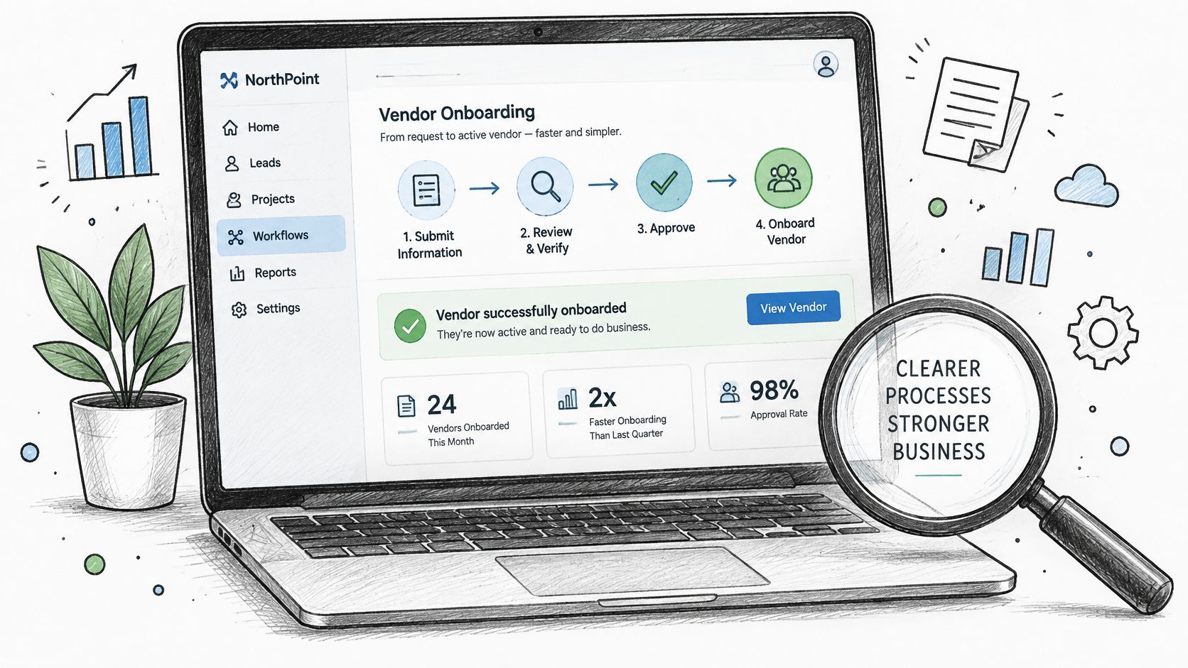
Stock photography is the fastest way to signal that you have nothing specific to say. The person-at-laptop shot appears on hundreds of SaaS sites, and buyers have seen it enough times to stop reading. Abstract dashboard mockups are worse. They imply the product is either unfinished or difficult to explain.
Experienced buyers want the actual workflow, the actual data model, the actual output. A 60-second interactive walkthrough that shows a deal moving from stage one to stage two persuades more than a hero animation, because it answers the question the buyer arrived with. Every screen you publish is a claim about what the product does. Show a workflow the product can't reproduce and you've written a churn ticket.
For technical buyers, documentation is marketing. Public docs, API references, and code samples are among the most-read pages on developer-facing sites, and they get read before the first call. Put them behind a login and you've slowed the evaluation for the exact person who decides whether the integration is viable.
The format that works: real screens, real sequence, no voiceover explaining how capable the team is.
A demo that only works with a mouse is a liability. WCAG 2.2 organises its requirements under four principles and 13 guidelines, with three conformance levels: A, AA, and AAA (WCAG 2.2 specification). Treat those levels as acceptance criteria for every demo, calculator, and form you ship.
Org charts make bad sitemaps. Product, Company, Resources, Blog describes how the vendor is structured, and buyers arrive carrying a different map: a problem to solve, alternatives to compare, a price to sanity-check, proof to verify. Each of those intents is a page with one job and one next step. A site that treats them as one undifferentiated stream sends pricing questions to a blog post and pushes evaluation-stage visitors toward a demo form they are not ready for.
Traffic and form fills are weak signals for judging that architecture. The metric that matters is whether visitors become opportunities, and whether the pages producing opportunities are the ones the team invested in. A sitemap that can't be read against pipeline is a guess with a navigation bar.
Machine-readability sits inside the same problem. A 2026 study reported that AI agents completed 96% of tested tasks when accessibility fixes were enabled, compared with 31% without them, and task completion fell by as much as 68% when the fixes were removed (2026 accessibility and AI readiness study). The same reporting cited the 2026 WebAIM Million scan, which found detectable WCAG failures on 95.9% of the top one million home pages. Your buyers' research agents hit the same walls their human users do.
Measurement rule: if a page can't be tied to an opportunity, it's a cost centre with a URL.
| Item | Primary Buyer Question | Common Failure Mode | Best Fit Motion | Metric to Watch |
|---|---|---|---|---|
| Lead with the buyer's problem and the category they already understand | Does this solve a problem I recognize, and how? | Generic product claims or unclear positioning | Problem-led evaluation | Visitor self-qualification and qualified conversations |
| Publish who the product is not for | Is this designed for a company like mine? | Trying to appeal to every segment | Focused ICP-led selling | Demo-to-opportunity conversion |
| Treat the pricing page as a qualification tool, not a conversion afterthought | What will it cost, and which option fits me? | Hiding prices or offering tiers without clear buyer guidance | Self-serve, sales-led, or hybrid pricing based on deal size | Pricing-page drop-off and sales calls spent explaining pricing |
| Replace generic proof with specific, attributable outcomes | Has this delivered measurable results for a buyer like me? | Vague testimonials and unverified logo walls | Evidence-led consideration and sales enablement | Opportunity conversion and use of customer proof in sales |
| Design for the buying committee, not the single visitor | Can each stakeholder find the information they need? | Addressing only one persona and leaving other questions for sales | Committee-based enterprise evaluation | Stakeholder engagement and repeated discovery questions |
| Match the primary CTA to the actual sales motion | What is the right next step for my needs? | Using the same demo CTA for every buyer | Product-led, sales-led, or clearly segmented hybrid motion | CTA-to-first-value conversion |
| Show the product as evidence, not as decoration | Can I see how the product works and whether it fits? | Stock imagery or generic mockups instead of real product evidence | Product-led evaluation and technical validation | Demo requests or engagement after viewing product evidence |
| Build the site architecture around search intent and buying stage, then instrument it to pipeline | Can I find the right information for my current evaluation stage? | Organizing pages around internal teams and tracking traffic instead of pipeline | Intent-led acquisition and measurable evaluation journeys | Site-sourced opportunities by page type |
Every practice in this list reduces to one question. Does the site reflect decisions the company has made?
A homepage that opens with a category nobody outside the company uses isn't a copy problem. It's a positioning decision nobody took. A pricing page that hides every number isn't a UX problem. It's a sales motion nobody wrote down. A logo wall with no outcomes isn't a design problem. It's proof the team never collected.
Work in this order. Positioning, segments, proof, committee paths, CTA, product evidence, architecture, measurement. Each step makes the next one cheaper. Settle the positioning and the hero takes an afternoon. Settle the segment definition and the pricing page stops being an argument with sales. Settle the proof format and every new case study becomes a two-hour job instead of a two-month negotiation.
The technical baseline follows the same logic. Design decisions tied to durable standards survive redesigns and procurement reviews. The Web Content Accessibility Guidelines became a W3C Recommendation in May 1999, WCAG 2.2 was published on 5 October 2023, and an updated WCAG 2.2 publication followed on 12 December 2024 (W3C standards history for WCAG 2.2). A site built against that baseline doesn't need rebuilding every time a visual trend turns over, and it clears accessibility requirements in US, UK, and EU procurement without a last-minute scramble.
Then instrument. A site without page-to-opportunity attribution drifts back to whatever the loudest stakeholder prefers, and that preference is usually about how the homepage looks in a board deck.
Big Moves Marketing runs this sequence with B2B SaaS teams across the United States, Europe, and India, and the pattern holds in every market. The website isn't the strategy. It's the visible surface of it, and buyers can tell which companies decided something before they opened the design tool.
If your site is underperforming, the fastest fix is upstream of the design. Big Moves Marketing runs positioning and messaging work first, then builds the sitemap, page structures, layouts, and copy that turn those decisions into pages buyers can evaluate without a call. Book a free consultation call through Big Moves Marketing and bring your last ten closed-won deals to the conversation.