The most popular advice about website header size is also the least useful: pick a pixel height and apply it everywhere. That treats navigation as a static graphic rather than a buying interface. For a B2B SaaS company, the better question is what the header leaves visible, how reliably it loads, and whether buyers can still use it when the screen or text size changes.
A smaller header isn't automatically a better header. A compact navigation bar that hides the next step, clips labels, or moves during loading can be worse than a slightly taller one. Set a starting range, then make the design earn its space.
| Header type | Desktop | Mobile |
|---|---|---|
| Standard top header | 64–90 px | 56–64 px |
| Sticky header | 60–80 px | 56–64 px as a starting point, validate persistent controls |
| Announcement strip | No established range, fit the message without competing with navigation | Dismissible or removed |
| Hero and above-the-fold block | Size to usable viewport height | Confirm first-screen content |
| Tablet layout | Test navigation fit rather than copying a desktop height | Switch layout when content stops fitting |
The standard and sticky desktop ranges, along with the mobile starting range, are practical guidance from Divimode's header design guide, not evidence-based limits. The mobile sticky recommendation applies the compact mobile starting range to a persistent header; it isn't a separately established benchmark.
One height fails across devices because available width changes how navigation fits, while available height changes how much content remains visible. A layout can look restrained on a large monitor and still consume too much of a phone's first screen. Tablet dimensions aren't a reason to invent another universal number.
For a standard B2B SaaS header, start with a logo, primary navigation, and one conversion action in a horizontal row. Put account access in a subordinate position. Don't give login, newsletter signup, a product trial, and a sales conversation equal visual weight.
The primary action should reflect the buying motion. A sales-led enterprise product needs a credible route to a conversation. A self-serve product needs a clear route to using the product. If the team can't agree on the header action, it has a go-to-market decision to resolve before a spacing decision.
A sticky header requires more restraint because it remains visible while buyers read. Keep the useful controls, not the entire top-of-page composition. Announcement strips shouldn't become permanent furniture because another team wants exposure.
Practical rule: Every persistent header element must help buyers orient themselves or take the next useful step.
The header handles orientation and access. The hero explains relevance. Review B2B hero section examples to judge the relationship between those jobs, rather than borrowing a visually impressive layout without its messaging logic.
Use a deliberate acceptance scenario: inspect the page at 1,024 × 768 on desktop and 390 × 844 on a phone. These are test canvases, not claims about audience device usage. The headline and primary CTA should be visible without scrolling, and the default closed header should never wrap onto another row at intermediate widths.
If the navigation doesn't fit, change its presentation. Don't compress everything until the interface becomes difficult to use.
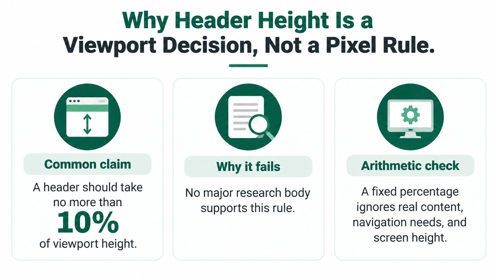
The claim that a header should occupy no more than 10% of viewport height sounds precise, but it isn't an established standard. JPKC's header sizing analysis notes that neither Nielsen Norman Group nor WCAG supports that universal maximum.
A percentage can describe a design. It can't decide whether that design works.
Consider the arithmetic documented in WPDean's above-the-fold explanation: on an 800-pixel usable viewport, a 120-pixel header occupies 15%, while a 160-pixel header occupies 20%. The trade-off isn't abstract. Increasing navigation height leaves less room for the product's category, differentiation, proof, and next step.
The distinction is easier to see as a decision model.
In its 2010 eye-tracking study at 1,024 × 768, Nielsen Norman Group found that participants spent 80.3% of viewing time above the fold. The later attention summary discussed by WPDean puts the above-the-fold share at approximately 57% in 2018, rather than treating scrolling as unusual behavior.
Buyers scroll, but that doesn't make the first screen expendable. It still needs to communicate enough relevance to justify further attention.
For a B2B SaaS homepage, this changes the design conversation:
These are messaging questions with layout consequences. Our landing page best practices apply the same principle: prioritize the information a buyer needs to decide whether to continue.
Calculate header share as rendered header height divided by usable viewport height. Then inspect what remains. A mathematically compact header can still sit above an oversized hero that communicates very little.
For teams implementing responsive interfaces, DOM Studio's guidance on accessible breakpoints for Vue interfaces is a useful companion when translating that hierarchy into breakpoint behavior.
Measure the share, then judge the message. Don't turn a diagnostic ratio into another rigid rule.
| Unit or rule | Scales with | Best use in a header | Main risk |
|---|---|---|---|
px | Fixed CSS pixels | Borders, hairlines, focus outlines | Doesn't follow root text-size preferences, though browser zoom still scales it |
rem | Root font size | Padding, logo height, font size | Larger text can require more room |
vh | Viewport height | Full-screen menu panels, with mobile caution | Browser controls complicate visible height |
vw | Viewport width | Fluid logo width inside clamp() | Unbounded sizing becomes too small or too large |
clamp() | Minimum, preferred, and maximum values | Horizontal padding and logo size | Poorly chosen bounds create cramped or excessive spacing |
min-height rather than height | A minimum with room for content | Header container | A rigid height can clip enlarged labels |
Put <meta name="viewport" content="width=device-width, initial-scale=1"> in the document head. Digital.gov's viewport guidance explains that this directs mobile browsers to use device width rather than a desktop-style virtual viewport that gets scaled down.
Without that setup, a header can appear to fit because the browser has made the entire interface smaller. That isn't responsive design. It's a misleading preview.
Use flexbox or grid to express the actual structure. Let the navigation region consume available space, keep the conversion action from shrinking into an unreadable button, and constrain the logo independently of its source file's canvas.
Use rem for dimensions that should respond to the root font size. That includes navigation typography, vertical padding, and often logo height. Don't override the root font size in a way that defeats the visitor's preferences.
Pixels remain appropriate for fine visual details. The important distinction is that browser zoom and text-size preferences aren't the same mechanism. Pixel-based layouts still zoom, but fixed dimensions don't automatically accommodate larger text.
For horizontal padding, use a bounded fluid rule such as clamp(1rem, 3vw, 2.5rem). Treat those values as an implementation example to tune against your navigation, not as another prescribed header size. The minimum protects narrow screens; the maximum stops wide screens from wasting navigation space.
min-height so enlarged labels aren't trapped inside a fixed box.dvh for expanded menus where supported.A declared CSS value isn't the final height. Fonts, padding, borders, and content all contribute to the rendered box.
As a practical test, compare computed header height at normal zoom and doubled zoom. Inspect the smallest supported width with enlarged text, and confirm that an intentional expanded navigation layout remains usable rather than clipped. A deliberate multi-row menu is acceptable; an accidentally wrapped closed desktop header isn't.
Also inspect horizontal overflow, focus outlines near container edges, and the moment a menu opens. A clean screenshot doesn't prove that the component behaves correctly.
Treat 900–1,100 pixels as a test hypothesis for your own header, not a published failure threshold. A navigation system that looks comfortable on a wide desktop may run out of room before the mobile menu takes over. That intermediate state is where a CTA wraps, a utility link disappears, or the logo gets squeezed to preserve an overgrown menu.
Compare the desktop and collapsed layouts before choosing where the transition belongs.
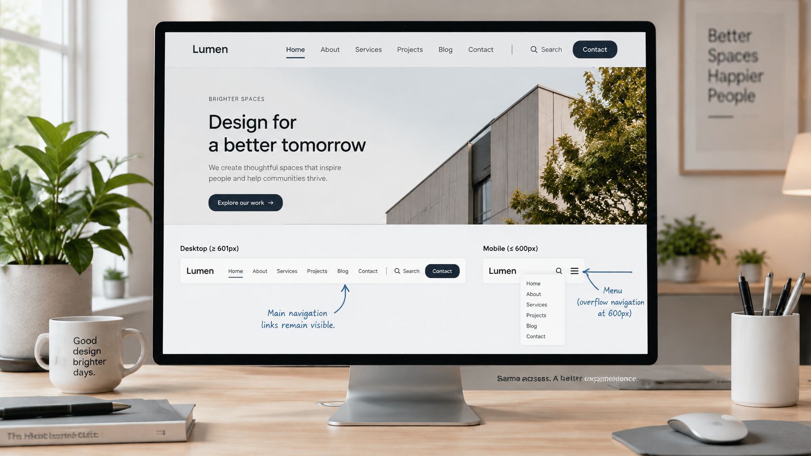
Microsoft's responsive-layout guidance recommends moving commands into an overflow control at 600 pixels or below. For a SaaS website, that's a useful reference point, not permission to leave an already crowded desktop menu intact until that width.
Reduce the viewport gradually with actual navigation labels, not placeholder text. Switch states before labels collide. Include the longest expected labels and localized versions where relevant.
Use a practical test matrix of 320, 375, 390, 768, and 1,024 pixels, plus a wide desktop view, and inspect portrait and wide-screen behavior. These are deliberately selected QA widths, not a claim that every buyer uses those dimensions.
Keep the primary conversion action visible in the collapsed header. A phone visitor shouldn't have to open navigation just to discover how to contact sales. For a product-led site, preserve the appropriate product entry point instead.
Collapsing navigation should reduce visual density, not remove access to the buying journey.
The W3C's accessible design guidance emphasizes accommodating different viewport sizes and adapting navigation presentation to available space. Use 200% zoom and a minimum 4.5:1 text-to-background contrast ratio as explicit QA checks for header text, alongside keyboard and touch testing.
Use the following responsive-navigation walkthrough as a visual companion, then validate your own implementation rather than copying its appearance.
Treat these checks as part of how you optimize user experience, not as post-launch cleanup. At the smallest supported width, the closed header must retain the logo, an obvious navigation control, and a primary action.
Shrinking the header isn't automatically an optimization. A tiny header that moves during loading, obscures navigation, or displaces the CTA can create more friction than a slightly taller stable design. Visual height and delivery cost are separate problems.
The 2025 Web Almanac performance chapter reports that 62% of mobile pages failed to define dimensions for at least one image. It also puts images at about 911 KB on the median mobile page and reports that 57% of Largest Contentful Paint images were delivered as JPEG. Those are page-level findings, not header-specific measurements, but they justify inspecting first-screen assets rather than assuming brand elements are negligible.
| Asset or finding | Target or figure | Basis |
|---|---|---|
| Header logo or UI shape | 2–20 KB, SVG preferred where appropriate | Practical optimization target |
| Largest above-the-fold image on mobile | 100–250 KB, avoid above 400 KB except for unusually complex imagery | Responsive sizing guidance |
| Median mobile page images | About 911 KB | 2025 Web Almanac finding |
| Mobile pages missing image dimensions | 62% | 2025 Web Almanac finding |
The asset targets come from PageVitals' image-compression guidance, which also notes that correctly sizing images can reduce file size by 50% or more compared with delivering oversized assets. Use these as investigation budgets, not reasons to damage an essential product visual through aggressive compression.
A logo without reserved dimensions can change the header geometry when it loads. An announcement graphic or delayed font can also move the content a buyer has started reading.
The Core Web Vitals image checklist recommends explicit image width and height attributes, or equivalent aspect-ratio reservation, so the browser can allocate space in advance. Responsive rendering doesn't remove that requirement.
Check the loaded state and the loading sequence. A final screenshot won't expose a CTA that moved while someone was about to select it.
Serve responsive image variants and prefer appropriate modern formats for raster imagery. Don't preload every header asset just because it appears near the top. Prioritize resources needed for the initial experience.
For a practical companion to this diagnosis, Silva Marketing explains how to reduce layout shifts on business websites. Use the guidance to inspect causes, not just chase a score.
Measure Largest Contentful Paint and Cumulative Layout Shift on throttled mobile before and after header changes. Keep a slightly taller implementation if it preserves readable navigation and stable geometry. Cutting padding while leaving oversized downloads and shifting elements untouched is cosmetic work.
Build the header after deciding what buyers need to understand and do. Starting with a template's default navigation encourages the team to preserve categories and buttons that don't match its buying motion.
This workflow keeps the commercial decision ahead of the component styling.
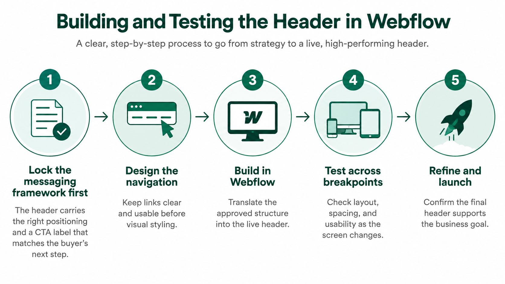
min-height in rem, explicit logo dimensions, and bounded horizontal padding so content preferences don't break a fixed box.Our Webflow website design process starts with a messaging framework, followed by a complete sitemap and template deployment. We build out every page, internal linking, SEO properties, copy, and layouts, provide visual guidance to the client's designer, and handle publishing, SEO, redirects, and forms.
For teams evaluating alternate page-production approaches, Landra's option to turn product URLs into landing pages is a relevant comparison. Whatever production method you choose, approve the message and navigation logic before accepting the generated or template-based layout.
The release decision belongs to the team responsible for buyer comprehension, not just the person who can make Webflow publish successfully.
Start with the buyer's first decision, not the designer's preferred dimensions. The first screen should explain why the product is relevant and offer a credible next step. Header sizing is one constraint on that outcome, not a substitute for it.
For a live site, schedule this audit within a week. For a rebuild, make it part of design acceptance rather than a task someone remembers before launch.
Use a structured website usability analysis to record failures and assign an owner. Save before-and-after captures so the team can distinguish an actual improvement from a preference expressed in a design review.
Don't tune pixels to rescue a hero that doesn't say what the company does.
A website project typically takes us about 3+ weeks from planning to go-live. That sequence begins with the messaging framework because the sitemap, navigation labels, and conversion path depend on it.
Treat the website framework, sitemap, page strategy, and copy as a connected, SEO-ready, conversion-focused foundation. A well-sized header helps buyers reach the right decision. It can't supply the positioning the team hasn't resolved.
Big Moves Marketing helps B2B SaaS teams connect positioning and messaging to a conversion-focused Webflow website, including the framework, sitemap, and copy across all pages. If your header competes with the product story or obscures the buyer's next step, visit Big Moves Marketing to discuss the messaging and website decisions that need fixing first.