%20png%20copy.avif)
Most B2B SaaS founders treat user experience as late-stage design polish. This is a fundamental—and incredibly expensive—mistake.
Good UX isn't about aesthetics. It's a core, non-negotiable part of your go-to-market engine. I’ve seen countless Series A to C companies learn this lesson the hard way, prioritizing feature velocity over fixing user friction. They operate under the broken assumption that a powerful product sells itself.
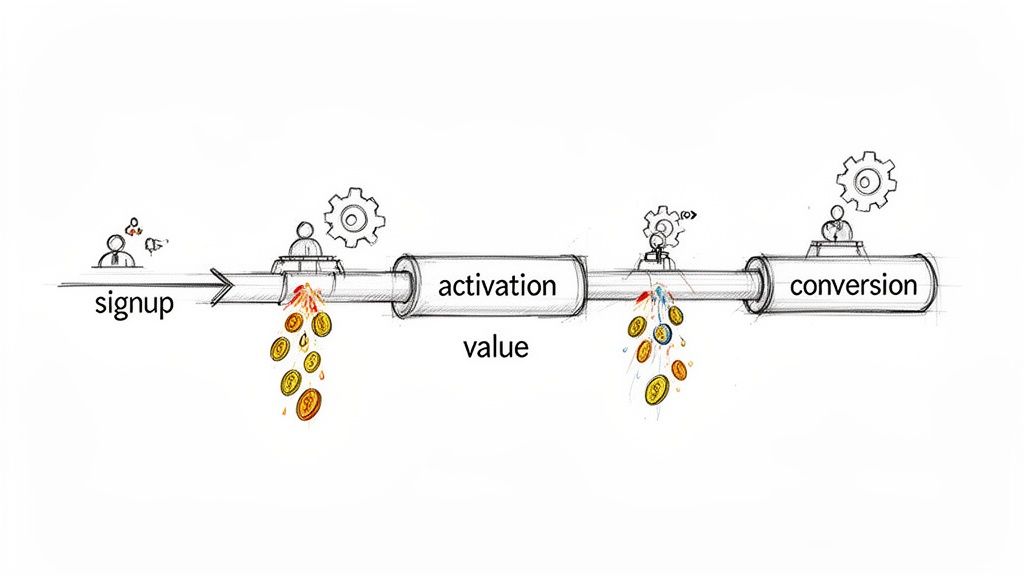
This thinking creates a leaky bucket. You pour capital into demand generation only to lose high-value prospects to a confusing onboarding flow, an unclear value proposition, or a clunky interface. Every point of friction is a direct tax on your growth.
Every point of friction in your user's journey is a tax on their attention and a leak in your revenue pipeline. Your GTM strategy is only as strong as the experience that delivers your product's value.
Your team's relentless focus on shipping more features is probably undermining your growth. Adding complexity to a product with existing friction doesn't increase its value; it buries it deeper. The correct move is to view every UX decision through a revenue lens.
This shift in perspective forces you to ask different questions:
In B2B SaaS, a superior user experience is a massive multiplier. The data is clear: every $1 invested in UX can yield up to $100 in return. That's a 9,900% ROI. Companies that lead with UX consistently outpace their competitors by turning intuitive design into a conversion mechanism.
Thinking of UX as a revenue function connects your product team’s work directly to C-suite priorities. A seamless onboarding flow isn't just "nice to have"; it's a critical lever in your B2B conversion rate optimization strategy.
When you successfully optimize user experience, you directly influence the SaaS metrics that matter.
For instance, we've seen teams double their trial activation rate simply by cutting the steps in their signup process in half. Another client slashed their customer support tickets by 30% by simplifying one core workflow, freeing up headcount for more strategic work.
These are not design wins. They are financial wins.
The work we do at Big Moves Marketing often starts here. Before advising on a new demand engine, we first audit the product experience to ensure it isn't actively working against growth. This mindset is the foundation for building a product that not only solves a problem but creates a competitive advantage that’s incredibly difficult for others to copy.
Before you touch a single line of code, you need a diagnosis based on the reality of how users actually behave inside your product—not on assumptions.
Most teams are sitting on mountains of data. The problem isn't a lack of data; it's a failure to connect it to a clear signal. This leads to a classic mistake: fixing the issue that generated the loudest complaint, not the one quietly bleeding the most revenue.
A proper diagnosis isn't about chasing UX "best practices." It's about finding your product's specific, money-losing moments of friction.
To get a complete picture, you must blend quantitative evidence with qualitative context. Relying on just one gives you a skewed view of what’s really happening.
Start with your product analytics to find the “what”: significant drop-offs in your critical user flows. Don't just glance at high-level dashboards. Map the exact sequences that precede churn, like the path from trial start to a key feature activation, and pinpoint where users vanish.
Next, uncover the “why” with session recordings. Filter for sessions from users who failed to complete onboarding or who churned after their first login. Watch what they do. Where do they hesitate? What do they click on right before giving up? You'll often see the exact moment of frustration that no analytics dashboard can show.
Finally, go find the “who” by talking to people who left. Set up quick, 15-minute exit interviews with recently churned trial users. Ask one simple question: “When you signed up, what did you expect our product to do for you, and what actually happened?” Their answer almost always pinpoints the disconnect between your marketing promise and your product's reality.
The failure point for most teams is not connecting these data sources. They look at analytics in one meeting and review customer feedback in another. You must bring them together to see the real patterns.
For a systematic view of this process, you can find more detail in our guide to building a B2B customer journey map.
To systematically identify and prioritize these friction points, use a framework to organize your findings. This structure translates raw data into actionable insights, ensuring you focus on what impacts revenue.
| Data Source | What to Look For | Key Metric to Track | Common SaaS Pitfall |
|---|---|---|---|
| Product Analytics | Significant drop-offs in activation, onboarding, or core feature flows. High feature non-adoption rates. | Funnel conversion rate, Time-to-value, Feature adoption % | Ignoring a 20% drop-off in a multi-step flow because the overall conversion "looks okay." |
| Session Recordings | "Rage clicks," confused mouse movements, rapid switching between help docs and the app, abandoning forms. | Session duration for failed tasks, rage click count, goal completion rate | Watching sessions from successful users instead of focusing on those who failed and churned. |
| Churn/Exit Surveys | Recurring themes in "why are you leaving?" open-text fields, especially mentions of "too complex" or "missing feature X." | Churn rate by reason code, Mention frequency of specific friction points | Only reading the multiple-choice answers and ignoring the rich context in the "other" field. |
| Support Tickets | High volume of tickets for a specific feature, recurring "how do I...?" questions for a workflow that should be intuitive. | Ticket volume by feature/topic, First contact resolution rate | Dismissing recurring "how-to" questions as user error instead of a clear signal of poor UX. |
| Customer Interviews | Mismatch between the user's "job to be done" and what the product enables. Emotional language (frustration, confusion). | Qualitative sentiment score, Frequency of specific pain point mentions | Asking leading questions like "Did you find feature X helpful?" instead of "Walk me through how you tried to solve Y." |
By populating this framework, you're not just collecting complaints. You're building an evidence-backed case for where to focus your team's development resources.
Once you've identified the patterns, create a "Friction Log." This isn't another backlog for feature requests. It's a living document that forces you to prioritize fixes based on their direct financial impact.
Don't chase every user complaint. Focus your engineering firepower on the friction points that have a direct, measurable impact on trial conversions, activation rates, and customer retention. The goal is to optimize for revenue, not to appease every user.
For every friction point, your log should document three things:
This process changes the conversation from "some users are complaining about this button" to "this workflow is costing us an estimated $20k in ARR each month."
The problem is now framed in terms the entire leadership team understands and finds impossible to ignore. This log becomes your roadmap to optimize user experience where it counts: the bottom line.
The first five minutes a new user spends in your product determine whether you’ve earned a champion or just another churn statistic. Most B2B onboarding flows are catastrophically wrong. They're either glorified product tours that pointlessly click through features or aggressive interrogations that demand too much commitment upfront.
This isn't about hand-holding. It's about engineering an immediate proof of concept. Your one job is to get that user to their "Aha!" moment—the instant they feel your product's core value—with the absolute minimum of friction.
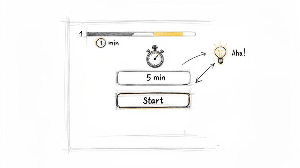
The single biggest mistake in B2B onboarding is assuming your user has the time or patience to learn your product. They don't. They signed up with a problem, convinced you might have the solution. Your onboarding must prove them right, immediately.
Most startups get this backward. They dump new users into an empty dashboard and present them with a long checklist of "setup tasks." This asks for work before delivering a single drop of value, and it almost always backfires.
Your user isn't there to "set up" your software. They are there to get a job done. The fastest way to optimize user experience is to help them complete one meaningful action that delivers a tangible micro-win.
The best onboarding flows are built around a single, critical first action. Forget the grand tour of every feature. Pinpoint the one thing a user can do in under two minutes that showcases your product's power, and then guide them relentlessly toward that outcome.
Getting this right means being ruthless about removing friction. Every field in your signup form, every optional setting, every introductory pop-up is a potential exit point.
A famous e-commerce company saw this firsthand. They changed a single button on their checkout page from 'Register' to 'Continue,' letting users buy without creating an account first. The result? A 45% jump in completed purchases, adding $300 million to their annual revenue. I've seen it happen repeatedly: for one of our AI tool clients, we stripped out one unnecessary step in the signup flow and watched conversion leap from 12% to 28%. These small UX changes have a massive impact, as detailed in various UX statistics and case studies.
Here's how to apply this thinking:
This is a fundamental shift from feature-led to value-led onboarding. By focusing on a single, successful first run, you earn the user's trust. Only then have you earned the right to introduce more complex features. For a deeper dive into structuring these initial interactions, check out our guide on customer onboarding best practices.
A great onboarding experience isn't about teaching someone how to use your product. It’s about making them feel smart and powerful for having chosen it.
Your engineers’ time is the most expensive resource you have.
Throwing unvalidated “UX improvements” at them is a direct path to burning capital and demoralizing your product team. I see this constantly in growth-stage companies: the leadership team assumes a good idea automatically translates to a good user experience.
That assumption is almost always wrong. Leaders fall in love with a solution, jam it into the development sprint, and only discover weeks later—after burning thousands in engineering hours—that it didn’t move the needle on activation or retention. The cycle repeats, and the friction that is actually killing your growth remains untouched.
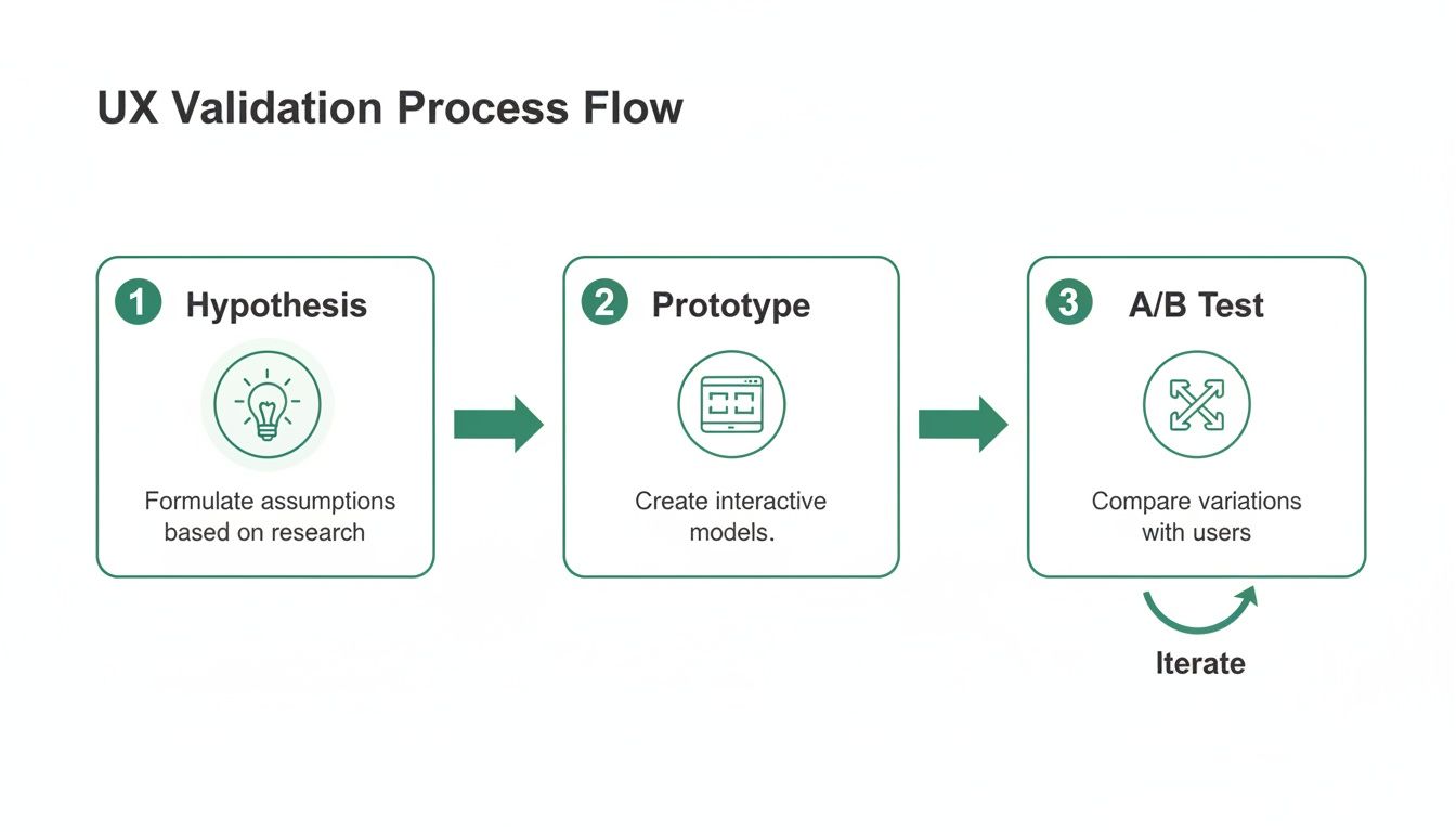
You must break this cycle. The key is to separate the idea from the implementation. A disciplined, lean validation process de-risks major product changes and ensures every development sprint is a high-leverage investment, not a gamble.
Here’s the first principle of validation: measure what users do, not what they say.
When you ask a prospect for their opinion on a new design, they almost always try to be helpful. Their feedback is theoretical and often misleading.
Behavior, on the other hand, is truth. An effective validation process engineers situations where you can observe a user's unfiltered actions. Does their cursor hesitate? Do they click the wrong element first? Do they abandon the task? This is the data that matters.
To validate UX improvements efficiently, you must test your ideas without heavy engineering investment. A great starting point is learning about prototyping an app and building a No-Code MVP to get fast, actionable feedback.
Before a single line of code is written, your hypothesis must survive contact with reality. The goal isn’t absolute certainty. It's to gather enough evidence to make a confident, data-informed decision.
This requires a pragmatic approach that combines several methods:
Interactive Prototypes: Use tools like Figma or Maze to build clickable, high-fidelity prototypes of the new workflow. Don't just show static screens. Create an interactive flow that mimics the real experience. Then, put it in front of actual prospects—not your internal team—and give them a specific task to complete. Watch them silently. You'll learn more in 15 minutes of observation than from a hundred internal meetings.
Targeted A/B Tests: For critical flows like onboarding, small changes can have a massive impact. Running A/B tests is essential, but only if done correctly. The test must have a clear hypothesis tied to a business metric (e.g., "Changing the button copy from 'Sign Up' to 'Start My Free Trial' will increase click-through by 10%"). Ensure you have enough traffic for statistical significance, or your results will be meaningless noise.
"Five-Second" Tests: Present a user with a new interface design for just five seconds. Then, hide it and ask: What was the main purpose of that page? What was the most prominent element? This test is incredibly effective for assessing clarity and whether your core message lands instantly.
Stop treating your engineering team like a feature factory. Every proposed UX change is a hypothesis, and it must earn its way into the sprint through rigorous, low-cost validation. Your job as a leader is to protect your most valuable resource from working on unproven ideas.
This disciplined process of validation moves your team from a culture of opinions to a culture of evidence. You can learn more about how to get this direct feedback by exploring our guide on how to conduct user research.
It builds a crucial muscle for the entire organization, ensuring that when you finally commit engineering cycles, it’s to build a proven winner.
You’ve just shipped a UX improvement. Your product team celebrates the win—maybe you slashed onboarding steps or saw a bump in your activation rate.
And then… nothing. The win stays trapped inside a Slack channel.
This is a massive, unforced error. Every piece of friction you remove from your product isn't just an internal victory; it's a powerful weapon for your go-to-market teams. A UX win that isn't broadcast to the market is a wasted opportunity.
Too many B2B teams treat product development and GTM as separate universes. The product team polishes the user experience while the sales team runs their standard playbook. This is a failure of strategic alignment.
That 40% increase in trial activation isn't just a number for your analytics dashboard. It's a tool your sales team can use to dismantle competitor claims about their "easy" setup. It's the proof marketing needs to build a campaign that actually stands out.
Smart GTM motions are a direct reflection of product strength. Here’s how to systematically turn internal wins into assets that drive customer acquisition.
Founders must also remember that their personal brand is a critical GTM asset. How you position yourself and your company's value on professional networks can be as important as your marketing campaigns. Reviewing effective LinkedIn Profile Examples to optimize your presence can provide a solid blueprint.
This entire process starts with validating that your UX improvements actually work before you ship them. You need to build a simple, repeatable validation engine.
Following this flow ensures that by the time you invest engineering resources, you already have evidence of the improvement's value. This makes it infinitely easier to craft a compelling GTM narrative.
The most powerful sales and marketing assets are backed by hard numbers. When you ship an improvement, you must quantify its impact on user behavior and then translate that into tangible business value for your prospects. This table shows exactly how to convert your product wins into GTM assets.
| UX Improvement | Key Result | Sales Asset | Marketing Asset |
|---|---|---|---|
| Redesigned onboarding flow | Onboarding time cut from 45 mins to 8 mins | Slide in pitch deck: "Time-to-Value in Under 10 Minutes" | Ad campaign targeting competitor pain points: "Tired of complex setups? Get started in minutes." |
| Streamlined core workflow | 3 fewer clicks to complete a key task | Competitive battlecard: "Our workflow is 40% faster" | Case study highlighting a customer who saved 5 hours/week |
| Improved microcopy | 25% reduction in support tickets for a specific feature | Sales script for objection handling on ease of use | Blog post: "How We Made [Feature] More Intuitive" |
| Faster page load speed | 50% improvement in platform performance | ROI calculator showing time saved from improved efficiency | Landing page headline: "The Fastest [Category] Platform on the Market" |
Connecting these dots is what separates teams that build good products from teams that build category-defining businesses. A great user experience isn't a "soft" benefit; it's a collection of hard metrics.
When you tell a prospect, "Our onboarding is 75% faster than the industry average," you're not selling design. You're selling speed, efficiency, and a faster return on their investment.
I saw this play out perfectly with a Series B fintech company. Their trial conversion rate had stalled. The product was powerful, but the initial setup was a nightmare, requiring users to connect multiple accounts and verify data over a day or two.
After diagnosing the friction, their product team re-engineered the flow to focus on a single, quick win. The results were dramatic:
These numbers didn't stay on an internal dashboard. They became the bedrock of their entire Q3 sales and marketing push. The sales deck was rebuilt around the "15-minute promise." Ad copy hammered home the ease of use. The outcome was their best quarter for new bookings, ever—driven by a product truth they successfully weaponized for the market.
As a founder, you own the user experience. You cannot delegate this, especially in the early days. Every decision you make—or defer—about how users interact with your product directly shapes your revenue trajectory.
Over the years, I've had the same critical conversations with dozens of B2B SaaS founders. Here’s the straight talk I give them.
This is the wrong question. It frames UX as a budget item to be squeezed into a spreadsheet. The real "investment" isn't a dollar amount; it's embedding UX thinking into your product development rhythm from day one.
Forget a "UX budget." Instead, dedicate a percentage of your existing team's time—say, 20% of your product and engineering capacity—to finding and crushing user friction. The investment is in your process, not new headcount. I’ve seen a single engineer spend one sprint fixing a broken onboarding step and deliver a higher ROI than a full-time designer hired too early to polish icons.
Start by measuring the revenue you're already losing at key drop-off points. That number isn't a "UX expense" you're considering. It's the cost of doing nothing.
You don't compete by matching their bloated feature list or massive design team. You win by out-focusing them.
Large, incumbent companies are almost always shackled by legacy tech, internal politics, and a one-size-fits-none product. Their size is your biggest opportunity. Your agility is your weapon.
As a smaller team, you can zero in on the single most painful, underserved problem for a specific user. Your job is to solve that one problem with an exceptionally intuitive workflow. Don’t play feature whack-a-mole. Find the core workflow that delivers immediate value and make it flawless.
A clean, fast, purpose-built solution that solves a high-value problem will win against a clunky, bloated enterprise tool every time. Focus is your only strategy.
You hire a dedicated UX designer the moment the cost of your engineers and product managers making uninformed design decisions becomes greater than the designer’s salary. That is the tipping point.
Early on, before product-market fit, the founder or a product lead is the user experience owner. Your entire focus should be on validating that the core workflow delivers on its promise. Nothing else matters.
The need for a dedicated UX role emerges as you scale, usually post-PMF. This is when you have multiple product teams working in parallel or you’re expanding into new use cases. At that stage, a dedicated UX leader is essential to maintain a coherent user journey and enforce a high, user-centric standard across the company.
Hiring a designer too early means paying for expertise you haven't earned the right to use. Hiring too late means you'll be buried under a mountain of "UX debt"—confusing flows and inconsistent UIs. The timing is everything. For a deeper dive into this and similar strategic questions, you can explore our complete collection of B2B Marketing FAQs.
These aren't design questions. They are fundamental go-to-market strategy questions. How you answer them will define your company's growth ceiling.
At Big Moves Marketing, we help B2B SaaS founders build the clarity and strategic alignment needed to turn a strong product into a market-leading business. If you're ready to move from guessing to knowing, let's talk. Visit us at https://www.bigmoves.marketing.
Explore Big Moves Marketing services and resources:
June 26, 2026


%20-%20white.svg)