%20png%20copy.avif)
The three highest-impact SaaS landing page examples to study right now: Stripe (enterprise/demo), Miro (self-serve signup), and Dropbox Sign (alternative/competitor capture). Each one earns conversions through a different mechanism, and each one is worth dissecting before you write a single word of copy.
| Example | Primary Goal | Design Pattern | Key Conversion Tactic |
|---|---|---|---|
| Stripe | Demo / enterprise | Screenshot-led hero | Outcome headline + layered case evidence |
| Miro | Self-serve signup | Single-column hero | Free tier CTA + product visual above fold |
| Dropbox Sign | Alternative capture | Feature comparison | Direct competitor framing + transparent pricing |
Three things to steal right now:
The highest-impact change on any SaaS landing page is replacing a feature-led headline with an outcome-first statement that names the audience and a specific result.
| Point | Details |
|---|---|
| Outcome-first headline | Name your ICP and a specific result; this single change consistently lifts demo and signup rates. |
| Real product screenshot in hero | Replace illustrations with actual UI screenshots to remove the “what does this look like?” objection above the fold. |
| Layered proof stack | Use logo band, quantified testimonial, and one case stat in sequence — each layer adds a different type of credibility. |
| Match page type to goal | Self-serve, demo, alternative, and feature pages each need a different structure, CTA, and primary KPI. |
| Bigmoves website service | Bigmoves builds Webflow-based SaaS sites with positioning, conversion architecture, and go-to-market messaging built in from the start. |
The 5-Second Verdict is the right frame here. A visitor who can’t state your product’s value in five seconds will leave. Most SaaS pages fail this test because they lead with features, not outcomes.
The non-negotiables, ranked by conversion impact:
Pro Tip: The most overlooked element is the subheadline. Most teams write a second feature statement. Write a one-line objection handler instead — “No credit card required. Cancel anytime.” That single line removes friction at the exact moment a visitor is deciding whether to click.
Pick the wrong page type and your traffic converts at half the rate it should. The structure, offer, and primary metric all shift depending on what you’re asking the visitor to do.
| Page Type | When to Use | Primary KPI | Hero Pattern |
|---|---|---|---|
| Self-serve signup | PLG, low-ACV, high-volume traffic | Signup rate | Product screenshot |
| Demo / enterprise | High-ACV, complex sale | Demo booked | Outcome headline + form |
| Pricing / alternative | Comparison-stage buyers | Plan selection | Comparison table |
| Feature-focused | Paid or SEO campaign traffic | Click-to-trial | Single feature screenshot |
| Campaign-specific | Events, content, webinars | Form completion | Asset preview |
On hybrid pages: split by ICP when your traffic mixes startup and enterprise buyers. A startup founder and an enterprise VP of Engineering need different proof, different CTAs, and different risk-removal language. One page trying to serve both usually serves neither well.
These best SaaS landing pages are organized by campaign goal. Each entry includes what to copy and why it works.
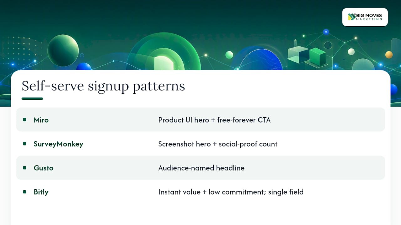
## 1. Miro Goal: Freemium signup. Pattern: Single-column hero. Tactic: Free-forever CTA with product visual. Miro leads with a canvas screenshot and a “Sign up free” CTA before any feature list. The page answers “what is it?” visually before asking for anything. Copy this: put your product UI in the hero, not a stock photo of happy people.
## 2. SurveyMonkey Goal: Free trial. Pattern: Screenshot-led hero. Tactic: Social proof count + single CTA. SurveyMonkey shows a live survey template in the hero, then immediately stacks a user count as proof. The combination of “here’s what it looks like” and “millions already use it” handles two objections in one scroll. Copy this: pair your hero screenshot with a proof number in the same viewport.
## 3. Gusto Goal: Signup / demo. Pattern: Single-column, clean layout. Tactic: Audience-named headline. Gusto’s headline names the audience directly (“For small businesses”). That specificity signals to the right buyer that this product was built for them, and it signals to the wrong buyer to self-select out. Both outcomes help conversion. Copy this: put your ICP in the headline.
## 4. Bitly Goal: Free account creation. Pattern: Minimal hero, single field. Tactic: Instant value + low commitment. Bitly lets you shorten a link before you create an account. The product delivers value before asking for anything. This is the strongest possible free-trial mechanic: show the result first, then ask for the signup. Copy this: if your product can demo itself in one action, make that action the CTA.
## 5. Stripe Goal: Enterprise contact / demo. Pattern: Screenshot-led hero with layered case evidence. Tactic: Outcome headline + named customer revenue examples. Stripe’s homepage leads with “Financial infrastructure to grow your revenue” — a direct outcome statement, not a feature list. Below the fold, it stacks named customer logos, then specific revenue examples. The proof escalates in specificity as you scroll. Copy this: start with the outcome, then prove it with increasingly specific evidence.
## 6. Microsoft Teams Goal: Demo / enterprise trial. Pattern: Video hero. Tactic: Use-case segmentation + enterprise proof. Teams segments its page by role (IT admin, end user, business owner) early in the scroll. Each segment gets its own proof point. This reduces the cognitive load for any single visitor. Copy this: if your product serves multiple roles, give each role its own proof block rather than one generic testimonial.
## 7. Xero Goal: Free trial / demo. Pattern: Screenshot-led hero. Tactic: Outcome headline + accountant partnership proof. Xero leads with a financial outcome (“Run your business better”) and immediately backs it with a partner network as proof. The accountant angle is smart: it signals third-party validation from a trusted professional category. Copy this: if your product has a professional partner ecosystem, make it visible above the fold.
## 8. Dropbox Sign Goal: Competitive displacement. Pattern: Feature comparison table. Tactic: Direct alternative framing + transparent pricing. Dropbox Sign runs dedicated alternative pages that name the competitor, list a side-by-side feature comparison, and end with a clear pricing CTA. This captures high-intent, comparison-stage traffic. Copy this: build a dedicated “/vs-[competitor]” page for your top two or three alternatives.
## 9. Shopify Goal: Free trial. Pattern: Minimal hero, single CTA. Tactic: Low-friction entry + social proof at scale. Shopify’s trial page strips everything out except a headline, a one-line subhead, an email field, and a “Start free trial” button. No nav, no footer links, no distractions. The page trusts the brand to carry the conversion. Copy this: remove navigation from high-intent campaign landing pages.
## 10. Kajabi Goal: Feature-led signup. Pattern: Screenshot-led, single feature focus. Tactic: Outcome headline + creator proof. Kajabi’s feature pages lead with a specific creator outcome (“Turn your knowledge into income”) and show the exact product screen the visitor will use. Each feature page is essentially a mini landing page. Copy this: build separate feature pages for your top three use cases rather than cramming everything onto one page.
## 11. Jasper Goal: Free trial / content-led signup. Pattern: Interactive demo widget. Tactic: Try-before-you-buy in the hero. Jasper embeds a live writing demo directly in the hero. Visitors generate a sample output before signing up. This is the interactive demo pattern at its best: the product sells itself. Copy this: if your product produces visible output quickly, embed a lightweight demo widget in the hero section.
The Webflow gallery and Design Key’s pattern teardowns are the two best references for studying these patterns in detail across dozens more examples.
| Example | Best For | Primary Goal | Key Conversion Tactic | Design Pattern | Target Audience |
|---|---|---|---|---|---|
| Miro | PLG / freemium | Signup | Free-forever CTA | Single-column hero | Startup / SMB |
| SurveyMonkey | Self-serve | Free trial | Proof count + screenshot | Screenshot-led | SMB |
| Gusto | SMB payroll | Signup / demo | Audience-named headline | Single-column | SMB |
| Bitly | PLG / freemium | Account creation | Instant value demo | Minimal, single field | SMB / startup |
| Stripe | Enterprise | Demo / contact | Outcome headline + case evidence | Screenshot-led | Enterprise |
| Microsoft Teams | Enterprise | Demo / trial | Role segmentation | Video hero | Enterprise |
| Xero | SMB finance | Trial / demo | Partner proof | Screenshot-led | SMB |
| Dropbox Sign | Alternative capture | Competitive switch | Comparison table | Feature comparison | SMB / enterprise |
| Shopify | E-commerce | Free trial | Distraction-free page | Minimal hero | SMB / startup |
| Kajabi | Creator tools | Feature signup | Creator outcome headline | Screenshot-led | SMB / creator |
| Jasper | AI content | Free trial | Interactive demo widget | Demo-in-hero | SMB / startup |
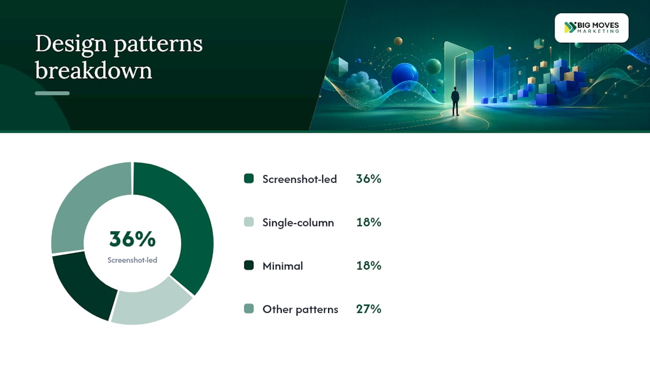
Good analytics for content and landing pages start with three primary KPIs: conversion rate by funnel step, lead quality (SQL rate), and cost per acquisition.
A/B testing checklist:
Tools: Google Analytics 4 for funnel tracking, Hotjar or Microsoft Clarity for heatmaps and session replay, and VWO or Google Optimize for lightweight A/B experiments. For strong CTAs specifically, test button copy variants in week one before touching layout.
One-week test sprint:
Outcome-first headline formula:
[Audience] + [specific result] + [time or metric]
Subheadline scaffolding:
[How you deliver the result] + [one-line objection handler]
Example: “One connected workspace for briefs, assets, and approvals. No credit card required.”
Short social-proof line:
"[Company name] helped [customer type] [specific result] in [time frame]."
CTA variants by intent:
| Before | After | Why it works |
|---|---|---|
| “Get started” | “Start free — no credit card” | Removes the friction of “what does ‘get started’ cost me?” |
| “Learn more” | “See how [Company] cut costs 30%” | Replaces a vague prompt with a specific proof hook |
| “Powerful analytics for teams” | “Your team sees every deal risk before it stalls” | Shifts from feature to outcome, names the reader |
Google’s research and industry benchmarks consistently show that slower pages convert at lower rates. A SaaS landing page that takes 5 seconds to load on mobile loses a significant share of visitors before they ever see the headline.
Target a Largest Contentful Paint (LCP) under 2.5 seconds. That means:
The hero image is the most common culprit. A full-width product screenshot at original resolution can weigh 2–4 MB. Compressed to WebP at the right dimensions, it drops to under 200 KB. That single change often cuts LCP by a full second.
The best SaaS homepage designs use layout to control attention, not just aesthetics. Visual hierarchy is a conversion tool.
The F-pattern and Z-pattern: Visitors scan in predictable patterns. Place your headline, product visual, and CTA along the natural scan path. On a single-column hero, that means headline top-left, screenshot center, CTA below the screenshot.
Proof stacking order matters. Design Key’s teardowns show the most effective sequence: logo band (recognition) → quantified testimonial (credibility) → case study stat (specificity). Each layer adds a different type of trust.
White space is not wasted space. Dense pages signal complexity. SaaS buyers, especially enterprise ones, read density as “this product is hard to use.” Generous padding around your headline and CTA signals confidence.
Interactive demos change the layout equation. When you embed a live demo widget in the hero, the screenshot becomes secondary. Jasper and Bitly both use this pattern. The interaction itself becomes the proof. If your product produces visible output in under 30 seconds, this layout earns its build cost.
Pricing layout: List tiers with audience labels (“For startups,” “For growing teams,” “For enterprise”), not just feature counts. High-performing SaaS pricing pages use ICP labels to help buyers self-select, which reduces support volume and improves plan-fit.
Most teams spend their sprint on design. The highest-ROI changes at Bigmoves are almost always copy changes, not design changes.
The single intervention that moves the needle most consistently: replacing a feature-led headline with an outcome-first headline that names the audience. It takes 20 minutes to write and test. It regularly produces double-digit conversion lifts. No redesign required.
A concrete example: a B2B SaaS client running paid traffic to a page headlined “AI-powered project management” switched to “Engineering teams ship on time, every sprint.” The same hero image, same CTA, the same page structure. The demo-booked rate improved meaningfully within two weeks of the test going live.
The tactical warning: don’t test headline and layout simultaneously. Teams do this because they want faster results, but it makes the data unreadable. You won’t know which change drove the lift, so you can’t replicate it on the next page. Run copy tests first, always. Then test layout once you have a winning message.
One more thing worth saying plainly: most SaaS pages have too many CTAs, not too few. Every additional CTA above the fold reduces the conversion rate on the primary one. Pick one action per page section. Let the page breathe.
If your team has the examples and the checklist but needs someone to build and position the page correctly, that’s exactly what Bigmoves does.
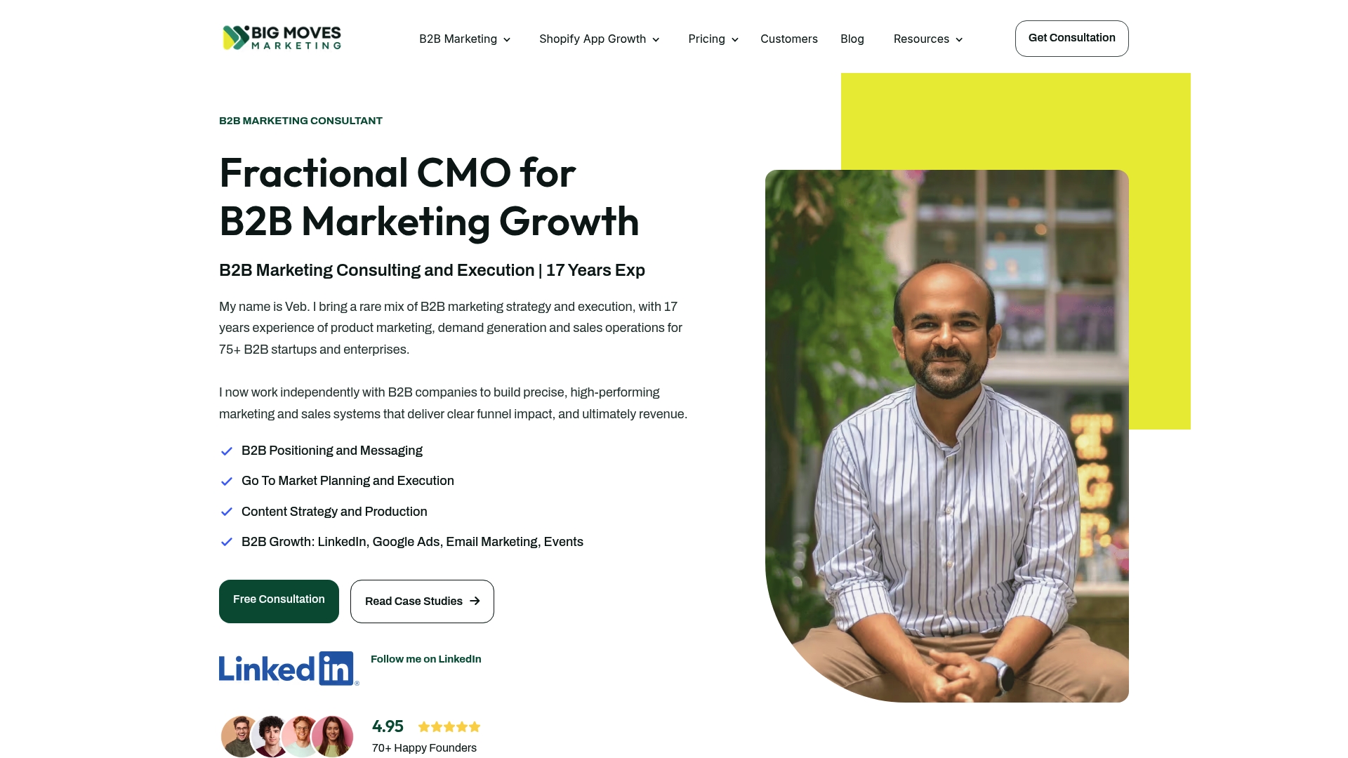
The Launch Your B2B SaaS Website for Go-To-Market service covers three things most agencies skip: positioning and messaging development before a single page is designed, conversion architecture built into the Webflow template from the start, and a deployed site ready for paid and organic traffic. No six-month retainer. No generic template with your logo swapped in.
Veb and the Bigmoves team have worked with over 75 B2B SaaS companies. The output is a site that passes the 5-Second Verdict test and gives your sales team something they can actually send to prospects. Book a call to see if it’s the right fit.
These galleries and teardowns are the best places to browse more SaaS landing page inspiration:
When saving examples for a brief, capture a screenshot and write one sentence: what is the conversion tactic and why does it work? That habit turns a gallery into a usable swipe file.
An outcome-first headline that names the audience, a real product screenshot above the fold, and a single clear CTA. Layered social proof (logos, testimonial, case stat) handles the credibility gap for new visitors.
One primary CTA above the fold. A secondary CTA (demo vs. trial) can appear after the first proof block. More than two CTAs in the hero consistently reduces conversion on the primary action.
It’s a clarity test: a visitor should be able to state your product’s value in five seconds or less. Sextant Labs scored 50 B2B SaaS homepages on this dimension and found most pages score “okay but forgettable” because they lead with features instead of outcomes.
Stripe, Microsoft Teams, and Xero are the strongest B2B landing page examples for enterprise audiences. Each uses outcome-focused headlines, role-specific proof, and a clear demo or contact CTA rather than a self-serve signup.
Bigmoves builds Webflow-based SaaS websites with positioning, conversion architecture, and go-to-market messaging developed before design begins. The website service is built for B2B SaaS teams that need a site ready for paid and organic traffic from launch.
%20-%20white.svg)