%20png%20copy.avif)
Pretty screenshots do not build pipeline. Most B2B teams collect attractive references, then skip the only part that matters, the decision behind the design. That's backwards. B2B website design inspiration should be treated as a research system, not a mood board. Before anyone copies a layout, the team needs to know the audience assumption, the message hierarchy, the page's job, the conversion path, the technical constraints, and the proof pattern the page has to support. That matters even more in SaaS, where the website often has to carry early discovery, vendor screening, and trust-building before sales gets involved, just as the research stage and vendor evaluation stage happen heavily online in B2B buying (B2B marketing statistics 2026). If you want a visual reference and a sharp contrast to weak ad thinking, you can also review B2B ad examples. Here are seven sources worth using, judged by the strategic decisions they help you make.
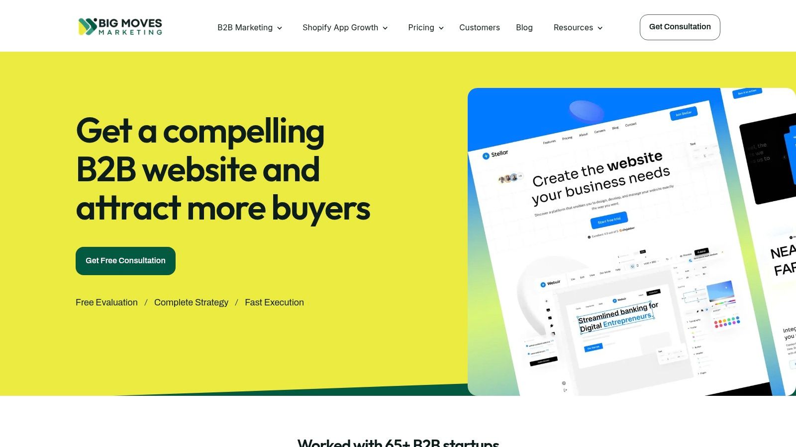
Big Moves Marketing's website service is the only source on this list that starts with the outcome, not the aesthetic. It is built for founders and revenue leaders who need a conversion-ready B2B website that links messaging, SEO, and buyer journeys to pipeline, not just a prettier homepage. The website service page makes the point clearly, and the right internal question is whether your current site can do the same.
The value here is strategic ownership. A fractional CMO-led approach matters because many B2B sites fail for a simple reason, nobody is deciding what the site is supposed to persuade, prove, and move forward. Big Moves Marketing's approach ties together audience research, sitemap and information architecture, conversion-focused page frameworks and copy, on-page SEO, and analytics tracking. That combination is what you want when the website has to support ads, content, email, and events instead of sitting apart from them.
Practical rule: if the site can't explain the product in a way sales would actually use, it's not a website problem, it's a positioning problem.
The trade-off is straightforward. This is a Webflow-first service, so it fits teams that want speed, clarity, and a controlled build process. It is not the right choice for teams that need heavy custom back-end engineering or complex platform integrations. For most B2B SaaS teams in pre-PMF through growth stage, that limitation is a feature, not a flaw.
This source improves decisions about structure, proof, and launch readiness. It is especially useful when your team is debating whether to rebuild around the buyer journey or keep polishing isolated pages. The right move is to use this kind of source to define what the website must accomplish, then treat visual inspiration as a lower-order input. If you're comparing agencies or operators, start with this guide to choosing a B2B web design agency so you don't confuse execution capacity with strategic fit.
Big Moves Marketing is strongest when you need an independent operator who can think and build at the same time. That's the core advantage. Many teams don't need more options. They need a sharper decision.
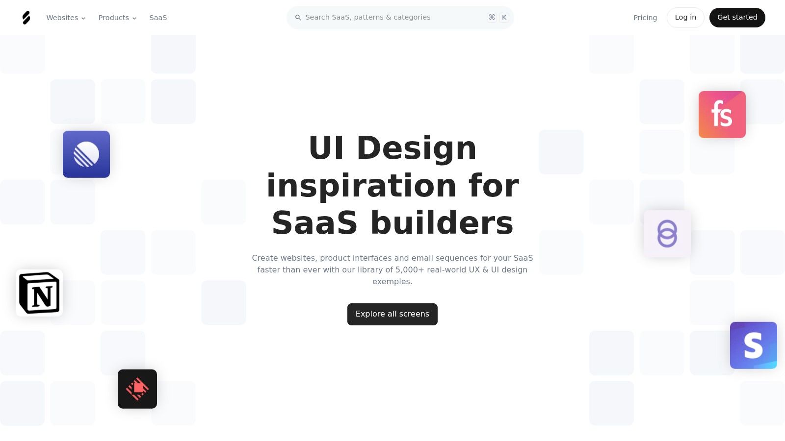
SaaSFrame is the better starting point if you need to decide how a SaaS site should handle Pricing, Features, Security, and product flow. Its taxonomy is built for SaaS, so you can judge which page elements answer which buying objections instead of browsing generic screenshots.
Use SaaSFrame to compare responsive variants, inspect mobile views, and pull downloadable Figma files for specific pages. That helps designers and Webflow builders turn research into a buildable structure. If your team is refining a pricing page or rebuilding an enterprise story, this source shows the page logic before anyone starts polishing visuals.
The paid tier is where the library becomes useful in practice. Free access lets you sample the value, but search, filters, flows, mobile views, and Figma access sit behind Pro. That trade-off makes sense if you want a working research tool, not casual browsing.
Use this source when the question is “what belongs on the page?” not “what should it look like?”
That distinction matters because SaaS teams often spend time debating hero treatments while the actual problem is missing proof, weak hierarchy, or a pricing page that does not match purchase intent. SaaSFrame keeps the focus on structure around the objection. For teams implementing those patterns in Webflow, the Webflow website design guide is the right companion because it turns inspiration into a buildable system.
It also helps keep marketing pages aligned with in-product UX. That matters for B2B SaaS teams where the buyer journey includes onboarding, security review, or product-led conversion paths. For broader context on go-to-market trends, see this overview of SaaS marketing for 2026. SaaSFrame gives you the structure. Your team still has to make it commercial.
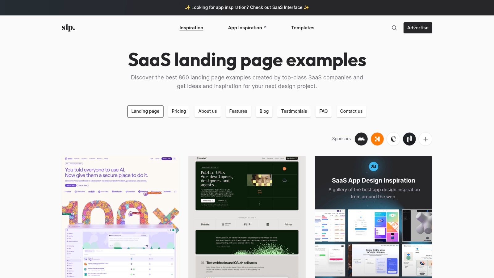
SaaS Landing Page is useful when you need fast access to real SaaS examples by page type. It is a long-running gallery, and the value is straightforward. You can move from research to page structure without wasting time on broad design noise.
Its strength is curation around marketing pages and interior sections, including Pricing, FAQ, About, Testimonials, and other common SaaS blocks. That makes it useful for founders and revenue leaders who want to compare how different companies frame the same section, not just how polished it looks. You can also spot stacks and frameworks in use, which helps when you need to judge whether a pattern fits Webflow, Framer, React, or another build approach.
The trade-off is obvious. This is mainly a screenshot-and-link library, so it will not give you deep UX flow analysis. It is a structure and messaging tool, not a product journey tool. Use it for what it is. Do not confuse a screenshot archive with strategic research.
For B2B SaaS teams, the strongest use is section-level benchmarking. You can study how competitors present pricing, proof, testimonials, and FAQ blocks, then decide what your site should say first and what it should hold back. That is especially useful when you are tightening a homepage or sharpening a landing page after a positioning change.
The right question is not “Which site looks best?” It is “Which page structure reduces friction for my specific buyer?”
If the goal is faster testing, pair it with 10 B2B conversion optimization tips. That keeps the team focused on changes you can ship and measure instead of taste-based debate. Sponsored placements can still bias what you see, so treat it as a starting point, not a final verdict. For B2B teams that need quick pattern finding without overengineering the process, it is one of the most practical tools on the list.
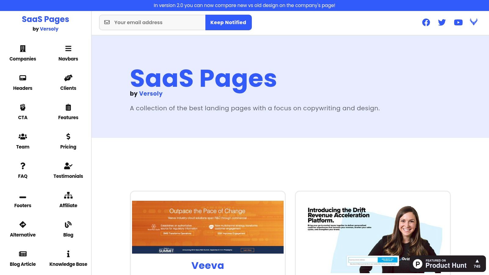
SaaS Pages is useful because it organizes inspiration by Blocks. That framing matters. B2B teams usually do not need a full-site gallery first. They need a sharper Navbar, a stronger Pricing section, or a CTA block that matches the buyer's path.
The company-by-company browsing and new-versus-old comparisons make this source useful for reading redesign logic. You can see what changed, and what the team chose to keep. That helps you separate “different” from “better,” which is where many redesigns go wrong. A page can look cleaner and still perform worse if it hides proof or slows the next action.
It also helps with copy structure. The section-level view makes it easier to compare how companies frame pricing, testimonials, footers, and FAQs. That matters when your site is stuck in generic SaaS language and needs a clearer order of claims, proof, and action. It is not a deep UX lab, but it is practical for section-level judgment.
SaaS Pages is strongest when your team needs a fast answer to a narrow layout problem. If the pricing section is thin, you can review a few examples and decide what belongs there, what should be cut, and what deserves a test. If the homepage lacks a clear conversion path, the block library helps you rebuild the page from function outward.
That makes it useful for revenue teams, not just designers. The question should be whether a block supports buying behavior, not whether it looks good in isolation. If you want a tighter commercial lens while evaluating section choices, use Big Moves Marketing's pricing page analysis alongside the gallery. The point is to check whether the section reduces friction, supports proof, and makes the next step obvious.
Land-book is useful because it is broad, not because it is trendy. If you need to compare page types, industries, color systems, styles, and build approaches without staying inside a narrow SaaS lane, it gives you enough range to spot patterns fast. For B2B website design inspiration, that makes it a research tool for positioning and page structure, not a gallery to copy.
The paid features are the reason to use it. Mobile previews, screenshot downloads, and historical site versions turn the library into redesign research, not just an archive of polished screens. You can compare how a site changed over time, which helps when you are studying a competitor's shift or trying to understand what changed between versions. In B2B, that context is usually more useful than a single finished mockup.
It also helps with implementation decisions. If your team is weighing platform choices or checking whether a layout can be built cleanly in Webflow, Land-book gives you a way to judge feasibility before anyone commits. That keeps the conversation grounded in what can ship, not what looks impressive in isolation.
Breadth expands the search space. A B2B company can find good hero treatment ideas, case study layouts, About pages, and pricing structures faster when the filtering is strong. For hero-specific patterns, compare these hero section examples (https://www.bigmoves.marketing/blog/hero-section-examples) to judge hierarchy and proof placement before committing to a layout.
Breadth also brings a trade-off. Curation can tilt toward aesthetics over performance. That is fine if your team knows how to evaluate conversion impact. It is a problem if you assume every polished site also supports buyer decisions.
If a reference cannot explain how it helps a buyer decide, it is not a decision tool. It is wallpaper.
Use Land-book when you need a wider view than SaaS-only libraries can offer, especially for platform and historical comparisons. Then bring the question back to your funnel. Does this pattern help a buyer understand the offer faster? Does it reduce doubt? Can your team build it? If the answer is no, the reference is interesting, not useful.
Lapa Ninja is one of the fastest ways to scan contemporary landing page styles. It's updated daily, and that makes it useful for spotting current patterns in hero treatment, hierarchy, spacing, and visual rhythm across SaaS and broader B2B categories. If you need a fresh visual read without overthinking it, this is a strong first pass.
The main value here is speed. You can move through a wide range of landing pages quickly and identify the design language that's showing up right now. That's useful when your team needs a reference for a new homepage, a campaign page, or a product launch page that can't look dated. The boards feature on Pro also makes organizing references simple, which matters when multiple stakeholders are reviewing the same direction.
The trade-off is predictable. This is less helpful for interior pages and product flows than SaaS-specific libraries. It's also more exposed to ad clutter on the free tier, which slows down browsing. That doesn't make it weaker. It just means it serves a different job. Use it for broad scanning, not for detailed UX analysis.
Lapa Ninja helps when the team already knows the commercial story and needs examples of how to stage it visually. That makes it useful near the end of a positioning or wireframing process, not at the beginning. If you haven't decided what the site needs to prove, don't start with aesthetic inspiration. If you have, this is a quick way to test whether your layout choices feel current or stale.
The useful mindset here is simple. Look for rhythm, not novelty. Look for clarity, not theatrics. The best landing pages don't shout. They make the next step obvious.
For B2B teams that need to move fast, this source helps you align visual direction before detailed design work begins. Once the visual lane is clear, you can translate it into something built for conversion, not just attention. That distinction matters if your team is trying to connect design choices to pipeline rather than internal approval.
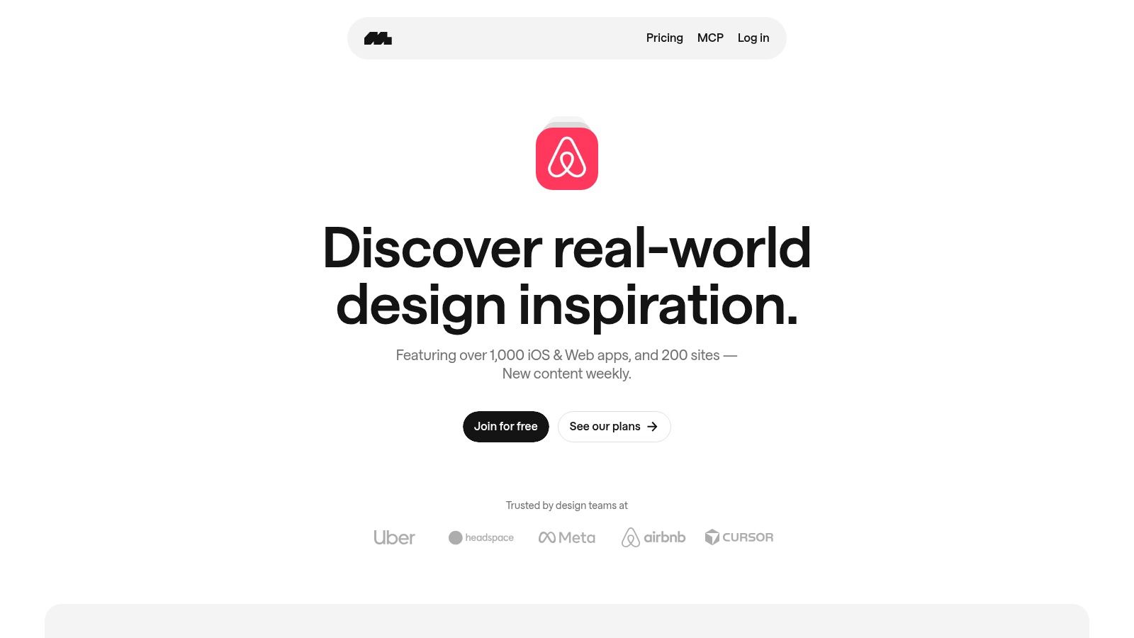
Mobbin is the strongest source here when marketing pages need to connect to product flows. It's known for app patterns, but the web coverage matters just as much for B2B SaaS teams. If your website has to support onboarding, signup, pricing, checkout, or any other step that leads into the product, Mobbin helps you design the transition instead of treating the website and product as separate worlds.
The value is in product interfaces and step-by-step journeys. That helps teams understand how leading products structure the experience from marketing promise to in-product action. In B2B SaaS, that's critical. A pricing page that looks clean but doesn't connect to signup behavior is incomplete. A homepage that sells the product but ignores onboarding is also incomplete.
Mobbin's coverage of web apps and sites is broad enough to help with those decisions. Weekly additions keep the library current, which reduces guesswork when you're trying to align with modern UX patterns. The paid tiers matter if you want full access, but the core idea is clear even before you subscribe. You're not browsing for prettiness. You're studying how top products guide commitment.
This source is most valuable when the buyer journey crosses multiple environments. That includes PLG motions, self-serve trials, and any SaaS site where the first conversion is not the final conversion. It helps you see how the marketing page, the signup step, and the onboarding path should feel like one continuous system.
Practical rule: if the marketing site promises one thing and the product flow makes buyers work to find it, you've created avoidable friction.
Mobbin is less focused on pure marketing sites than the other sources here, so you need to filter deliberately. Use it when the decision is about experience continuity, not visual identity alone. That's the right choice for teams serious about conversion paths, not just page views.
| Item | Implementation (🔄) | Resource needs & speed (⚡) | Expected outcomes (⭐ / 📊) | Ideal use cases (💡) | Key advantages (⭐) |
|---|---|---|---|---|---|
| Services - Website | Moderate, strategic planning + Webflow build; senior operator involvement 🔄 | Higher budget; client inputs required; very fast mobilization (days) ⚡ | High ⭐⭐⭐⭐, conversion-focused site with measurable pipeline impact 📊 | B2B startups / mid-market wanting revenue-driven websites & GTM integration 💡 | Senior fractional CMO ownership, SEO+analytics integrated, fast deployment ⭐ |
| SaaSFrame | Low, browseable inspiration + Figma downloads 🔄 | Low cost (freemium; Pro ≈ $14/mo); quick research time ⚡ | Medium ⭐⭐⭐, rapid pattern discovery and reusable Figma assets 📊 | SaaS product/marketing teams doing detailed pattern and Figma research 💡 | Deep SaaS taxonomy, flows, mobile variants, Figma files ⭐ |
| SaaS Landing Page | Low, gallery browsing, no build effort 🔄 | Free to browse; time to curate examples; sponsored monetization ⚡ | Medium ⭐⭐⭐, practical messaging and structure references 📊 | Gathering live SaaS landing, pricing and section examples for inspiration 💡 | Large curated set (800+), tags, stacks and template links ⭐ |
| SaaS Pages | Low, block-focused examples for reverse-engineering 🔄 | Free; minimal setup; limited filtering ⚡ | Medium ⭐⭐⭐, useful for section-level copy/layout heuristics 📊 | Quickly finding multiple section variants (Pricing, FAQ, CTAs) 💡 | Blocks library, redesign comparisons, conversion callouts ⭐ |
| Land-book (Landbook) | Low–Medium, broad gallery with advanced filters 🔄 | Freemium; Pro (~$6–$9/mo) unlocks downloads, mobile previews ⚡ | Medium–High ⭐⭐⭐⭐, broad inspiration and historical trend insight 📊 | Competitive redesign research and cross-industry style searches 💡 | Powerful filters, historical versions, mobile previews ⭐ |
| Lapa Ninja | Low, daily-updated landing-page archive 🔄 | Free; Pro (~$9/mo) removes ads and adds Boards; very quick scanning ⚡ | Medium ⭐⭐⭐, fast visual inspiration for hero and layouts 📊 | Rapidly scanning current hero treatments and visual styles 💡 | Large daily archive, simple save-to-board workflow (Pro) ⭐ |
| Mobbin | Medium, flow- and journey-focused analysis (mobile + web) 🔄 | Freemium; paid tiers for full access; time to analyze flows ⚡ | High ⭐⭐⭐⭐, real product flows inform onboarding & conversion 📊 | Aligning marketing pages with in-product UX, onboarding and checkout flows 💡 | Step-by-step journeys from top products; extensive app/site coverage ⭐ |
The best research workflow starts with the buyer journey, not the gallery. First define positioning and the decision your site needs to support. Then use SaaSFrame or SaaS Pages for section-level structure, because those tools help you answer what belongs on the page and in what order. Use SaaS Landing Page or Lapa Ninja when you need broader visual scanning and want to see how current B2B and SaaS sites handle hierarchy, hero treatment, and layout. Use Land-book when you need platform comparison or historical context. Use Mobbin when the marketing page has to connect cleanly to product flows like signup, onboarding, or checkout.
That sequence matters because a reference is only useful if the team can explain what it reveals. The right questions are not “Do we like this?” or “Can we copy this?” The right questions are whether the reference clarifies the audience assumption, the message hierarchy, the conversion mechanism, the responsive behavior, the Webflow feasibility, and the SEO implication. If a reference doesn't help answer those questions, it's not inspiration. It's noise.
The final decision checklist should be short and brutal. What should we emulate because it lowers friction? What should we reject because it distracts from the offer? What should we test because the answer is unclear? And how will the final site tie directly to measurable pipeline rather than visual approval in a meeting?
That is the standard for B2B website design inspiration. Not originality for its own sake. Not a gallery of nice screens. A site that helps the right buyers understand, trust, and act.
If you need a partner that treats the website as part of the revenue system, not a design exercise, Big Moves Marketing builds conversion-ready B2B sites, messaging frameworks, and SEO foundations for teams that care about pipeline. Visit Big Moves Marketing if you want a sharper website decision process and hands-on strategic execution tied to growth.




%20-%20white.svg)