Most advice about B2B websites is funnel advice. Shorten the form. Test the button color. Add a chatbot. Swap the hero image. Teams run a dozen of those experiments, lift a conversion rate by a fraction of a point, and the pipeline number doesn't move, because none of it touches the thing that loses deals.
What loses deals is disagreement. Your website tells one story, your sales team tells another, and the buyer (who now does most of the research alone, across several colleagues) notices the gap and reads it as risk.
Fix the disagreement and the site starts producing pipeline. Ignore it and you're paying a designer to make a contradiction look better.
A B2B homepage that describes your company is a brochure, and buyers stopped reading brochures around the time they started building shortlists before they ever spoke to a rep. Define the object properly and the failures stop looking like design problems. A B2B website is a company-owned digital destination that sells to other businesses and moves a multi-person buying group from research toward a sales or self-service action.
That definition is accurate but misleading if you stop there, because it describes pages rather than a job.
When pipeline stalls, the reflex is to rewrite the homepage. What usually ships is the sales deck with the pricing slide removed. The same claims, minus the numbers, minus the caveats a rep would have added on a call. The site then asks buyers to trust assertions that a salesperson will contradict three weeks later.
Watch what happens inside a buying group. A CTO opens three vendor sites in a row, finds three different names for the same category, and can't tell whether the tools are even comparable. She doesn't email each vendor to ask. She shortlists the one whose pages match the language she heard on a sales call, or whose site answered the question her security lead dropped into Slack that morning.
Buyers don't punish inconsistency loudly. They drop you quietly, and nobody files a complaint.
The mechanism is boring and reliable. Conflicting language raises the effort of evaluation. Effort reads as risk. Risk pushes a vendor down the list. By the time your rep follows up, the buyer isn't hostile, just busy.
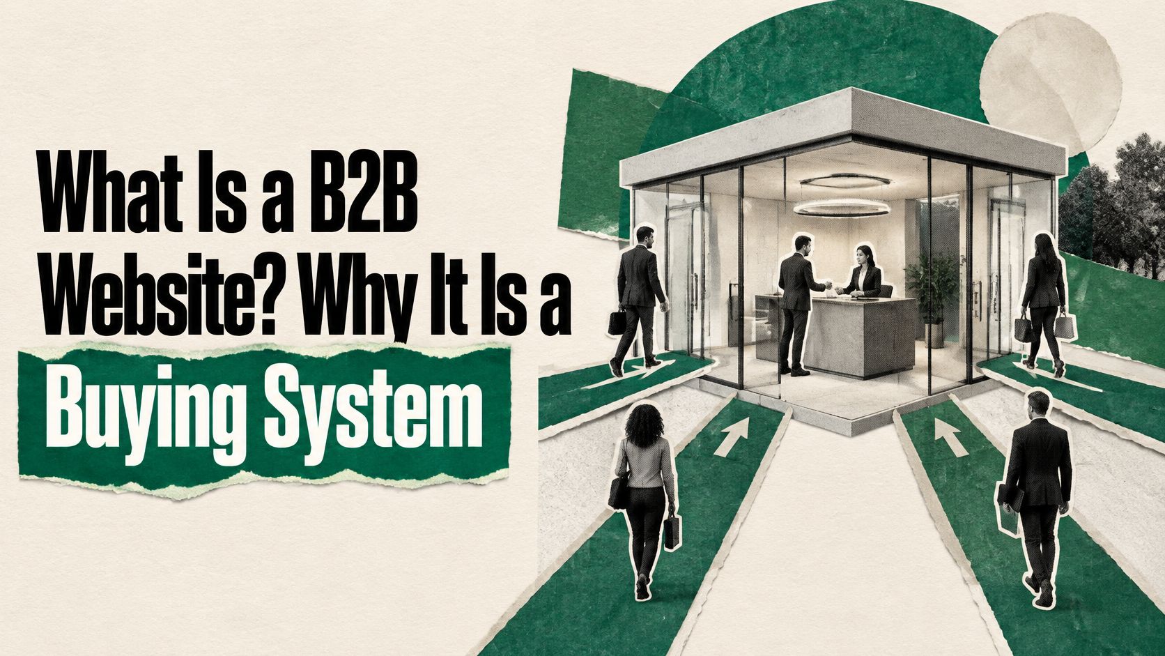
That's the reframe everything below rests on. The site is a buying system with a defined job, and every page, claim, form and tracking event gets judged against that job rather than against how sharp it looks in a design file.
Start with the shortest version. A B2B website is a company-owned digital destination that sells products or services to other businesses and moves a multi-person buying group from research toward a sales or self-service action.
Now the scope, because "website" hides a lot. In practice it carries product and use-case pages, packaging or pricing logic, customer evidence, technical documentation, integrations, security posture, comparison content, forms, booking tools, chat, and sometimes a complete online purchase path. For SaaS companies it also holds demos, trials, and the enablement material reps send after a call.
It differs from a consumer store in one structural way. The purchase is rarely one decision, made by one person, in one session. McKinsey's survey of more than 1,000 B2B buyers across four countries found that only 10% said they currently made an online B2B purchase, while 46% said they would buy through a supplier's website if the option were available and efficient. Read that gap carefully. Demand for self-service exists. The supply of a site good enough to earn it usually doesn't.
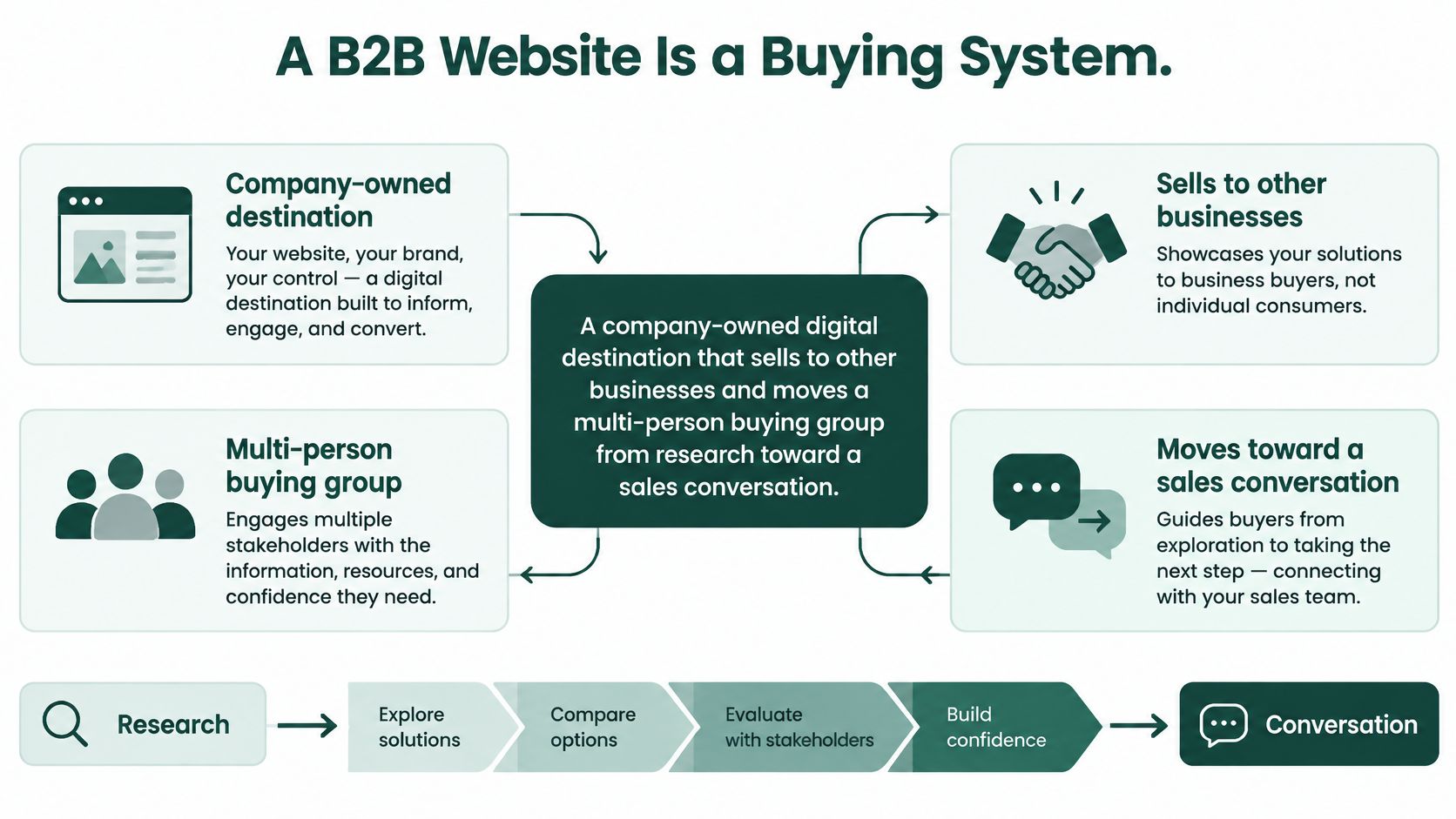
Think of the site as a sales floor that never closes. It's only as useful as its consistency with the humans who normally work that floor. A buyer who reads one promise on a page and hears another on a call doesn't conclude that the page is stale. They conclude the vendor is.
Four roles run in parallel on that floor, and most companies are strong at one while absent at the rest.
Enterprise SaaS tends to nail education and skip evaluation. Product-led tools do the reverse: a great trial and nothing a CFO can forward internally. The exercise of mapping those roles against stages is B2B customer journey mapping, and it's the cheapest diagnostic you can run before touching design.
Here's the test. Give someone outside your company five minutes on your site, then ask what you sell and who it's for. If they can't answer, you don't have a buying system. You have a brochure with a demo button.
Navigation and conversion logic that works for a checkout breaks when a buyer is running an enterprise evaluation with a committee. Not because B2B buyers are different species, but because the decision has a different shape, and the site has to match it.
| Dimension | B2B website | B2C store |
|---|---|---|
| Buying group | Several evaluators with different questions | One shopper |
| Decision length | Weeks to months | Minutes to days |
| Primary conversion | Demo, trial, quote or qualified lead | Purchase at checkout |
| Proof that matters | Case studies, security documentation, integrations | Reviews and ratings |
| Pricing visibility | Often quote-based or gated | Listed and fixed |
| Content depth | Technical documentation and use cases | Product photos and specifications |
| Success metric | Sales-stage progression and pipeline | Revenue per visit |
Two rows in that table hide a trade-off rarely made on purpose. Pricing visibility and primary conversion are linked. Hide your pricing and you lower early conversion while raising lead quality, because the people who bother to ask are usually further along and better funded. Publish a starting price and you get more form fills from people who then discover they can't afford you.
Neither is universally right. But the choice should be deliberate, and it should match how sales qualifies. If your reps open every call by asking about budget, gating pricing is coherent. If they spend the first ten minutes explaining why the product costs what it costs, your gate is just a delay.
The common mistake is copying consumer patterns wholesale. A single-button homepage that assumes one visitor and one decision. A sitewide discount banner on software that renews annually. A newsletter pop-up that fires on the first scroll, before the buyer has read anything worth subscribing to. Each one is a consumer reflex imported into a committee purchase.
The trade-off: hiding pricing buys you better-qualified conversations and costs you volume. Refusing to state any packaging logic buys you nothing at all.
Start by finding the two rows where your site behaves like a store and fixing those. If your decision length is months but your only conversion is a purchase button, that's the first repair. If your proof is a star rating instead of a security page, that's the second.
Every page should exist to answer one buyer question. Pages that answer none should be deleted or merged, not redesigned. Use this inventory as the audit checklist.
| Page | Buyer question | Must contain |
|---|---|---|
| Homepage | What is this and is it for me? | Category, outcome, one proof point, primary call to action |
| Product or solution pages | How does it work for my situation? | Capabilities by role, integration list, deployment detail |
| Use case or industry pages | Has this worked for a company like mine? | Problem, workflow, measured outcome |
| Pricing or packaging | What will it cost to start? | Plans, what is included, or a clear quote path |
| Customer proof | Can I trust this vendor? | Named case studies with results and stated constraints |
| Security and documentation | Will IT approve it? | Security posture, compliance statements, technical docs |
| Resources | Is this vendor credible on the problem? | Guides, comparisons, original research |
| Contact or demo | What happens if I reach out? | Stated form fields, response time, routing to an owner |
The homepage and the product pages do most of the work, and they fail differently. A homepage fails when it names a category nobody searches for and an outcome nobody measured. A product page fails when it lists capabilities in the order your engineers built them rather than the order a buyer evaluates them, with the integration list buried in a slide deck instead of on the page.
Security and documentation pages sit earlier in the journey than most marketing teams assume. A technical evaluator who can't find your compliance posture or deployment options doesn't book a call to ask. They ask a competitor instead, or they tell their champion the vendor looks immature.
The resources layer is where category credibility gets built, and it's usually the thinnest part of a SaaS site. Comparison pages, honest guides, and original research do more qualification work than another gated ebook. If you sell into the public sector specifically, it helps to see how a specialist handles a narrow, procurement-minded audience; AI for Government Contracting is a decent reference for how a tightly defined category page earns trust with a reader who has a compliance checklist open in another tab.
One structural note before you build anything. Each page needs a claim it's allowed to make, and the same claim has to appear on the call. A B2B messaging framework does that job: it gives marketing and sales one vocabulary so the site and the rep don't describe the product in two different dialects.
The table is a minimum, not a maximum. A product sold to a technical buyer needs documentation earlier in the journey than one sold to a single department head. But nothing on your sitemap should survive the question "which buyer question does this answer?"
The five features below aren't a list. They're a dependency chain. Positioning sits underneath everything, messaging translates it for each role, and lead capture, technical SEO and analytics carry it into the business.
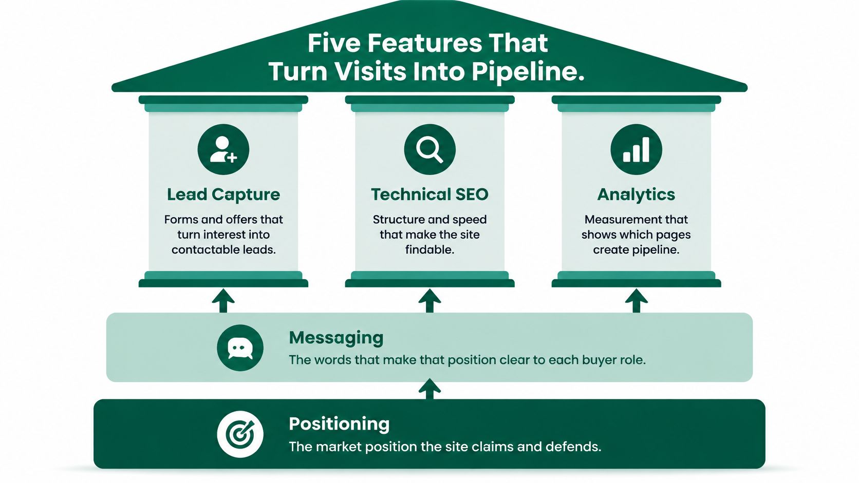
Positioning is a market choice: where you fit, which alternative you replace, stated in one sentence your sales team also uses verbatim. The usual failure is a positioning statement that could describe three competitors. If swapping your logo for a rival's leaves the sentence true, you haven't positioned anything.
Messaging is that choice expressed for each buying role, with proof attached to every claim. A controller needs time saved against a stated baseline. An engineering lead needs to know whether the thing breaks existing pipelines. One message won't do both jobs.
Lead capture means progressive forms that ask only what the buying stage justifies, plus one high-intent path (demo, trial, quote) and one low-intent path (guide, comparison, newsletter). The failure is a form demanding company size before the buyer has seen the product. The fix is to enrich firmographics in the background rather than ask for them, which is the core argument in this digital lead generation guide.
Technical SEO means crawlable category and product pages, clean URLs, structured data for product and FAQ content, fast mobile rendering, and internal links that walk a visitor from problem content to product pages. The failure mode is a page that's indexed but never linked, so it neither ranks nor converts.
Analytics means events for documentation views, pricing views, demo requests and return visits, tied to CRM records so each lead traces to its source. The failure is a dashboard counting clicks that never reach a pipeline stage. The mechanics of wiring that up properly are covered in these conversion optimization tips.
Gartner's survey of 632 B2B buyers found that 61% prefer an overall rep-free buying experience, yet 69% of buyers see inconsistencies between information on a supplier's website and information provided by sellers. That 69% is the whole argument for treating site copy and sales enablement as one asset. A site that generates traffic but contradicts the sales conversation adds friction instead of removing it.
There's a second audience now, and it doesn't click. G2's 2026 AI search research reports that 51% of B2B software buyers now start research with an AI chatbot more often than Google. Which means product, pricing and integration pages need plain sentences, clear headings and definitions a model can quote without mangling them. Vague category poetry gets summarized into something worse than silence.
The buyer type dictates page order. Not your feature list, not your product roadmap, not what the last conference demo emphasized. Walk three composite examples through the sequence and the pattern becomes obvious.
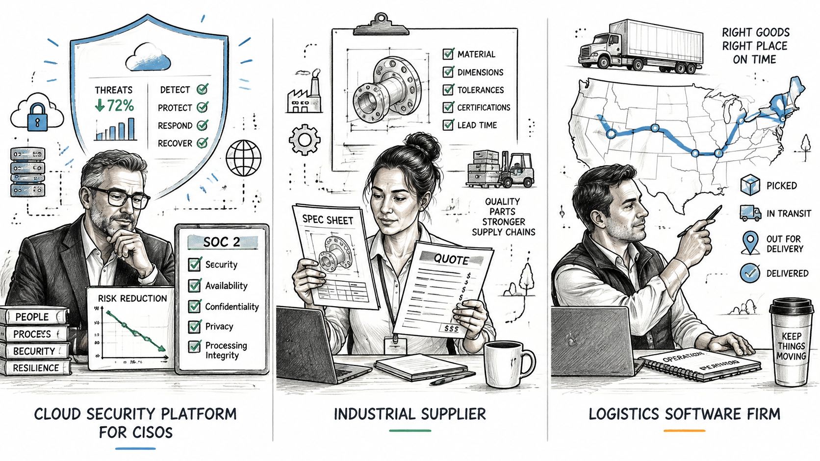
A cloud security platform selling to a CISO. The homepage has five seconds to answer what risk this removes and whether an auditor will accept it. From there the site supplies compliance evidence, architecture diagrams and a downloadable security questionnaire well before a demo form appears. The primary conversion is the questionnaire download, and the page most often missing is a real trust center instead of a paragraph promising that security is a priority.
A data integration tool selling to engineering leads. This buyer is asking whether it will break their existing pipelines. The site documents connectors, API limits, rate behavior and deployment steps, then offers a sandbox so the answer can be tested rather than believed. The missing page is usually a per-integration page that states constraints clearly, because constraints are what an engineer searches for first.
A finance automation product selling to mid-market controllers. Time saved needs a stated baseline, the ROI calculator needs visible assumptions, and pricing logic needs to be forwardable to a CFO without a rewrite. The page that's almost always absent is the packaging page, because the team assumes pricing kills deals. It doesn't. Silence does, when the controller has to guess.
Here's the pattern in motion, if you want it as a walkthrough rather than a list.
Notice what the three cases share. In each one the buying group is a group, the decision runs for weeks, and the site's job is to remove a specific uncertainty rather than to make a general impression. The vendor that wins is usually the one that answered the awkward question early.
Measure the website as a conversion system, not as a traffic report. Pageviews tell you whether the blog is working. They tell you nothing about whether the site is doing its job in a six-week evaluation.
For reference points, a 2026 benchmark summary citing Ruler Analytics data reported an average conversion rate of 5.13% across more than 110 million sessions in 13 industries, with 7.6% for software, and the same summary cites a 6.6% median for campaign landing pages from Unbounce's 2024 study of more than 41,000 pages.
| Metric | What it reveals | Reference point |
|---|---|---|
| Whole-site conversion rate | Share of sessions taking any conversion action | 5.13% average across 13 industries; 7.6% for software |
| Landing-page conversion rate | Effectiveness of campaign-specific pages | 6.6% median (Unbounce 2024) |
| Qualified lead rate | Share of form fills matching the ideal customer profile | Set your own floor from closed-won accounts, not from an industry figure |
| Demo or trial starts from organic search | Whether search brings buying-stage visitors | Compare against your own 90-day baseline |
| Pricing or documentation views before contact | Depth of self-service research | A contact with zero prior pricing or doc views usually signals a mismatch |
| Form-to-opportunity rate | Whether leads become pipeline | Judge by stage progression, not by lead count |
| Return visits by account | Re-engagement of the buying group | Track unique companies returning, not sessions |
| Sales-reported inconsistencies | Alignment between site claims and sales conversations | Ask reps which claims buyers challenge on calls |
Benchmarks are not targets. Segment by channel and intent before you compare anything, then hold each page against its own history and the pipeline it produces. A site converting at 9 percent with leads that sales rejects is worse than a site converting at 4 percent with qualified pipeline, and the second one will survive a board review.
Cadence matters as much as the metric. Review conversion monthly and pipeline contribution quarterly. Monthly catches broken forms and dead landing pages. Quarterly catches positioning drift, which is the expensive one. The broader measurement model that connects those two views is laid out in how to measure marketing effectiveness.
Audit before you rebuild. A rebuild that starts in design repeats the same architecture with better typography, and you'll be having this conversation again in eighteen months.
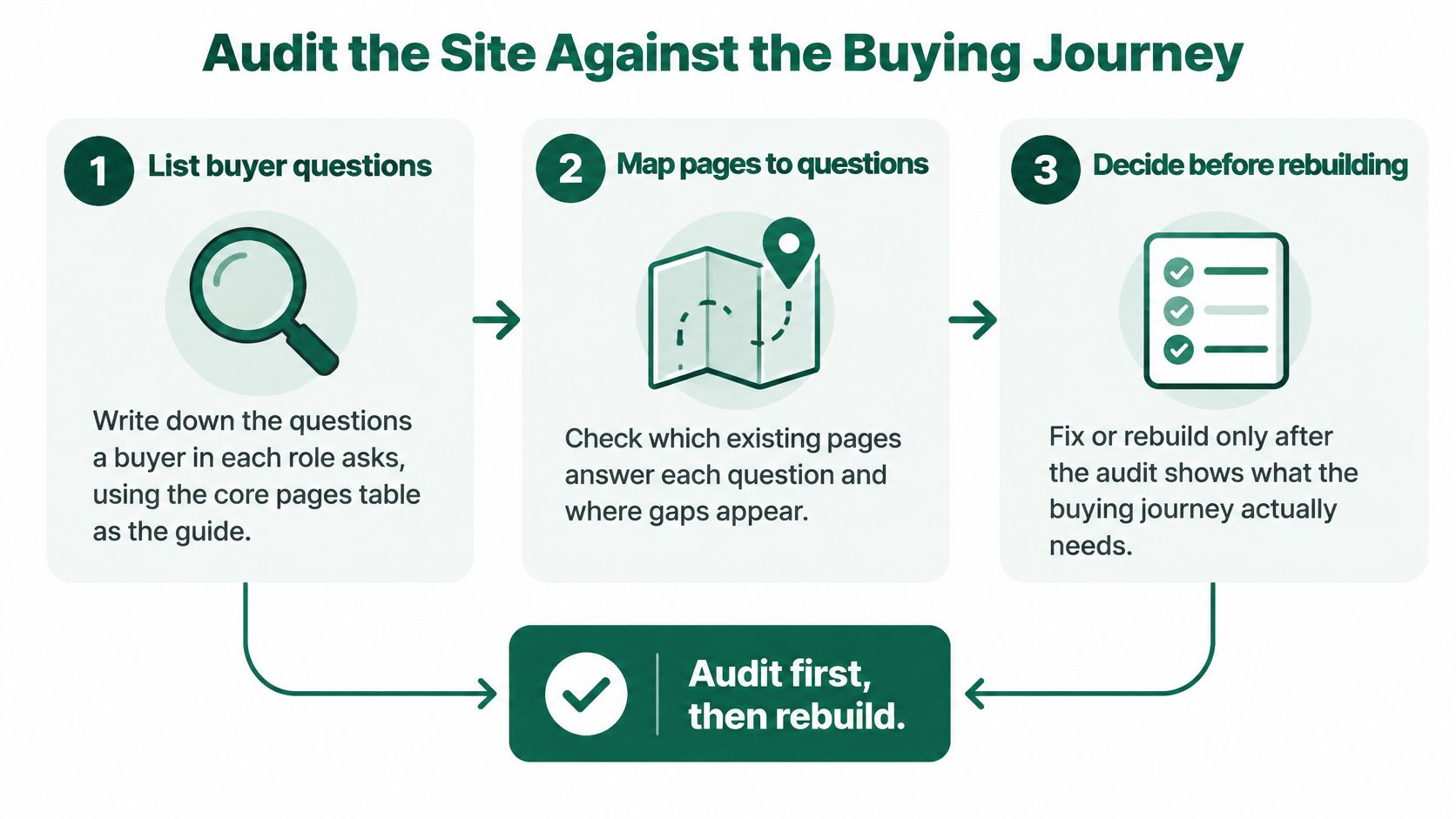
The sequence that produces usable findings:
Stop doing this: adding another gated ebook to a homepage that still can't explain the category in one sentence.
A usability analysis of a website will surface the same gaps from the outside, which matters because internal teams read their own navigation as familiar rather than confusing. When the gaps stay invisible, an outside review of positioning and page architecture is faster than another round of internal debate. That's the review we run, usually alongside a rebuild on Webflow templates shipped in three weeks, for teams including Lexacon.ai, IgnitePost.com and Chargepay.ai.
If your site and your sales calls are telling two versions of the same story, that gap is the most expensive thing in your funnel, and it's fixable in weeks rather than quarters. Big Moves Marketing works with B2B SaaS founders and revenue leaders on positioning, messaging and the website system that carries both, from sitemap and page architecture through copy, build and analytics. Visit Big Moves Marketing to see how the engagement works and to book a review of your current site against the buying journey.