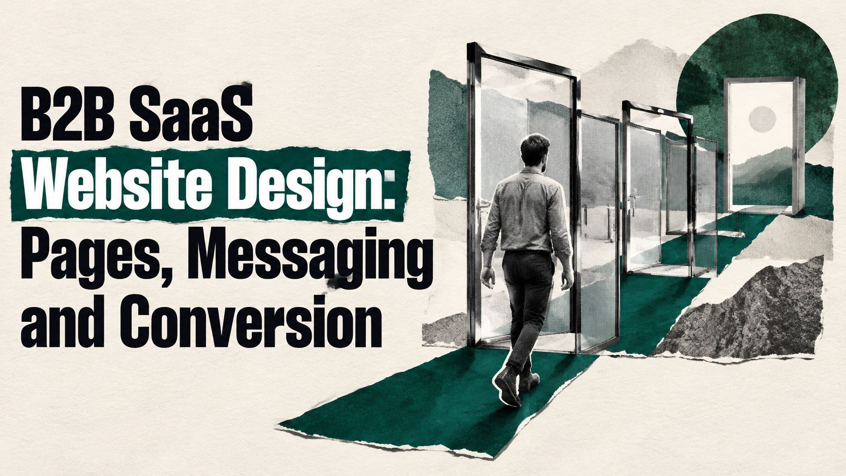
The most popular B2B SaaS website design advice starts in the wrong place: borrow a successful company's layout, sharpen the headline, and make the demo button impossible to miss. That produces a familiar-looking site, not a stronger buying decision. Your website should help qualified accounts recognize fit, help poor-fit accounts leave, and give buying committees enough evidence to move without you narrating every page.
Treat it as a qualification system, not a brochure. Then judge the build by a less fashionable question: who will own the message after launch?
Hand your designer a map of buyer questions before you hand them visual references. Each page needs a distinct job, evidence that supports its answer, and an action appropriate to the visitor's intent.
Required pages, buyer questions and primary actions
| Page | Buyer question it answers | Proof it must carry | Primary action |
|---|---|---|---|
| Homepage | What is this and is it for companies like mine? | Category statement, two or three named customers, one product visual | Book a demo or start a tour |
| Product | What does the product actually do? | Capability walkthrough, real interface, supported workflows and limits | Explore the product tour |
| Use-case pages | Does it solve my specific workflow? | Role-specific outcome, workflow screenshot, customer quote | Explore the workflow or request a sample |
| Pricing | What will this cost and how does it scale? | Tier logic, usage drivers, public range or calculator | Compare plans or start a trial |
| Integrations | Does it connect to my stack? | Supported tools, setup steps, known limits | Check the integration list or read the docs |
| Security and trust | Can my organization approve it? | Compliance statements, data handling summary, access controls | Request the security pack |
| Comparison or alternatives | How do you differ from the tool I already know? | Criteria-based comparison with honest trade-offs | Talk to sales or start a trial |
| Documentation and resources | How does it work in detail? | Technical depth, limits, implementation timeline | Sign up for updates or open a support path |
| Demo or contact | Who can answer my specific question? | Route description, response expectations, qualification fields | Submit the qualified request |
The Octo analysis of First Page Sage client data reports approximately 1.1% visitor-to-lead conversion for B2B SaaS during 2022–2025, roughly one lead per 91 unique visitors and the lowest among 24 tracked industries; it also cites a separate December 2025 sample of 80 companies with the same result. These are different samples, not a universal conversion constant.
The same analysis reports pricing pages attracting 16.5% of traffic and converting 3.8%, while demo pages attracted 0.91%; its channel figures were 8.2% for paid search, 7.9% for organic, and 1.7% for paid social. It also calculates that moving from 1.1% to 1.5% produces approximately 36% more leads, while 2.2% doubles output, from unchanged traffic.
Don't confuse channel conversion with page performance. The useful budget decision is narrower: fund pricing, product, comparison, and solution pages before another homepage styling pass. The case for showing B2B pricing starts with helping buyers qualify themselves, not collecting their email addresses.
A finance use-case page, for example, should show the reconciliation workflow, customer-approved outcomes attributed by name, and a sample ROI calculation. If those outcomes aren't available, show the workflow rather than manufacturing proof.
Working rule: Give every page one primary action and one clear next page for the buyer who isn't ready to act.
A redesign can become an expensive way to avoid a positioning decision. Better spacing won't rescue a category claim that buyers can't repeat, and a product animation won't explain which alternative you replace.
Separate the decisions before anyone opens a design file:
A homepage written from the feature list outward reverses this order. It presents capabilities, attaches broad benefits, and leaves the buyer to work out why the product belongs on their shortlist.
Make customer value explicit before discussing visual treatment.
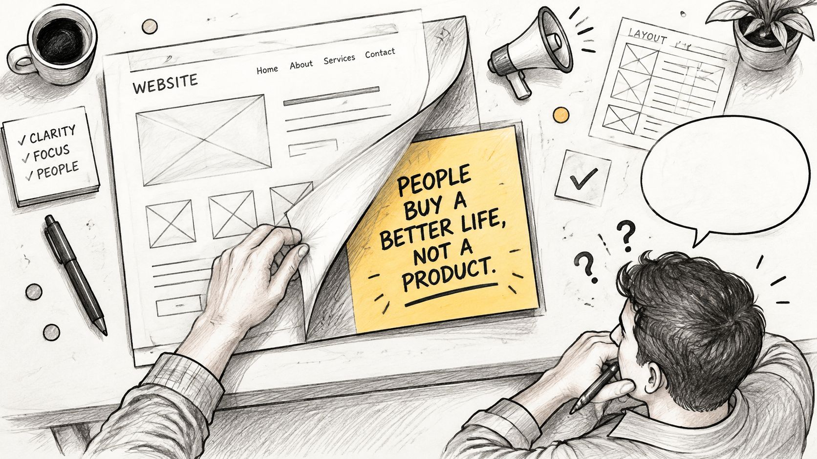
Gartner's B2B buying report describes enterprise buying groups containing five to 11 stakeholders, representing an average of five distinct business functions. A value statement aimed exclusively at the end user leaves the people approving cost, deployment, and risk without an answer.
Say you sell workflow software to finance teams. The champion wants fewer manual exceptions. The economic buyer wants to understand the operational return. IT wants to know who maintains the integration when an upstream system changes.
Those aren't competing positioning statements. They're different reasons to approve the same purchase.
Use a B2B messaging framework to keep the central claim stable while changing the supporting evidence by role. Write a headline claim, then map proof and objections to the people who must agree.
A buyer shouldn't need to become your copywriter to make the case internally.
Founder-led sales makes weak messaging visible. If the founder has to rebuild the explanation for every prospect, the website team doesn't yet have a reliable message to publish. Extract the recurring explanation, not the most polished pitch.
Our view is that B2B growth is cumulative and heavily reliant on a strong brand framework. Stable positioning lets website copy, sales conversations, and demand generation reinforce the same choice.
Before approving layouts, write the headline and a short paragraph for the champion, economic buyer, and technical evaluator. Cut any sentence a competitor could publish unchanged. Then check whether the remaining claims have evidence.
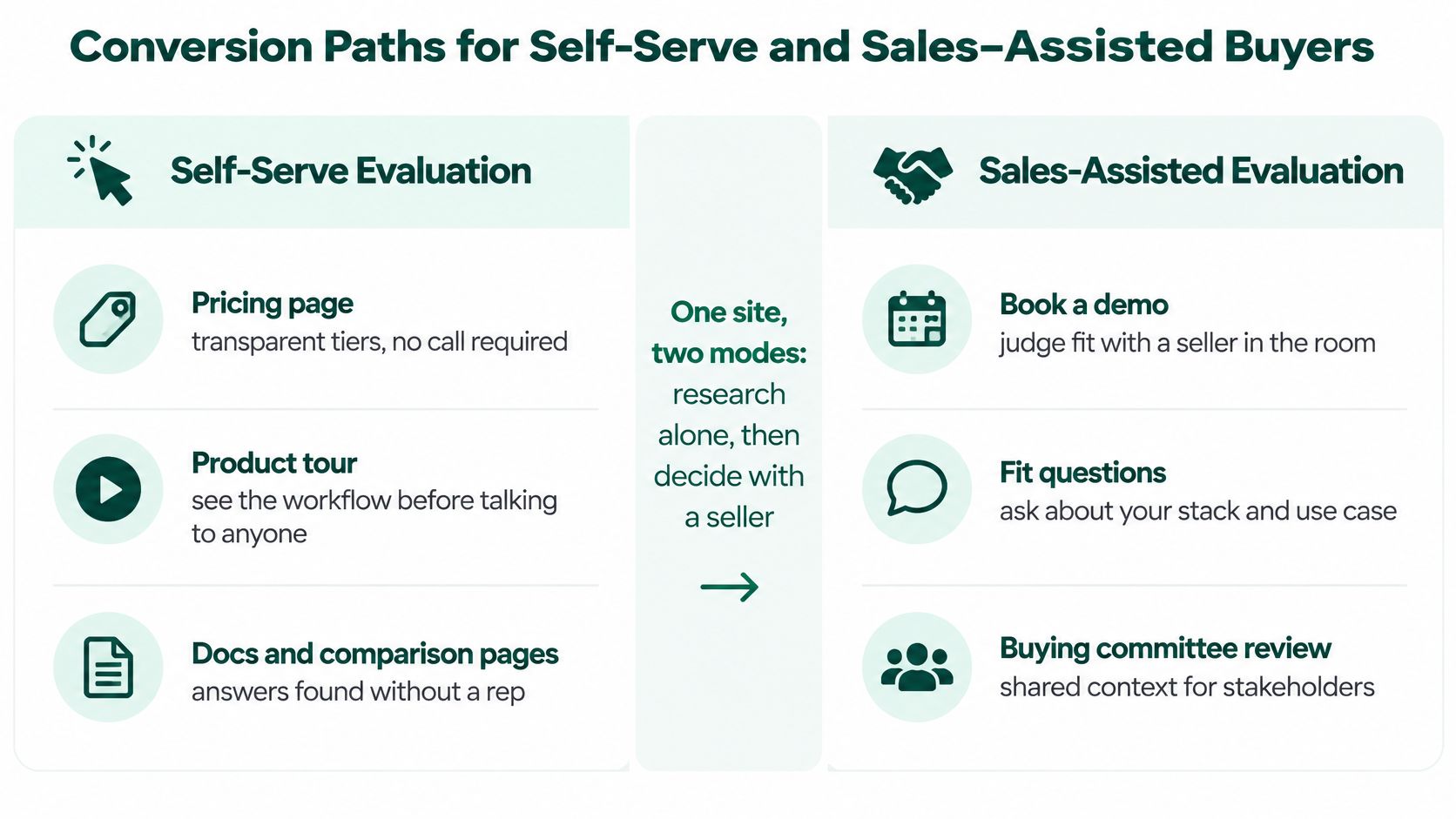
Buyers can want independent research and still want a seller's judgment. Treating those preferences as contradictory leads teams to force everyone into a trial or push everyone toward a calendar.
Gartner's survey of 632 B2B buyers found that buyers preferred online self-service for general information and learning, but seller input when determining whether a product fit their company's needs. Design around the task, not an ideological commitment to product-led or sales-led growth.
Two buying paths on one B2B SaaS site
| Path | Best fit | What the page must show | Primary action | Do not |
|---|---|---|---|---|
| Self-serve evaluation | Lower-complexity accounts | Product tour, public pricing range or usage calculator, trial or sandbox | Start a trial or compare plans | Force a demo before any product proof |
| Sales-assisted validation | Larger or regulated accounts | Security review, implementation timeline, procurement pack, business-case proof | Request the security pack or talk to sales | Hide all pricing and pretend a trial replaces a review |
The distinction is the work required to establish fit, not company size.
A Webwavers guide citing 2025 buyer research reports that 45% of B2B technology buyers identified vendor pricing transparency as the most desired improvement in the buying experience. Publish tier logic, usage drivers, a range, or a calculator when a single price would misrepresent the contract.
For a concrete evaluation exercise, open LunaBloom AI's pricing page to compare video generation plans, then list the commercial questions you'd need answered before selecting a tool. Apply that exercise to your own product: what usage unit, allowance, or upgrade condition would change the buyer's decision?
Don't use the form to compensate for an unclear B2B SaaS sales funnel. Ask for information needed to route the request, then collect deeper qualification after the visitor has received useful product evidence.
A work email and a deployment-requirements field can be more useful than a long questionnaire about budget, authority, and purchase timing. Explain what happens after submission and offer a research path to visitors who aren't ready.
Fewer demos can mean better pipeline, but only if qualified opportunities improve. Early disqualification can save sales time; it isn't automatically a commercial win.
Set the routing rule explicitly. Standard configuration and independent setup go toward self-serve. Custom deployment, regulated data, or formal procurement go toward sales-assisted validation. Use the deployment-requirements field to distinguish them, rather than assuming every large company needs the same motion.
Layout should let a buying group evaluate the product, not decorate the headline. The practical test is whether a champion can send a page to another function without adding a long explanation.
Start navigation with Product, Use cases, Pricing, Integrations, Security, Customers, and Resources. Use familiar labels unless a different label makes the destination more explicit. Your internal product architecture isn't a navigation strategy.
Above the fold, show the category, intended customer, a real product visual, and a primary action. Don't present several equally prominent buttons and ask the visitor to resolve your sales strategy.
On use-case pages, organize the explanation in the sequence a champion would screenshot:
That last element matters. A clearly stated constraint helps evaluators distinguish a credible workflow from a demonstration built around ideal conditions.
Give finance, security, and IT scannable evidence blocks. Label implementation requirements, data handling, integration ownership, and the business metric affected. Don't bury these answers inside a long end-user narrative.
Keep the initial component library deliberately small: a hero, proof row, comparison pattern, and form pattern. Add components only when a buyer task requires something the existing set can't express. A smaller system makes updates easier to review and prevents every new landing page from becoming a separate design project.
| Interface decision | Acceptance check |
|---|---|
| Mobile pricing | Buyers can read units, limits, and plan differences without horizontal guessing |
| Sticky primary action | The action remains available without covering evidence or form controls |
| Interactive explanations | Essential information is available without hovering |
| Product motion | Buyers can pause it and understand the claim from accompanying text |
| Stakeholder blocks | A colleague can find their approval requirements by scanning headings |
Motion and illustration can support comprehension. They shouldn't contain the only explanation of how the product works.
Before approving a page, send its URL to someone outside the target user's function. Ask them to identify the relevant benefit, requirement, and unresolved question. If they need a call to locate the answers, revise the interface.
The page that earns an AI citation isn't necessarily your most polished page or your highest-ranking one. The 6sense guide to AI-mediated buyer research reports 72% of B2B buyers encountering Google AI Overviews and 40% saying AI makes discovery easier, twice the 2024 level, while discussing findings that pages cited by ChatGPT often rank at position 21 or lower for related Google queries.
The buyer behavior is substantial: Gracker's account of 6sense's 2025 survey reports that 94% of 4,510 B2B buyers used large-language-model tools during the buying process. Rankings alone won't tell you whether those buyers receive an accurate account of your product.
The design problem is making product facts understandable outside their original visual context.
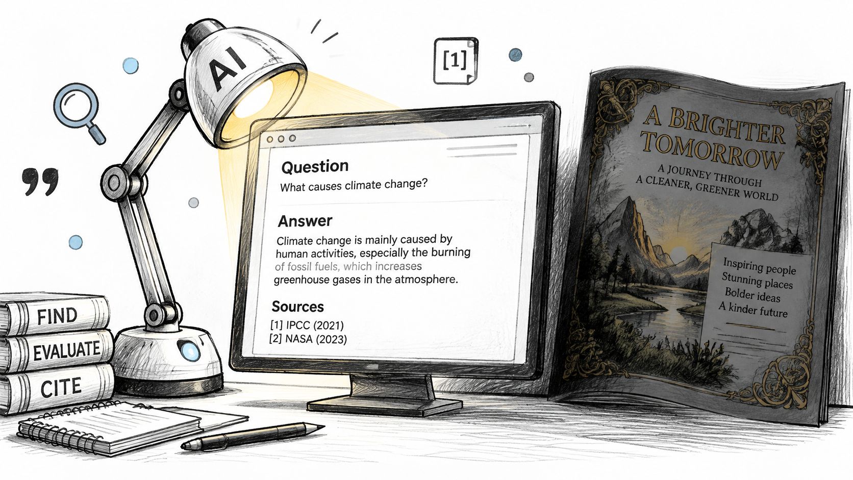
Put a plain definition near the top of each important page. Name what the product is, whom it serves, the workflow it supports, and any material boundary.
A use-case page for finance operations should explicitly identify finance operations. Don't assume a screenshot of a ledger communicates the audience to every retrieval system.
Structured data isn't a citation guarantee. Nor can you prevent every inaccurate summary. You can remove ambiguity and provide a dependable page against which claims can be checked.
For Webflow builds, use CMS collections for use cases and integrations. Define required fields for audience, capability, setup requirements, limitations, and supporting evidence. Templates should enforce completeness, not manufacture interchangeable pages.
Set unique titles and meta descriptions, review sitemap inclusion, and control canonical tags. Keep critical copy in crawlable HTML rather than loading the entire explanation only after an interaction.
This discussion is useful alongside a practical inspection of what your published pages expose.
Use the B2B AI Overviews playbook to connect page clarity with discovery work. Track citations, factual accuracy, branded search, and identifiable assisted pipeline, not just referral sessions. Some AI-assisted journeys won't arrive with a clean referral label.
Run a founder-level test: ask an AI tool to describe your product, suitable customers, pricing model, integrations, and limitations. Check every claim against a published page. Where the answer is wrong, identify whether your site is missing the fact, contradicting itself, or leaving outdated material accessible.
Website quality depends on who owns the message after launch, not just who draws the layout. A fixed-scope build can ship cleanly and still leave nobody accountable when the product, buyer, or sales objection changes.
Choose a resourcing model around that ongoing responsibility.
Resourcing options for a B2B SaaS website
| Option | Best fit | Typical timeline | Main risk | Cost shape |
|---|---|---|---|---|
| Specialist agency | Defined scope and a fixed launch date | Several weeks for a template-based build | Messaging drafted without a lasting owner | Project fee |
| Fractional CMO | Positioning, messaging and hiring decisions before scaling | Weeks to set up, then ongoing oversight | Leadership time split across clients | Monthly retainer |
| In-house team | Sustained volume and constant iteration | Several months to hire and ramp up | Slow to start and costly for one launch | Salaries plus tooling |
| Hybrid (fractional strategy plus build partner) | Strategy needed first, build needed fast | Often the fastest route to launch | Coordination between two parties | Retainer plus project fee |
These are planning expectations, not delivery commitments. An undefined message can delay any model, while an experienced internal team may already have the capacity to begin.
A specialist build partner fits when the positioning is settled and someone internally can approve copy. Don't expect a template project to resolve an unresolved market choice. That requires a different mandate.
Fractional leadership fits when founders still need decisions about positioning, messaging, and the marketing team. The trade-off is availability: agree who decides between scheduled conversations and how urgent revisions get resolved.
An in-house team makes sense when the company needs sustained publishing and experimentation. Hiring an entire function to complete a launch is an expensive answer to a temporary capacity problem.
The hybrid model works when strategy and implementation can proceed under a shared brief. It fails when the advisor and builder each assume the other owns copy approval.
At Big Moves Marketing, we follow the fractional pattern: the same independent advisor connects positioning and messaging with the website rather than treating launch as an isolated handoff. Our website deliverable includes a complete sitemap, page structures, individual page layouts, complete copywriting, and visual guidance for the client's designer; we build B2B websites with Webflow templates and deploy them in 3 weeks.
Use this decision sequence:
A settled message makes a short build practical. It doesn't eliminate approvals, missing assets, or migration work.
Ownership test: When sales discovers a new objection after launch, who can decide what changes, approve the evidence, and publish the correction?
If that answer is unclear, don't approve the build yet.
Form fills alone hide the difference between an interested visitor and an account that can buy. They also hide broken routing, stalled evaluation, and meetings your sales team shouldn't have accepted.
Launch approval should depend on working buyer paths, not a screenshot presentation.
Test accessibility against W3C's WCAG 2.2 Level AA criteria, which require conformance with all Level A and Level AA success criteria. Check the homepage, pricing page, demo form, and sign-up flow with keyboard navigation, text alternatives, usable forms, and interface names, roles, and states exposed to assistive technology.
Then test mobile performance on the pages where buyers evaluate commercial and technical fit. Use browser developer tools and real devices; a desktop preview doesn't expose every obstructive overlay or difficult form interaction.
Pipeline metrics after launch
| Metric | What it shows | Pass signal |
|---|---|---|
| Visitor-to-lead rate by page type | Whether high-intent pages outperform your measured site average | Pricing, product and comparison pages above the site average |
| Share of demo requests that become sales-qualified | Quality rather than lead volume | Qualified share holds or rises even if demo count falls |
| Assisted pipeline from AI-referred and branded search | Whether citable pages contribute to opportunities | Pipeline contribution identified, not only sessions |
| Time from first visit to first meeting | Friction in the path for qualified accounts | Shorter time for accounts that match the ICP |
Treat attribution as evidence with limits, not a complete account of buyer behavior. Combine analytics with sales qualification notes and buyer-reported discovery.
Test high-intent pages first. Change a meaningful variable, define the qualified outcome before starting, and collect enough observations to distinguish movement from noise. Don't declare a winner because button clicks increased while qualified meetings stayed flat.
At the 30-day review, confirm event accuracy, inspect failed submissions, compare qualification by page and source, and read the objections from recent sales conversations. Assign the next change to a named owner. If traffic is limited, use task testing and sales evidence rather than forcing an inconclusive experiment into a success story.
Big Moves Marketing helps B2B SaaS founders connect positioning, buyer evidence, and website decisions under consistent senior marketing ownership. Visit Big Moves Marketing to discuss your current site, the buying decisions it leaves unanswered, and whether you need a focused rebuild or clearer positioning first.