%20png%20copy.avif)

Most founders treat their pitch deck as a presentation. A document to get through.
This is the first and most critical mistake. It signals you don't understand the game you're in.
Your pitch deck is not a presentation. It’s a product, engineered for one user—the investor. Its single job is to build enough conviction to get the next meeting.
Viewing your deck as a product changes everything. You stop thinking like a presenter and start thinking like a product manager obsessed with the user experience.
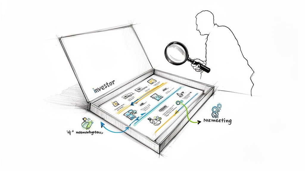
Your "user" is a time-starved, deeply skeptical VC who sees hundreds of decks a month. They aren't reading your deck; they're pattern-matching against thousands of past failures and successes. Your product’s only job is to survive this brutal filtering process.
Investors don’t read decks linearly. They jump around, scanning for signals of life. In the first 60 seconds, they’re hunting for three things:
Bury this information and you create friction. Your product has failed its first usability test. The investor is gone. An effective deck is engineered for efficient communication. The best founders understand how VCs scan a startup pitch deck template to get answers, fast.
The goal is clarity and velocity. Every slide must land its core message instantly. If a slide requires a five-minute voiceover to make sense, it’s a design flaw. It’s a confusing UI that ships with a user manual.
Your deck isn’t a transcript of your verbal pitch. It’s an asynchronous sales tool that must work on its own. The story must be so tight and the data so compelling that the investor sells themselves on taking the next meeting.
Applying a product mindset forces you to be ruthless about what goes in and what stays out. Features that don't serve the core job-to-be-done are cut.
That means no vanity metrics, no buzzword-laden mission statements, and no complex architectural diagrams on slide three.
Instead, you obsess over:
This approach shifts the process from filling in boxes to making strategic choices. While most founders build presentations, the ones who get funded build products.
Investors don’t read decks. They scan them.
After thousands of pitches, VCs develop brutally efficient pattern-recognition. They have mental shortcuts to filter an opportunity in under three minutes. Deviating from the expected narrative flow doesn't make you look innovative. It creates cognitive friction and signals you don’t understand the rules of the game.
Your pitch deck structure isn't a creative writing exercise. It's a ruthlessly efficient tool designed to build conviction, slide by slide. The order is almost non-negotiable because it maps directly to how an investor de-risks an investment in their head.
You're not just presenting information; you're guiding them through a logical argument.
The classic 10-12 slide structure isn't arbitrary. Each slide has a specific job, answering the sequential questions already running through an investor’s mind. Miss a step or present them out of order, and the logical chain breaks.
The sequence is everything.
You cannot talk about your solution before establishing a painful, urgent problem. You cannot show traction before explaining what your product does. You cannot ask for money until you’ve proven a massive market exists.
This isn’t about filling in a template; it’s about respecting the investor’s process. Data shows VCs give your deck just over two minutes, and only 1% of pitches get funded. The standard 10-12 slide template works for one reason: it aligns with how decisions are made. Title, Problem, Solution, Market Size, Product, Business Model, Traction, Go-to-Market, Competition, Team, Financials, and The Ask. Storytelling provides the hook; hard data provides the proof.
The job of the deck is to make the next meeting feel inevitable. Each slide must earn the right to present the next. If any slide fails, the chain is broken, and the investor has moved on.
This isn’t a checklist. It's a strategic framework for building a compelling argument.
This first sequence establishes the core opportunity, moving logically from a big-picture problem down to your specific, monetizable solution.
The second half of the deck shifts from "what it is" to "why it will win." This is where you prove the model works and that you're the right team to execute.
Following this structure doesn't stifle creativity. It provides the rails for your unique story, ensuring the investor stays with you from the first slide to the last.
The traction slide is where most early-stage B2B SaaS decks die. It’s the make-or-break moment where a compelling story is either validated by hard numbers or exposed as a fantasy.
Founders consistently treat this slide like a junk drawer for any positive metric they can find—website visits, social media followers, download counts. This is a fatal mistake.
Investors see those vanity metrics for what they are: noise. They aren't looking for activity; they're looking for a clear signal. They need evidence of a repeatable, scalable growth engine. Your job on this slide is to translate early wins into an undeniable signal of emerging product-market fit.
This timeline shows the narrative arc of your pitch. Notice how "Proof"—your traction—sits in the middle, connecting your idea to your ask.
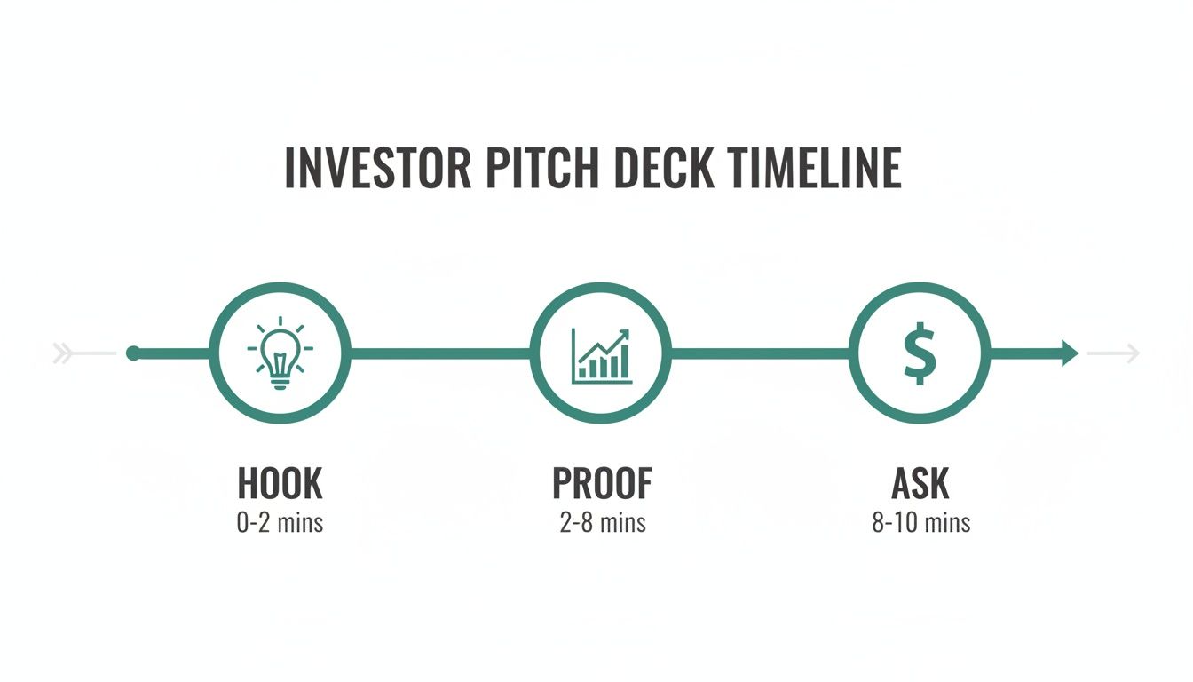
Without credible proof, your hook is just a story and your ask is a dream.
Meaningful traction isn't a single number; it's a set of signals that change as your company matures. Presenting Series A metrics at a pre-seed pitch makes you look naive. Showing only user counts when raising a Series A makes you look stalled.
Your investor pitch deck template must match your stage.
Pre-Seed: You are selling a vision backed by early validation. Revenue is likely minimal or non-existent. The goal is to prove you've found a real, painful problem. Meaningful signals include a qualified ICP waitlist, high engagement from a small pilot group, or signed letters of intent (LOIs).
Seed: The game shifts to proving your initial go-to-market motion. Investors need to see that you can acquire and retain paying customers. Primary metrics are logo velocity (rate of new customer acquisition), pilot-to-paid conversion rates, and early signs of customer love like strong testimonials.
Series A: The focus is now on proving a repeatable, scalable business model. Unit economics and revenue quality are paramount. Key signals include consistent MoM ARR growth (15-20% is a strong benchmark), net revenue retention (NRR) over 100%, and a healthy LTV:CAC ratio (ideally 3:1 or higher).
A traction slide without context is just a chart. Your real job is to annotate the data and tell the story behind the numbers. Why did growth spike in Q3? What strategic decision led to that inflection point? What did you learn from the churn in Q2 that improved retention?
How you present the data is as critical as the data itself. Avoid static, point-in-time numbers. Investors are buying your future trajectory, so your visuals must show momentum.
Instead of stating you have "10 paying customers," show a chart of customer acquisition over the last six months. Don't just show current ARR; show the month-over-month growth rate that got you there. This paints a picture of progress and allows the investor to mentally extrapolate your future growth.
For early-stage companies, nothing beats a good cohort analysis. Showing that customers from your earliest cohorts are still active—or expanding their usage—is a powerful signal of a sticky product. It proves you aren't just pouring water into a leaky bucket.
The table below breaks down what investors are actually looking for, versus where founders often miss the mark.
Ultimately, this slide must answer one question for the investor: "Is this thing working?"
Your financial projections are a core part of that story. For a better handle on building a credible financial narrative, review our thinking on what is revenue forecasting and how it applies to early-stage ventures.
Every number and chart should be engineered to lead a skeptical investor to an undeniable "yes." Stop showing them noise. Start signaling a real business.
Investors don’t read pitch decks cover-to-cover. They hunt for signals.
They jump straight to the slides that answer two fundamental questions: Is there credible proof this works? And is this the right team to make it happen? Understanding this is a strategic advantage.
You can have the most elegant problem slide and the most beautiful product mockups, but if your proof points are weak, the conversation is over. Investors are pattern-matching for evidence that de-risks their capital, and they know exactly where to look.
This isn’t a hunch. Analysis of over 1.3 million investor sessions shows a clear pattern. The team slide alone commands an incredible 43% of the total time an investor spends on a deck. Proof comes right after, with case studies being clicked in 64% of sessions, followed closely by the team/about us slide at 59%.
The data confirms what experienced founders know: investors bet on people and proof, not just ideas.
These two slides—Team and Proof—are your moments of truth.
Early-stage investing is a bet on your ability to execute, adapt, and navigate the chaos of building a company. That makes your team slide the single most important piece of real estate in your entire investor pitch deck template.
Most founders get this wrong. They treat it like a mini-resume, listing past employers and academic credentials. This misses the point.
The purpose of the team slide isn’t to show you’re employable. It’s to prove you have an unfair advantage to win this specific market. It must answer one question: Why is this the only team that can pull this off?
Connect each founder’s background directly to a core risk in the business.
Don't have big-name logos on your resume? Good. It forces you to articulate your actual advantage.
Did you spend five years working deep inside the industry you’re now disrupting? That’s more valuable than a generic MBA. Did you build a community of 10,000 target users before writing code? That's a massive GTM advantage.
Frame your experience as the unique key that unlocks this specific opportunity.
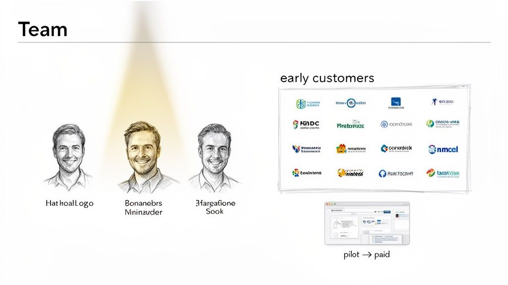
The second most scrutinized area is proof. After looking at the team, an investor’s eyes scan for logos, case studies, or testimonials. This is pure social proof, and it’s infinitely more powerful than any product slide.
Early customer logos do more than just show revenue. They validate your Ideal Customer Profile. They signal that a specific market segment is willing to risk using an early-stage product—a powerful leading indicator of product-market fit.
If you have recognizable logos, feature them prominently.
If you don’t, use mini-case studies to bring the value to life. A single slide with a customer's logo, a powerful quote, and 2-3 bullet points with hard ROI metrics is more compelling than ten slides of feature descriptions.
Example Mini Case Study:
This is the evidence that builds conviction. It moves your pitch from theory to tangible business results. This proof is a cornerstone of any effective fundraising strategy, a topic we explore further in our guide on the modern approach for fundraising for B2B SaaS startups.
Obsess over these slides. They carry more weight than the rest of the deck combined.
I've reviewed thousands of B2B SaaS decks. You start to see the same mistakes, again and again. These aren't deep strategic flaws; they're tactical, unforced errors in the pitch itself.
To an investor, these mistakes are tripwires. They immediately signal inexperience and provide an easy reason to pass.
Promising companies get rejected not because the idea is bad, but because their deck commits one of these avoidable sins. It trips the investor’s pattern-matching algorithm. This isn’t about typos—it’s about pressure-testing every claim so it can withstand the scrutiny of a deeply skeptical audience.
Fixing these red flags is the fastest way to elevate your pitch from amateur to credible.
The most common red flag? A "hockey stick" financial slide projecting $100M ARR in five years with nothing to back it up.
Investors know these are guesses. They aren't testing your psychic abilities; they're testing your grasp on reality.
When they see an absurd projection, they don't think you're ambitious. They think you're naive about customer acquisition costs, sales cycles, and the grind of scaling a SaaS business. It tells them you haven’t built a bottoms-up model based on real-world assumptions.
The fix is to anchor your projections to your go-to-market motion. Show your math. Your financial model should be a direct output of your GTM strategy, built on defensible assumptions about conversion rates, quota attainment, and CAC payback. A thoughtful, realistic projection that shows you understand the levers of your business is infinitely more impressive.
Another frequent offender is the generic two-by-two "Competition" matrix. Founders place their company in the top-right quadrant (labeled "High Functionality, Low Cost") and cram every competitor into the other three boxes.
This backfires immediately. It tells an investor two things:
A strong competition slide isn’t a feature checklist. It's an argument for why you have a right to win a specific segment of the market. It demonstrates deep market knowledge and a clear point of view.
Instead, frame your differentiation around a dimension that incumbents are structurally unable or unwilling to compete on. This could be a new technology, a disruptive business model, or an intense focus on an underserved niche. Acknowledge your competitors' strengths, but articulate why those strengths make them ill-suited to solve the specific problem you’re tackling. This shows you're a strategic thinker, not just another startup with a few extra features.
The "Ask" slide seems simple but is easy to get wrong. Many founders present a fuzzy request for capital without connecting it to specific, measurable business outcomes. An ask for “$2M for hiring and marketing” is weak. It signals a lack of operational discipline.
An investor isn't just giving you money; they are buying milestones. Your ask has to be framed as a precise plan to get from Point A to Point B.
A strong ask connects the capital directly to key objectives:
This demonstrates you are a capital-efficient founder who thinks in terms of ROI. You're not just asking for money to keep the lights on; you're presenting a clear, fundable plan to de-risk the business and create the next inflection point.
For a real-world example of how a refined pitch narrative drives success, see how we helped transform a concept into a market-ready sales automation platform.
Before sending that deck, run it through an honest filter. I’ve put together a quick table of the most common red flags I see and, more importantly, how to fix them.
Cleaning up these unforced errors requires a shift in mindset. Stop seeing your deck as a presentation and start seeing it as an evidence-based argument designed to withstand intense scrutiny. Every slide is an opportunity to build credibility—or to lose it.
Founders always have questions when putting their first real deck together. Here are the most common ones I hear, with straight answers based on what VCs actually care about.
Keep it high-level.
Investors know your five-year projections are a work of fiction at this stage. A detailed, multi-tab spreadsheet signals you don't understand how early-stage ventures evolve. They are testing your thinking, not your Excel skills.
Your financial slide should cover three things:
Don't embed a complex spreadsheet in the slide. It’s cluttered and invites investors to get bogged down in trivial details. Keep the full model ready for follow-up if they ask.
Always send a link using a platform like DocSend.
This isn't a debate. Sending a static PDF attachment is a rookie move that signals inexperience and puts you at a disadvantage.
A link gives you three critical advantages:
This is a common source of anxiety, but it stems from a misunderstanding of what "traction" means to an investor.
Traction is about demonstrating momentum and reducing risk. It’s not a logo-collecting contest. If you don't have well-known customers, show other signals of validation that prove your thesis is sound.
Your job isn't to show you've landed a Fortune 500 company. Your job is to prove you've found a pocket of the market that is desperate for what you've built. The logo is secondary to the evidence of that desperation.
Here are powerful alternatives to big logos:
First, get rid of the standard four-quadrant matrix where you're magically in the top-right corner. It looks lazy.
A better approach is to show a sophisticated, strategic understanding of the landscape. This positions you as a market expert, not just another product builder.
A strong competition slide does three things:
This reframes the conversation from "Are you better?" to "Are you different in a way that creates a new opening in the market?"
Ready to move from theory to execution? Big Moves Marketing partners with B2B SaaS and AI founders to translate complex products into compelling narratives that win customers and convince investors. We help you build the positioning, messaging, and sales tools—like your pitch deck—that drive real growth.
Find out how we can help you sharpen your story at https://www.bigmoves.marketing.
Explore Big Moves Marketing services and resources:


%20-%20white.svg)