Website Design for B2B: Boost Your Business Growth
July 17, 2025

Think of your B2B website as more than just an online brochure. It’s your digital headquarters—the central hub where complex deals are nurtured, trust is built, and your brand’s authority is cemented. It’s a strategic engine designed from the ground up to support long sales cycles and speak to sophisticated buyers.
Building Your B2B Digital Headquarters

It’s time to graduate from the digital brochure mindset. Your website is easily the most powerful asset in your marketing toolkit, serving as the command center for every interaction a potential client has with your brand.
This requires a fundamental shift in thinking. You're not just putting up a few pages; you're engineering a strategic platform. One that’s built to engage multiple decision-makers on a buying committee, each with their own set of questions, priorities, and pain points. Your site’s job is to answer all of them, seamlessly.
From Brochure to Business Engine
The way B2B buyers operate has changed, and our websites have to change with them. They're no longer static information dumps. They’ve become interactive platforms where serious business evaluation happens. Unlike a B2C site geared for quick, emotional purchases, a B2B platform has to deliver deep, credible resources—think detailed case studies, technical specs, and ROI calculators—to a committee of rational thinkers.
This is how your website transforms into an active growth driver. It’s not just sitting there waiting for traffic; it’s a lead-generation machine that works for you 24/7. Its purpose is threefold:
- Establish Unwavering Trust: Every element, from your homepage headline to your privacy policy, must scream expertise and reliability.
- Deliver Immense Value: Your site needs to be the single most helpful resource a prospect can find on their journey to solve a problem.
- Guide Complex Decisions: It must provide a clear, logical path that helps prospects navigate the information-gathering process with confidence.
Core Pillars of a Strong Digital HQ
To help frame this, we've broken down the essential elements that form the foundation of a modern, high-performing B2B website. These pillars aren't just best practices; they are the non-negotiable components that separate an average site from an exceptional one.
| Core Pillars of Modern B2B Web Design || :--- | :--- | :--- || Pillar | Why It Matters for B2B | Key Action || Strategic Messaging | B2B buyers need to see their specific pain points and goals reflected in your copy. Generic language fails to connect. | Develop a clear value proposition and targeted messaging for each of your ideal customer profiles (ICPs). || Authority Content | Decision-makers seek out industry leaders. In-depth content like white papers and case studies proves your expertise. | Create a resource hub with high-value, downloadable content that addresses complex buyer questions. || Clear Conversion Paths | A confused visitor won't convert. Your site must guide different user types toward the right next step (e.g., demo, contact, download). | Design distinct Calls-to-Action (CTAs) for each stage of the buyer's journey. Don't just use "Contact Us" everywhere. || Technical Performance | A slow or insecure site is an immediate red flag for business buyers. Trust is lost in milliseconds. | Prioritize site speed, mobile responsiveness, and robust security measures as core development requirements. || User Experience (UX) | Complex B2B solutions require intuitive navigation. If buyers can't find the information they need, they'll leave. | Map out user flows for key personas to ensure a logical and frustration-free journey to find information. |
These pillars provide a strategic roadmap for your project. As you build out your digital headquarters, incorporating broader insights from fields like essential app development best practices can also be incredibly valuable. The principles of solid architecture, security, and user-centric design are universal and directly applicable here.
Your B2B website is your hardest-working salesperson. It never sleeps, speaks to every prospect perfectly, and has all the answers they need to make a confident purchasing decision. It's your ultimate brand ambassador.
Ultimately, the goal is to create a seamless experience that positions your company as an undeniable authority. An effective website doesn't just look professional; it actively nurtures relationships and drives tangible growth. For a deeper dive into turning your site into a lead-generating powerhouse, check out our guide on B2B website marketing. This strategic approach ensures your digital headquarters doesn’t just exist—it performs.
Mapping the Modern B2B Buyer's Journey

If you want your B2B website to be anything more than a digital brochure, you have to get inside your client’s world. I’m not talking about creating a few shallow buyer personas. I’m talking about deeply understanding the messy, winding, and often frustrating path your ideal customers take from the first hint of a problem to the final purchase order.
A great website doesn't just sit there waiting to be found. It actively meets buyers at every single turn with exactly what they need, right when they need it.
The modern B2B journey isn’t a straight line. It's a tangled web of independent research, internal committee meetings, budget approvals, and technical validation. Your website needs to be the single most reliable, authoritative resource throughout this entire ordeal. When you get this right, you build the kind of credibility that sways high-stakes decisions in your favor.
Who Are You Really Talking To? The Buying Committee
Forget the idea of selling to a single person. B2B purchases are almost always made by a buying committee, a group of people from different departments, each with their own questions, priorities, and biases. Your website has to speak to all of them, often at the same time.
Here's who you'll typically find around the table:
- The Champion: This is your internal advocate. They’re usually a manager or department head who feels the pain most acutely and is motivated to find a fix. They need content to help them build a business case—think ROI calculators, solution briefs, and powerful case studies with hard numbers.
- The End-User: These are the folks who will be in the trenches using your product or service every day. They care about features, usability, and how it will integrate with their existing workflow. Give them detailed feature pages, clear documentation, and video demos.
- The Decision-Maker: This is the executive with the final say and the budget—the CFO, CEO, or VP. They're less concerned with the nitty-gritty features and more focused on the bottom line. They need to see the ROI, understand any business risk, and see the long-term strategic value. Executive summaries and pages on security, compliance, and total cost of ownership are for them.
- The Influencer: Often a technical expert from IT or security, this person’s job is to kick the tires. They’re evaluating your solution’s technical feasibility, security protocols, and integration capabilities. Make it easy for them to find technical specs, security whitepapers, and integration guides.
Your site’s design must provide clear, frictionless pathways for each of these individuals to find the answers they're looking for.
Aligning Your Content with the Buyer's Journey
This is where you turn a passive website into an active sales machine. By mapping specific content to each stage of the journey, you build trust and guide prospects forward.
Content for the Awareness Stage
Early on, your prospects are just starting to realize they have a problem. They might not even know solutions like yours exist. Your goal here is purely to educate, not to sell.
- Blog Posts & Articles: Address their high-level questions and pain points.
- Industry Reports & Ebooks: Offer genuinely valuable insights that establish your authority.
- Webinars: Provide educational content that positions you as an industry thought leader.
Content for the Consideration Stage
Okay, now they're in research mode, actively comparing you against your competitors. This is where your website's credibility is put to the test. You have to prove why your approach is better.
- Detailed Case Studies: Don't just tell them you get results—show them. Use real-world examples with quantifiable outcomes.
- Solution Pages: Break down exactly how your service solves specific problems for their specific industry or role.
- Comparison Guides: Be honest and transparent. Compare your solution to alternatives, even if it means admitting a competitor is better in one niche area. This builds immense trust.
Content for the Decision Stage
The committee is close to a final choice. They need that last bit of validation that they're making the right call and that you'll be a reliable partner.
- Client Testimonials & Video Reviews: Let your happy customers do the selling for you. This social proof is incredibly powerful.
- Free Trials or Live Demos: Give them a low-risk way to experience your solution firsthand. Let the product speak for itself.
- Transparent Pricing Pages: Don’t make them jump through hoops to understand costs. Being upfront removes friction and shows you have nothing to hide.
The modern B2B buyer is a serious researcher. A staggering 90% of B2B buyers look at between two and seven different websites before making a purchase. And with 75% of a website's perceived credibility coming directly from its design, you can't afford to be average.
The competition for your buyer's attention is fierce. Your site doesn't just have to be good; it has to be exceptional. For a deeper dive into this, you can explore our detailed breakdown of the B2B customer journey and learn how to optimize every touchpoint.
By strategically placing the right content at the right time, you transform your website from a digital business card into your most effective sales and marketing asset. You’ll be guiding prospects with confidence toward an informed "yes."
Designing a High-Converting User Experience
A beautiful website that doesn’t generate leads is just an expensive digital painting. The real magic in B2B website design happens when you translate user experience (UX) and user interface (UI) principles into smart, practical choices that guide professional visitors toward a conversion.
It’s about clearing a direct path from their first click to a valuable action, whether that's booking a demo or downloading a key resource. This means designing navigation that feels second-nature, crafting calls-to-action (CTAs) that hit on real business pains, and creating forms that feel like a helpful exchange, not an interrogation.
Crafting Intuitive Navigation and Site Structure
Your navigation is the roadmap to your digital headquarters. If it’s confusing, your prospects will get frustrated, get lost, and leave. For busy B2B professionals who are deep in research mode, clarity is everything. They need to find specific information—technical specs, case studies, pricing—and they need to find it now.
Forget about clever or jargon-heavy menu labels. Stick to clear, universally understood terms that leave no room for guesswork.
- Solutions/Services: Clearly state what you do and who you do it for.
- Case Studies/Results: Offer undeniable proof that your solution works.
- Resources/Blog: Showcase your deep industry expertise.
- About Us: Build trust by sharing your company's story and mission.
- Contact/Get a Demo: Make it incredibly easy for them to take the next step.
Think of your site structure as a well-organized library. A logical hierarchy not only makes life easier for your users but also clearly signals to search engines what your site is about. This is a critical piece of the puzzle for any effective website for B2B growth.
High-Impact UX Elements for B2B Conversion
Focusing on the right UX elements can make a dramatic difference in how B2B buyers interact with your site. It's not just about aesthetics; it's about strategically guiding them through their decision-making process. The table below breaks down some of the most critical elements and how to implement them for maximum impact.
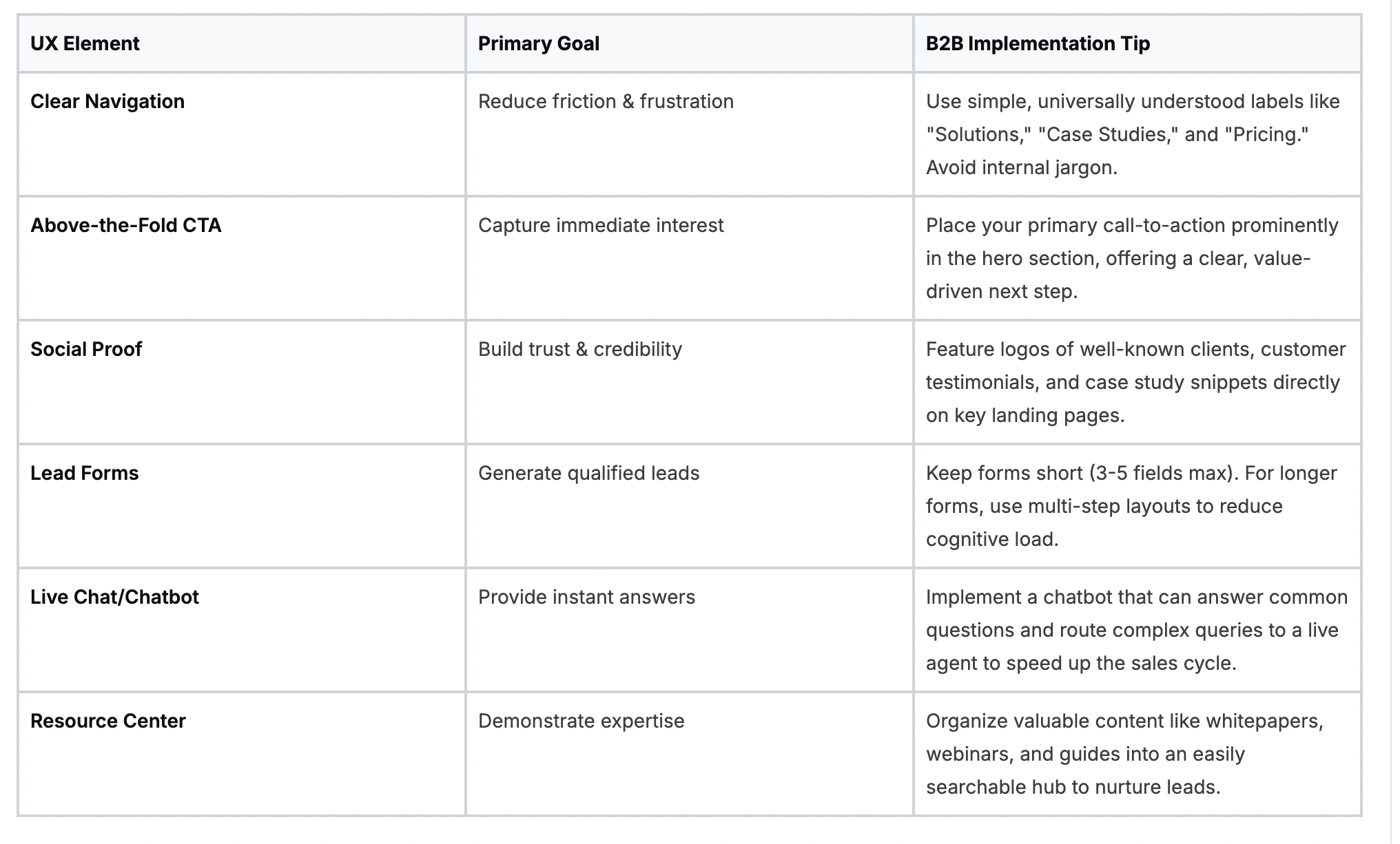
These elements work together to create an experience that feels helpful, trustworthy, and efficient—precisely what a time-crunched B2B buyer is looking for. By implementing them thoughtfully, you transform your website from a passive brochure into an active lead-generation tool.
Writing Calls-to-Action That Actually Convert
A generic "Learn More" or "Submit" button isn't going to cut it with a busy executive. Your CTAs need to be specific, compelling, and laser-focused on value. They must instantly answer the user's unspoken question: "What's in it for me?"
Instead of bland, passive phrases, switch to action-oriented language that promises a clear and immediate benefit.

The key is to match the CTA to the user's intent at that exact moment. A visitor reading a top-of-funnel blog post might be ready to download a report, but they're probably not ready for a full demo. Your "ask" should always align with their level of commitment.
Designing Lead-Capture Forms That Don't Scare People Away
The form is the final gateway to conversion, but it's also where many high-value prospects get spooked and abandon the process. A long, intimidating form can feel more like an interrogation than an invitation. Your job is to make it feel like a fair exchange.
A great lead-capture form is a promise. It signals that the value you're about to deliver—whether it's a demo, a whitepaper, or a consultation—is worth the information they are providing. Make the exchange feel effortless and worthwhile.
Here’s how to get it right:
- Ask for Less: Only request the absolute minimum information you need to qualify a lead. You can always gather more intel later in the sales process.
- Use Smart Forms: Leverage technology that recognizes returning visitors and either pre-fills their information or shows them a more advanced offer.
- Explain the "Why": Add helper text to clarify why you need specific information. For example, next to a "Company Size" field, you could add, "So we can provide the most relevant case studies."
The difference a user-focused redesign can make is often dramatic. The infographic below shows the kind of performance lift you can expect after putting these UX principles into practice.
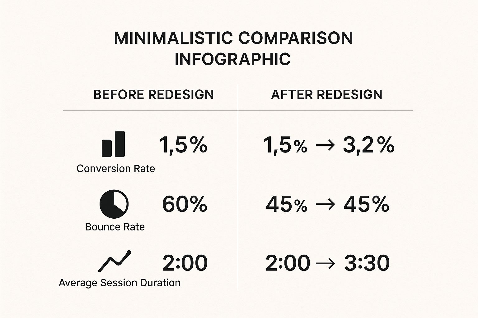
These metrics aren't just vanity numbers; they represent real business growth. Prioritizing the user experience directly translates into turning more visitors into genuinely engaged prospects.
Crafting Content That Builds Authority

In the high-stakes B2B world, your website content isn’t just marketing fluff—it’s the currency of your credibility. Simply listing your services won't cut it. You need to build a fortress of authority that educates, empowers, and guides your ideal clients toward making a confident decision.
Think of your site less like a sales brochure and more like a curated library of expertise. It's here that website design for B2B moves beyond aesthetics and becomes a powerful tool for showcasing thought leadership. The mission is to create and present high-value content that your target audience is actively searching for, ultimately making your website their go-to resource.
Building Your Digital Resource Center
A dedicated "Resources" or "Insights" section is non-negotiable for any serious B2B company. This isn't just a blog. It’s a strategic hub designed to attract, nurture, and convert leads by proving your expertise at every single stage of their journey.
This is the intellectual heart of your website. It’s where you house the assets that do the heavy lifting in a long B2B sales cycle, building the case for your solution one piece of content at a time. The key is to organize this content so it’s not only easy to find but also visually compelling and scannable for busy professionals.
A great resource center often includes:
- Insightful Whitepapers: Go deep on complex industry challenges, offering unique data and perspectives that immediately position you as an expert.
- Detailed Case Studies: These are your most powerful sales tools. They provide concrete, real-world proof of your value with quantifiable results.
- Practical Webinars: Offer live and on-demand video that educates your audience and gives your brand a human, approachable face.
- Actionable Blog Posts: Address top-of-funnel questions and pain points to draw in new prospects through organic search.
Having this content isn't enough; you must present it with intention. Every whitepaper needs its own landing page, meticulously designed to highlight its value and encourage downloads. The data is clear on this: companies that maintain an active blog generate 67% more monthly leads than those that don't. It’s a perfect example of content and design working in tandem.
Weaving Content into the User Journey
Your most valuable content shouldn't be locked away in a "Resources" silo. The best B2B websites seamlessly weave these assets into the entire user journey, placing them exactly where a prospect needs them most.
Imagine a visitor lands on a specific "Solutions" page. Instead of just describing what you do, you can embed a link to a relevant case study right on that page. This instantly validates your claims and provides the social proof a buyer is looking for at that precise moment.
The most effective B2B websites don't just host content; they deploy it strategically. Think of your case studies and whitepapers as expert salespeople, ready to join the conversation on any page of your site to provide proof and build trust.
This integration turns passive page views into active engagement. A prospect evaluating your cybersecurity solution should find a link to your latest security whitepaper without having to hunt for it. Someone exploring your logistics software should see testimonials from other supply chain managers. This kind of contextual relevance is what separates a good website from a great one.
Turning Technical Data into Scannable Assets
Let's be honest—a lot of B2B content is dense and technical by nature. The real challenge is presenting this information in a way that respects a professional's limited time. This is as much a design problem as it is a content problem.
Here are a few ways I’ve seen this done effectively:
- Use Visual Cues: Incorporate pull quotes, custom icons, and bolded statistics to draw the eye to key takeaways.
- Break Up Text: Use short paragraphs, clear subheadings, and bulleted lists to make long-form content scannable. No one wants to read a wall of text.
- Incorporate Graphics: Simple charts, graphs, and infographics can explain complex data or processes far more effectively than words alone.
When you master the art of turning dense information into visually appealing and easily digestible assets, you make your expertise more accessible. This attention to detail shows a deep respect for your audience's time and intelligence, which only solidifies your authority. Planning for this is a core part of any winning B2B content marketing strategy for conversions.
Winning with Technical SEO and Performance
Even the most brilliant design and compelling content will fall completely flat if your ideal clients can't find you. Behind every great B2B website is a powerful technical foundation—the invisible engine that drives visibility, builds trust, and delivers a flawless user experience.
This isn't just about appeasing search engines. For discerning business buyers, a slow, clunky, or broken website is more than an inconvenience; it's a direct reflection on your company's competence. Let's demystify the behind-the-scenes work that turns a good design into a high-performance business asset.
Building an SEO-Friendly Site Architecture
Your website’s structure is its digital skeleton. A logical, well-organized architecture makes it incredibly easy for both users and search engine crawlers to figure out what your site is about and find what they need. This clarity is absolutely crucial for B2B companies with complex solutions.
Think of it as creating a clean filing system. Your main services should be top-level pages, with more specific features or industry applications nested underneath them in a sensible hierarchy. This creates intuitive pathways for users and helps search engines assign authority to your most important pages.
A clean structure also makes sure that "link equity"—the authority passed from one page to another—flows efficiently throughout your site, boosting the ranking potential of your most valuable content. We go much deeper on this topic in our comprehensive guide on SEO for B2B companies.
The Unforgiving Nature of Page Speed
In B2B, first impressions are solidified in milliseconds. Your website's loading speed is a critical, non-negotiable factor that directly impacts both your reputation and your revenue. Slow performance sends a clear message: you're either not technically proficient or you don't value your visitor's time.
The data on this is staggering. A massive 83% of potential buyers expect a website to load in under three seconds. Failing to meet this expectation is costly, with businesses risking a collective loss of around $2.6 billion in revenue due to slow-loading sites.
To win on this front, focus on these practical steps:
- Optimize Images: Always compress images before uploading them. Use modern formats like WebP that offer high quality at much smaller file sizes.
- Leverage Caching: Implement browser caching so that a returning visitor's browser doesn't have to re-download all your site's assets every single time.
- Minimize Code: Clean up your site’s HTML, CSS, and JavaScript by removing unnecessary characters, spaces, and comments that bloat file sizes and slow things down.
Speaking the Language of Search Engines with Schema Markup
Schema markup is specialized code you add to your website to help search engines understand your content on a much deeper level. For B2B sites, this is an incredible opportunity to stand out in the search results.
Instead of just telling Google you have a service page, you can use schema to specify the exact service you offer, the problems it solves, and even who it's for. This can lead to richer, more informative search results (known as "rich snippets") that significantly improve click-through rates.
Think of schema markup as giving Google a detailed briefing about your business. It allows you to control the narrative and present your company's expertise with precision, directly within the search results page.
Consider implementing specific schema types that are highly relevant for B2B:
- Organization Schema: Clearly defines your business name, logo, and contact information.
- Service Schema: Details the specific services you provide, helping you rank for long-tail, high-intent keywords.
- FAQ Schema: Allows your Q&A content to appear directly in search results, answering user questions instantly and establishing authority.
By investing in this technical groundwork, you're not just optimizing for bots. You're building a faster, smarter, and more findable digital headquarters that inspires confidence and drives growth.
Your B2B Website Design Questions Answered
Starting a B2B website project can feel like you're staring at a thousand-piece puzzle. Questions about strategy, cost, and what actually works are bound to come up. We get it. This is the stuff that keeps business leaders and marketers up at night.
Let's cut through the noise. Here are the straight answers to the most common questions we hear, based on our experience building sites that don't just look good—they generate leads.
How Is Website Design for B2B Different from B2C?
The biggest difference isn't the technology; it's the psychology. B2C design usually plays on emotion to drive a quick, individual purchase. Think about buying a new pair of sneakers online—it can be an impulse decision that takes all of two minutes.
Website design for B2B, on the other hand, is built for a completely different journey. You're not selling to one person on a whim; you're convincing a committee of highly analytical people making a high-stakes decision over weeks or even months. Their choice is driven by logic, ROI, and mitigating risk for their company.
This changes everything about how your site needs to be designed. Instead of flash sales and emotional triggers, you have to nail the fundamentals:
- Deep, Substantive Content: Your audience is looking for proof. This means detailed whitepapers, data-rich case studies, and technical spec sheets that answer tough questions.
- Clear Information Architecture: A buying committee can’t afford to get lost. They need to find complex information easily, or they'll simply move on to a competitor who makes it easier for them.
- Building Long-Term Trust: Every single element on your site—from the team photos to the privacy policy—needs to reinforce that you are a credible, reliable partner for the long haul.
The goal isn't a fast conversion. It's about guiding a group of professionals to a deeply informed decision they feel confident about.
What Are the Most Important Pages on a B2B Website?
While every page contributes to the overall experience, some pages do the real heavy lifting. These are the ones that buying committees will pore over, share internally, and use to build the case for choosing you.
From our experience, these are the non-negotiable pages that drive the most impact:
- Solutions or Services Pages: These can't just be a laundry list of what you do. They must articulate the specific problems you solve for specific roles or industries, speaking directly to a visitor's most pressing challenges.
- Case Studies or Results Section: This is where you move from claiming value to proving it. Nothing is more powerful to a business audience than concrete examples with quantifiable outcomes.
- The About Us Page: Never underestimate this page. It's your chance to show the human side of your business, tell your company's origin story, and showcase the deep expertise of the people on your team. It builds a connection that logic alone can't.
- A Resource Center or Blog: This is your engine for establishing thought leadership. It’s where you prove you understand your clients' world better than anyone, capturing their attention and trust long before they're even thinking about making a purchase.
How Do I Measure the ROI of My B2B Website?
Measuring the ROI of your B2B website means looking far beyond surface-level metrics like traffic or bounce rate. You have to connect your website's performance to what the C-suite actually cares about: revenue and growth.
Think of your website not as a marketing expense, but as a revenue-generating asset. The right metrics will prove its value by tracking its direct contribution to the sales pipeline and bottom line.
To get a true picture of your ROI, you need to track these Key Performance Indicators (KPIs):
- Lead Generation Rate: Of all your visitors, what percentage turns into an actual lead by filling out a form?
- Lead Quality Score: This is even more important. How many of those leads does your sales team accept as "sales-qualified"? This metric bridges the gap between marketing and sales.
- Conversion Rate on Key CTAs: Don't just track all conversions together. Separately measure downloads of high-value content, demo requests, and consultation bookings to see what's really driving pipeline.
- Customer Acquisition Cost (CAC): When you close a deal that originated from the website, how much did it cost to acquire that customer through this channel?
By connecting these dots, you can draw a straight line from your investment in a professional website to qualified leads and, ultimately, new revenue.
How Often Should I Redesign My B2B Website?
The old-school approach of a massive, painful redesign every three to five years is dead. It just doesn't work anymore. Buyer expectations, SEO standards, and technology change so fast that a site built in 2021 can feel ancient by 2024.
A far more effective strategy is continuous, iterative improvement. Your website should be a living, breathing asset that evolves based on real data, not a gut feeling every few years. By constantly analyzing user behavior, running A/B tests, and listening to customer feedback, you can make smaller, smarter updates on an ongoing basis. This keeps your site performing at its peak without the massive disruption of a full rebuild.
Of course, a ground-up redesign might still be necessary if there's a major catalyst for change. This could be a complete company rebrand, a fundamental shift in your business model, or if the site's underlying technology has become so outdated it’s a security risk or just can't keep up anymore.
Ready to build a B2B website that drives real growth? At Big Moves Marketing, we specialize in crafting conversion-ready websites and strategic growth campaigns for B2B tech companies. Let's create your company's most powerful sales asset. Learn how we can accelerate your growth.
%20-%20Alternate.svg)


%20-%20white.svg)